Your cart is currently empty!
Tag: tips

✷ What is Canva and why it’s one of the coolest graphic design tools EVER!
Update: this post was written around 2016/17. Much has changed on Canva since then, and I plan to write about it soon. So many cool, useful changes! I still love Canva and use it more than ever now. But this is just.a heads up if you’ve arrived here in 2020 that the information below might be outdated 😘
Hey guys, how are you doing?
As always, I will start the post by going straight to the point, for those who want a simple answer!
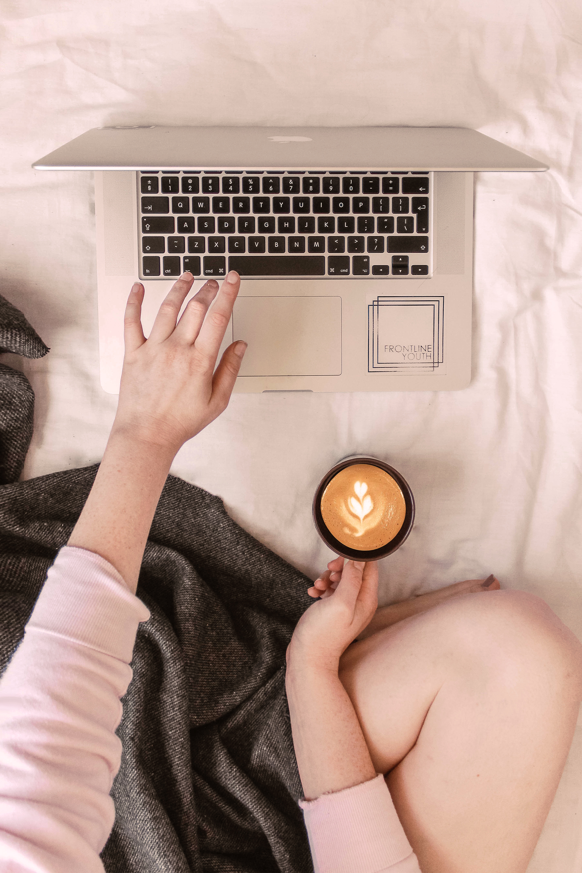
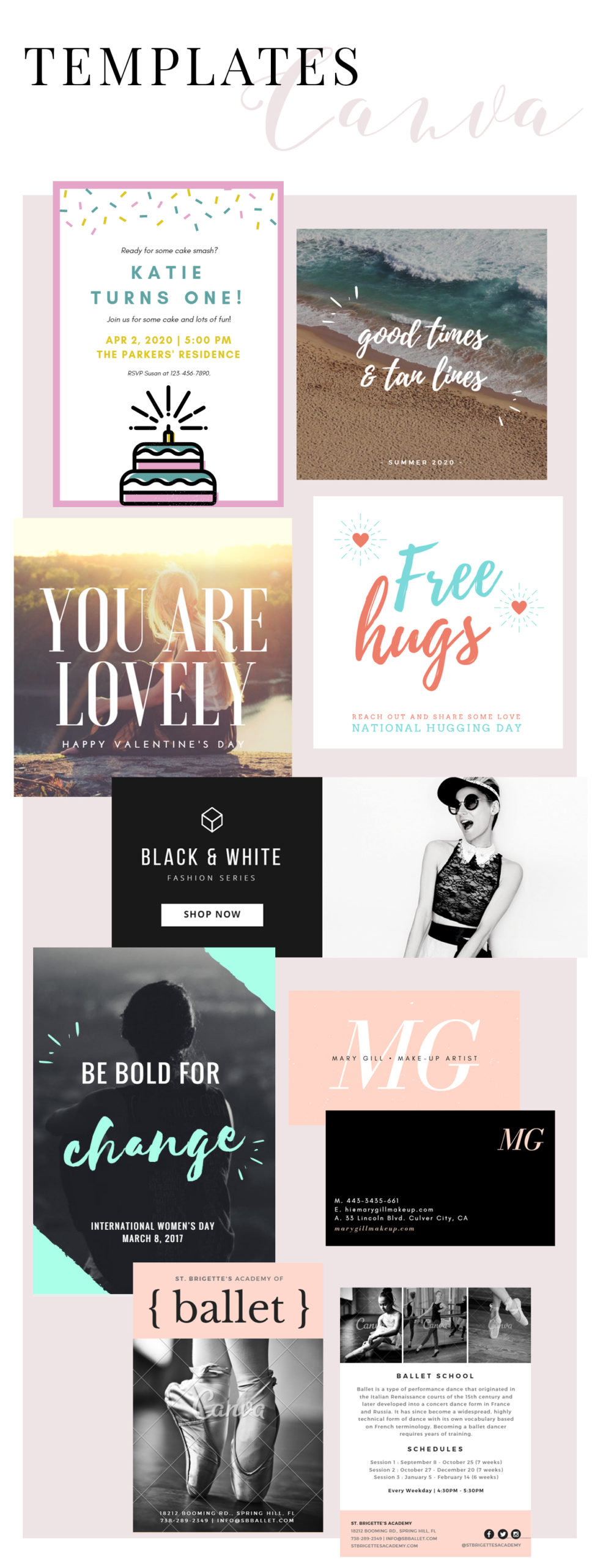
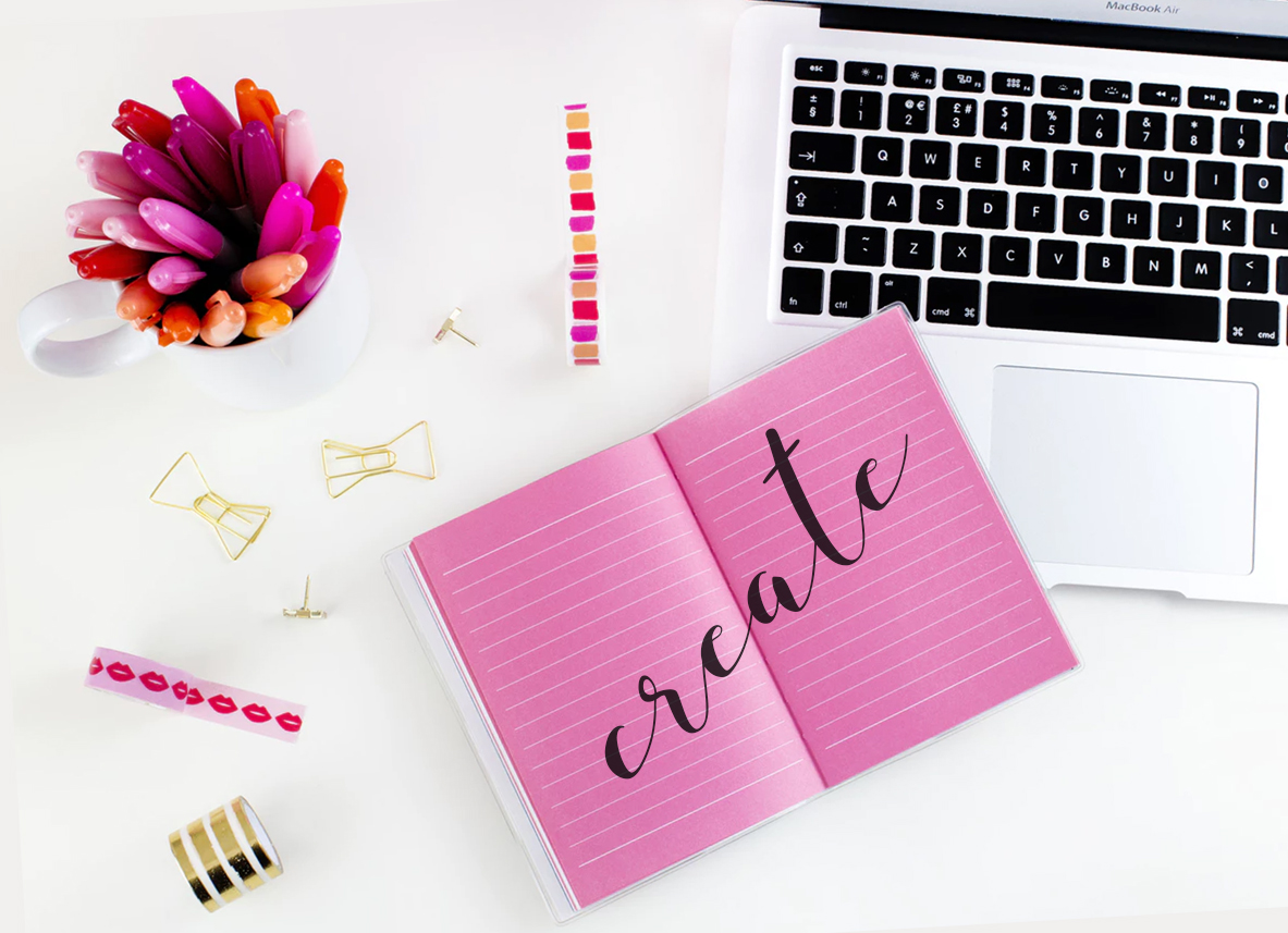
Canva is a very popular website and app that offers resources to create graphic and digital design pieces such as social media posts, flyers, business cards, invitations and more. It has a VERY easy and pleasant interface, useful tools for the development of elaborate or simple layouts, and templates (models) of very beautiful graphic pieces in the most used formats in everyday life.

Canva is free, but it has a paid version (Canva for Work) that can be very worthwhile in some cases. It can be accessed from both your computer or your phone, although, depending on the need, it is much better to use it on the computer.
I admit that when I first heard about Canva, I was afraid, thinking that the design profession would end now that such a tool was offered so easy to use, and with templates of such good taste. But the truth is that the designer’s vision remains the great differentiator. Nowadays it is a great ally in my work! 💖💫
Now let’s elaborate on the subject !
Is Canva a replacement for Photoshop? Which one is better?
Yes, Canva replaces Photoshop in creating everyday designs. It has features that are good enough to create countless types of layouts without having to learn PS. In addition, Canva is highly recommended for entrepreneurs, bloggers, freelancers and amateurs who want a practical and simple alternative to develop graphic arts in good taste. It’s easy to start and finish a beautiful design in Canva with a few clicks.
This does NOT in any way mean that Photoshop loses its value. Photoshop is still the best graphics editing software out there, it has fantastic tools that are much, much more advanced than Canva and achieves unparalleled results. It’s not that with Photoshop you can do the same things you do on Canva, only better. Photoshop actually has way more advanced options 🤩💫
It is not possible to register any design created in Canva, for example, something inconceivable for professional creations for major brands or projects. In Canva, you can’t edit images (just some very basic controls), nor create gifs among the million possibilities Photoshop offers. For a professional graphic designer in the 2020s, mastering Photoshop is still essential, and knowing how to work with Canva alone is not enough to have a competitive advantage in the profession.
I don’t even think that Canva’s intention is to replace PS entirely. It is just a simplified alternative, specifically focused on making layouts, specially for business owners who are not full time designers.
To sum up, each one is better in one sense, and knowing how to handle both with ease is ideal for any designer.

How to use Canva?
The interface is all intuitive, like almost everything these days. Create an account, select the type of design you want, choose a template and edit the content with your texts, images, graphic elements, etc. On the left side, the site offers several options of resources to use. Some are free, others paid.
My tip for those who don’t want to pay for premium images is to search for images on google and upload them to your account, when Canva doesn’t offer the option you want for free.

Is it worth it having a premium Canva account (Canva for Work)?
I hate to give this vague answer, but each case is different. Before hiring my professional plan, I read many posts and professional designer reviews. I confess that opinions were divided. About half of them love Canva for Work and highly recommend it. Another half say they have not seen so much advantage.
I think it’s worth it. For entrepreneurs, bloggers etc who, as I mentioned above, can have Canva as their main ally in marketing and design, I would super bet on the premium option for sure.
Guys, I really hope this was helpful somehow! 🥰💖✨
Don’t even think twice before creating your account to start making awesome designs on Canva.
beijos!
Lu


COLOR PALETTES: LOVECORE
Love really is in the air, isn’t it?
So much so that the lovecore aesthetic has expanded to a 365 of the year kinda thing instead of restricting its elements to February only. Are we getting more romantic? Or is it just an aesthetic thing, not really connected to actual feelings of love? 💌
Who knows!
Regardless, here’s a collection of lovecore aesthetic color palettes I’ve created to help bring some inspo to any projects you might be currently working on. These are great for graphic design pieces, decor projects, event planning or anything that has love as a theme! 💕
Oh, and check out these lovecore CANVA font pairings too!
Hope you like these:
Lovecore aesthetic color palettes
I’m a hue fan (and prolific creator) of color palettes, so check these ones out too: spring color palette, monochromatic color palettes, fairycore color palettes, pink winter color palettes… phew! Much more to come!
Beijos,
Lu

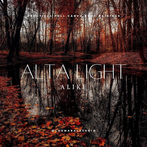
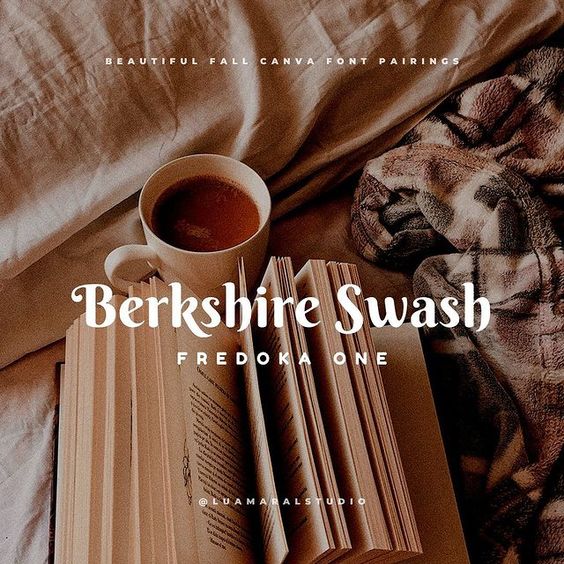
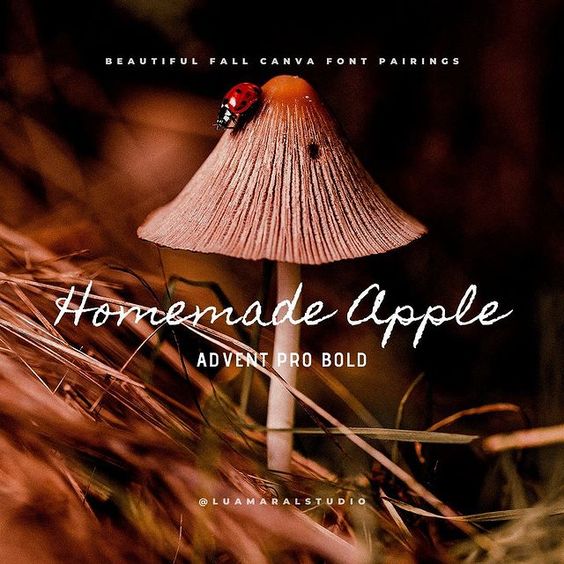
FONT IDEAS: FALL
Hi!!
You know, during Fall time, I don’t really talk about anything else in this world but the fact that I LOVE the Fall! hahaha!
The vibe, the aesthetic, the weather, the feeling inside my heart. All of it. Just pure love. 🧡🍂
So in that spirit of adoration of these 3 beautiful months where everything is just right in the world, I’ve selected some of my favourite Autumn inspired font combos from CANVA.
There’s a little bit of coziness, a bit of nature, a lot of orange and brown and, yes, some spookiness because Halloween is one of the best parts about the Fall! 🎃🧡🖤
Here they are. Hope you enjoy!
Fall aesthetic CANVA font pairings

Want more font inspo? We have them! Cottagecore fonts, cute fonts and more 🙂
And hey, since you’re already here and interested in Fall aesthetics, checkout this post with pretty Fall aesthetic phone wallpapers, this one with Fall aesthetic photo ideas, and this one with beautiful Fall aesthetic quotes for social media, texts, etc 🧡🍂
Beijos,
Lu
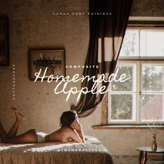
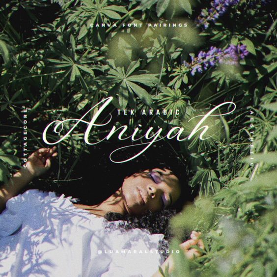
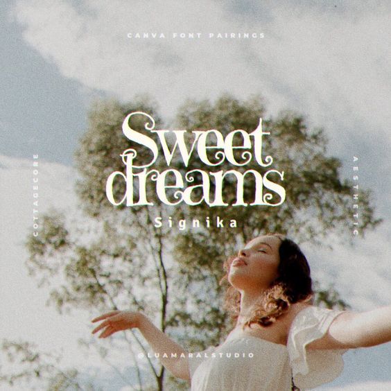
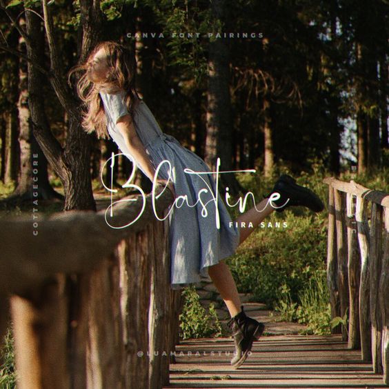
FONTS: COTTAGECORE
I know exactly what you’re thinking. There are SO MANY amazing fonts to chose from on Canva, how on Earth am I suppose to pick one?
Well my friend, I know the struggle. And I’m here to help.
If your goal is to find a Cottagecore aesthetic font, I’ve gone through Canva’s font library and selected a few that are just so damn adorable!
-
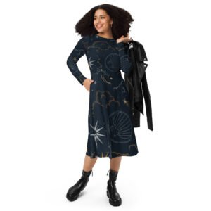
 Dark Academia Long Sleeve DressPrice range: $55 through $65
 -
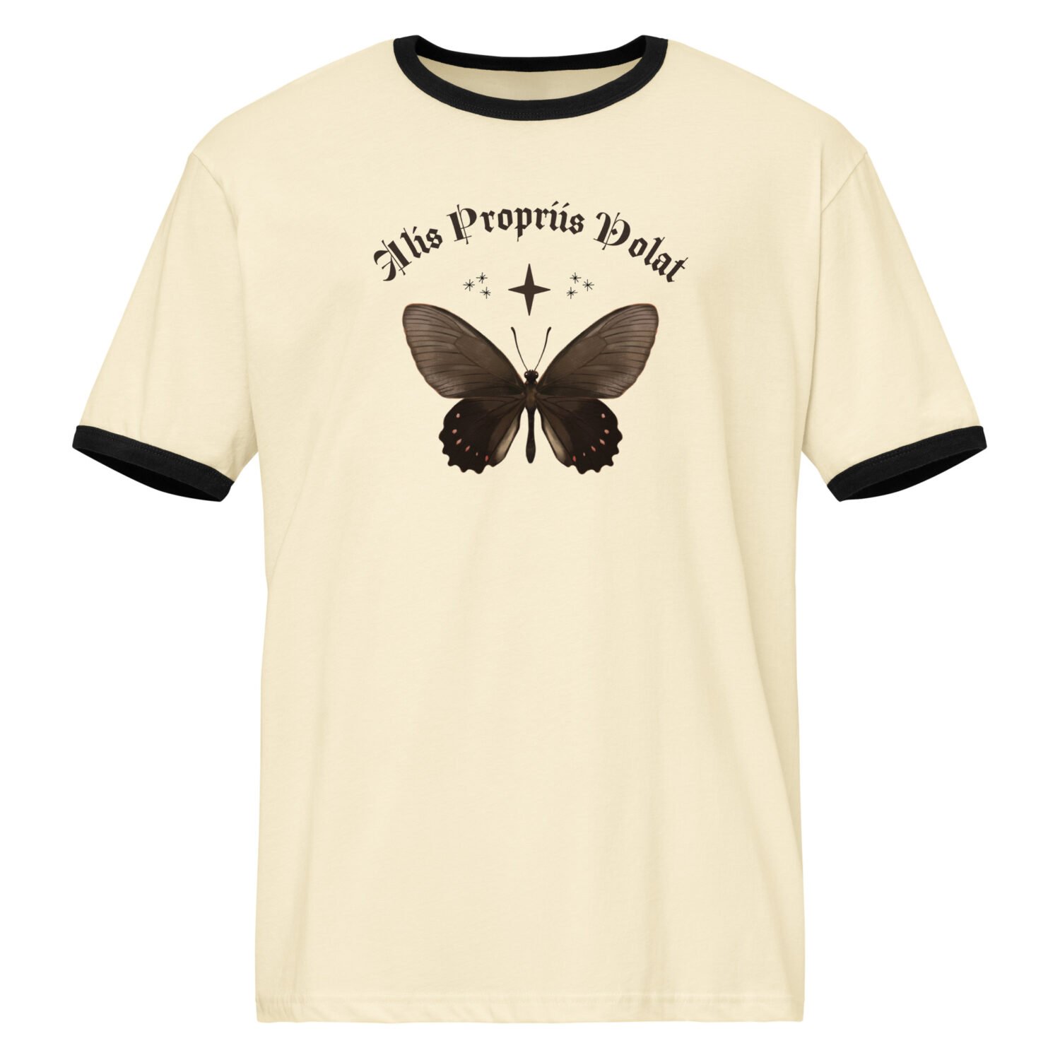
Dark Academia T-shirtPrice range: $21 through $26
-
Oversized heavyweight sweatshirtPrice range: $61 through $67
By the way, if you want to read a little about it, I have a post here on the blog that’s all about Cottagecore aesthetic. Check it out!
Now, to the font combos!
Cottagecore font pairings
Aren’t these SO lovely?
Check out these font pairing as well. And these cute ones too! And since we’re on the typography topic, take a look at this post with font secrets everybody should know about 🙂
Beijos,
Lu
-

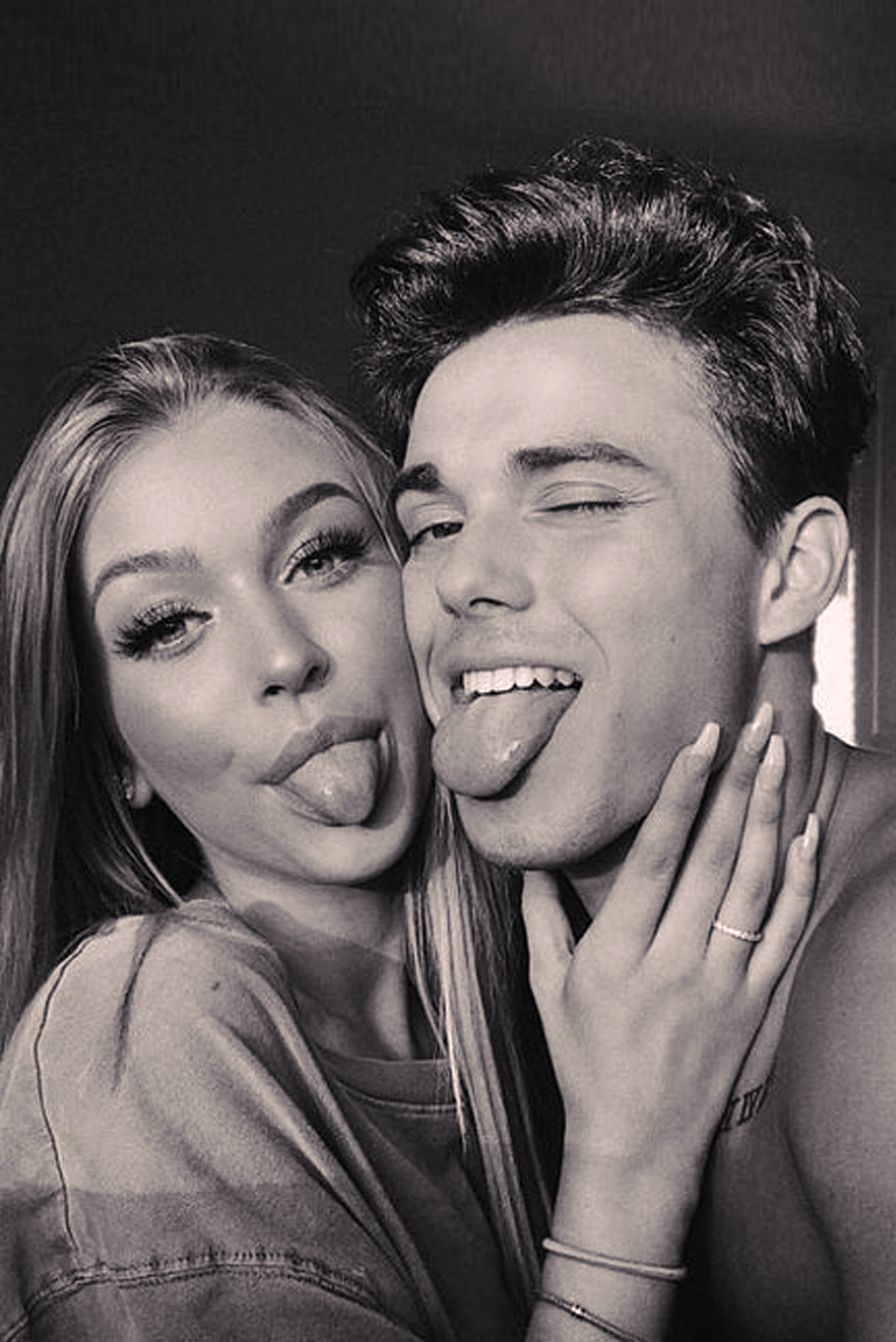
PHOTO IDEAS: COUPLES
Cute couple photos are always a delight to see, and of course, to copy. After all, there’s nothing like a good dose of inspiration for us to unleash our creativity, right?
Especially with your bae! 💕

I made a selection of several aesthetic pictures of couples in love I found on Pinterest and around the web. Some might be a bit difficult to emulate in real life, but many of them are very simple and easy!
All you need is to be willing to have a good time and enjoy the moment together 💖💖
♡ Cute shot ideas for aesthetic couple photos ♡


Sooo..? Do you like them?
💡 Check out this blog post by Pixpa, throwing light on how more and more couples are looking for professional photographers to capture their personal stories to share with their friends and family 💡
Beijos,
Lu

PHOTO IDEAS: FAMILY
I know, family photo ideas are easy to find online. It turns out though that the vast majority of the references we find are not very cool and “posed” photoshoots… And that’s not quite what we’re looking for, right?
When I went to research images to make this post, I spent so much time hunting for more natural and creative options without being overly posed to inspire our future pics with our parents, uncles, cousins, siblings, grandparents… 🌸 💖🌷
And this is what I got!

Beyond this issue of having a lot of professional photo essay photography posed, almost always, regardless of the search terms I use, the results are a super young couple with young children, in most cases babies. I wanted something more real, with real parents, adult children, people like us in the real world, living real life! hahahaha
You couldn’t find much realistic stuff like that, but you could make an interesting gallery of inspiring family photos to copy that will improve over time.
Shot ideas for family photos
Family is everything, right? Seeing these photos make my heart warm 🧡
Beijos!
Lu

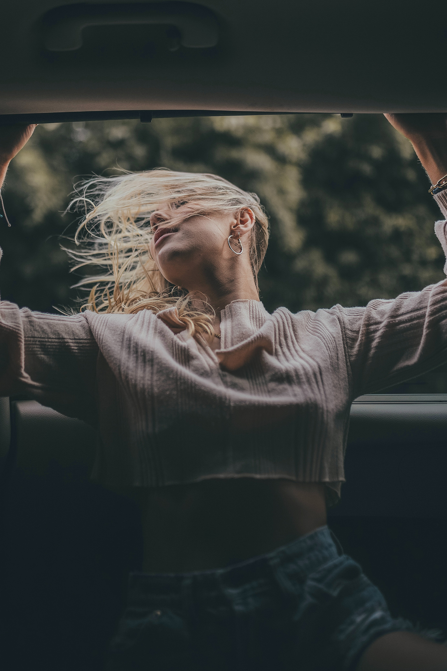
CAPTION IDEAS: TRAVEL
Nobody can argue that trips are the best moments to take pictures, right?
Even those who never post on social media suddentely show up on our feeds even if just a little bit with a few shots of the journey. After all, it’s such a special occasion… ✈🧡💙🌎

We’ve all been there, hopefully we’ll continue been there many and many times throughout out our lives!
BUT, sometimes we can’t really get the best inspiration for the perfect caption for the perfect picture to manifest before our eyes.
And that’s where I come in!
-
Dark Academia Long Sleeve DressPrice range: $55 through $65
-
Dark Academia T-shirtPrice range: $21 through $26
-
Oversized heavyweight sweatshirtPrice range: $61 through $67
-
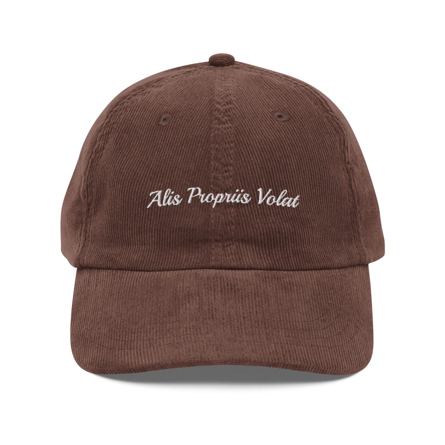
Vintage corduroy cap$24
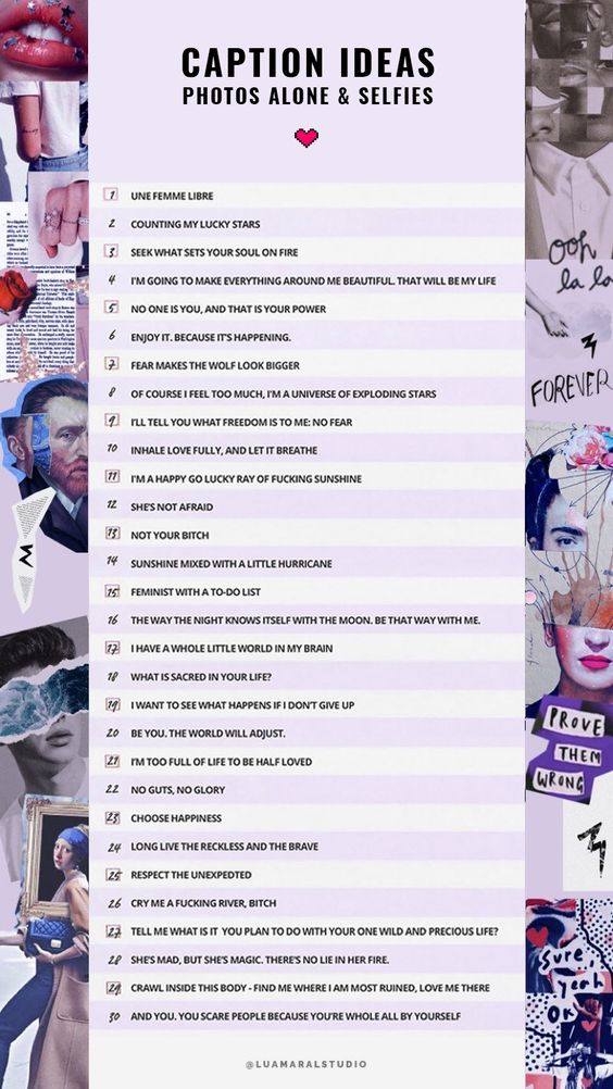
I came up with a list of caption ideas for travel, with 30 options. The image is down below, and next I typed them on the post in case you want to copy and paste directly into your post 🦋💙
30 caption ideas for travel photos

Copy paste the captions:
- So we finally meet, london !
- Ready to fall in love with a new place in this beautiful world
- Into the wild i go: losing my way, finding my soul
- I was always the girl who loved seeing the world
- See the line where the sky meets the sea? it calls me!
- Up in the clouds
- Adventure keeps my heart wild
- Good things come for those who fly
- It’s time to leave this town it’s time to steal away
- Now let us drink the stars it’s time to steal away
- I whispered to myself: go live!
- Summer nights in sindey
- Another day in paradise
- Livsnjutare (Swedish): Someone who loves life deeply and lives it to the extreme
- Paris + me + you = dream come true
- Taking all this beauty in
- Obsessed with barcelona
- My never ending desire for freedom
- You belong among the wildflowers, you belong in a boat out at sea
- Sail away, kill off the hours. You belong somewhere you feel free
- Come away with me
- Tell the angels i’m home
- The kind of beauty that is impossible to truly comprehend
exist loudly. - Hi, new york. i’ve heard a lot about you.
- It feels good to be lost in the right direction
- There she goes… there she goes again
- But I keep cruising, can’t stop, won’t stop moving
- Numinous (latin): Feeling both fearful and awed by what is before you
- Lisbon brings out the best in me
Sooo? Did you guys like my suggestions? I hope you did! ♥
Beijos,
Lu
P.S) Want more aesthetic caption ideas? Check out these posts with captions for every topic, like friends, selfie, family, winter, fall, spring and summer!
-

CAPTION IDEAS: SELFIES
Hey guys!
I’m so happy to share this post with you today.
The blog is finally getting consistent and I could not be happier about it. My native language is Portuguese, but I’ve been translating more and more posts to English, so the information, tips and inspiration can reach more and more people everyday. LOVE IT!! 💖💕
So on this post I’ll be sharing 30 ideas for captions to use on Instagram, feed or Stories, whenever you post a selfie, or any pics of yourself alone… my favourite kind! hahah JK!!

This is a tricky kind of photo to post because we feel like getting philosophical and deep on the caption, but the inspiration is not always there. You know what I’m talking about!
So here’s a little help! Hope you like these:
Caption ideas for selfies
- une femme libre
- counting my lucky stars
- seek what sets your soul on fire
- i’m going to make everything around me beautiful. that will be my life
- no one is you, and that is your power
- enjoy it. because it’s happening.
- fear makes the wolf look bigger
- of course i feel too much, i’m a universe of exploding stars
- i’ll tell you what freedom is to me: no fear
- inhale love fully, and let it breathe
- i’m a happy go lucky ray of fucking sunshine
- she’s not afraid
- not your bitch
- sunshine mixed with a little hurricane
- feminist with a to-do list
- the way the night knows itself with the moon. be that way with me.
- i have a whole little world in my brain
- what is sacred in your life?
- i want to see what happens if i don’t give up
- be you. the world will adjust.
- I’m too full of life to be half loved
- no guts, no glory
- Choose happiness
- long live the reckless and the brave
- Respect the unexpedted
- cry me a fucking river, bitch
- tell me what is it you plan to do with your one wild and precious life?
- she’s mad, but she’s magic. there’s no lie in her fire.
- crawl inside this body – find me where I am most ruined, love me there
- and you. you scare people because you’re whole all by yourself

That’s it for today girls!
Hope you find the ideas useful and inspiring! 🦋💕
Beijo,
Lu
P.S) Want more aesthetic caption ideas? Check out these posts with captions for every topic, like friends, travel, family, winter, fall, spring and summer!

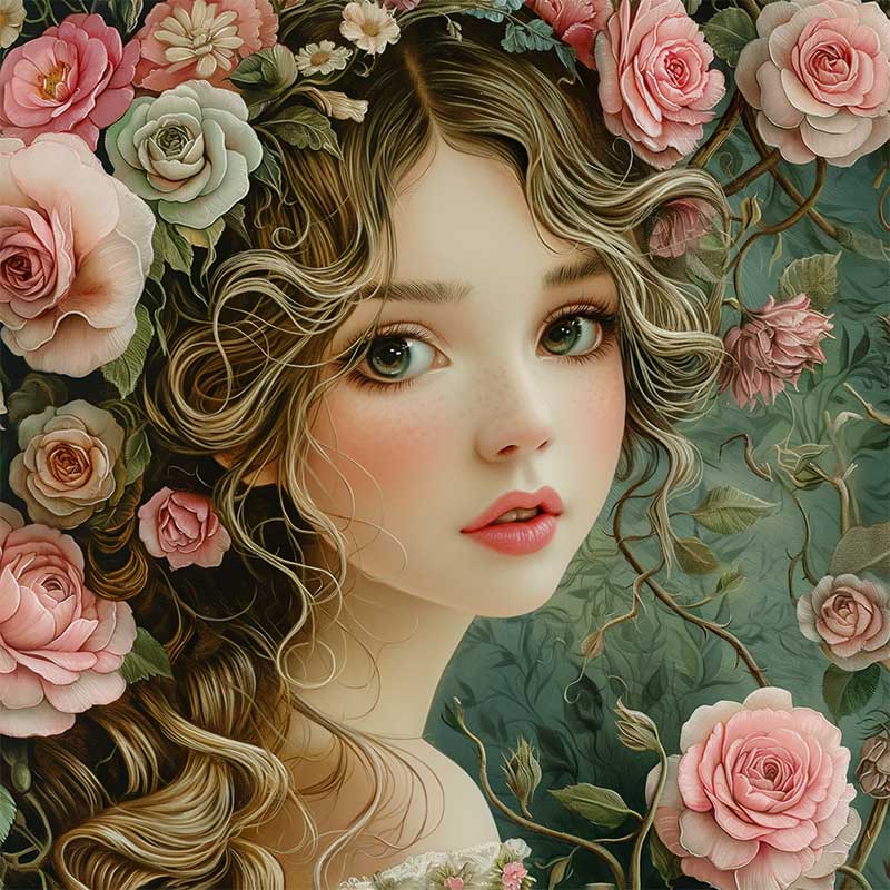
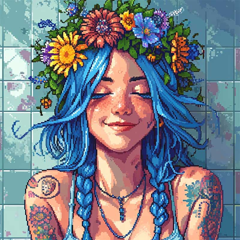
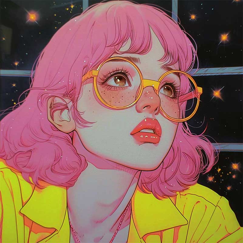
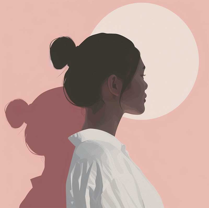
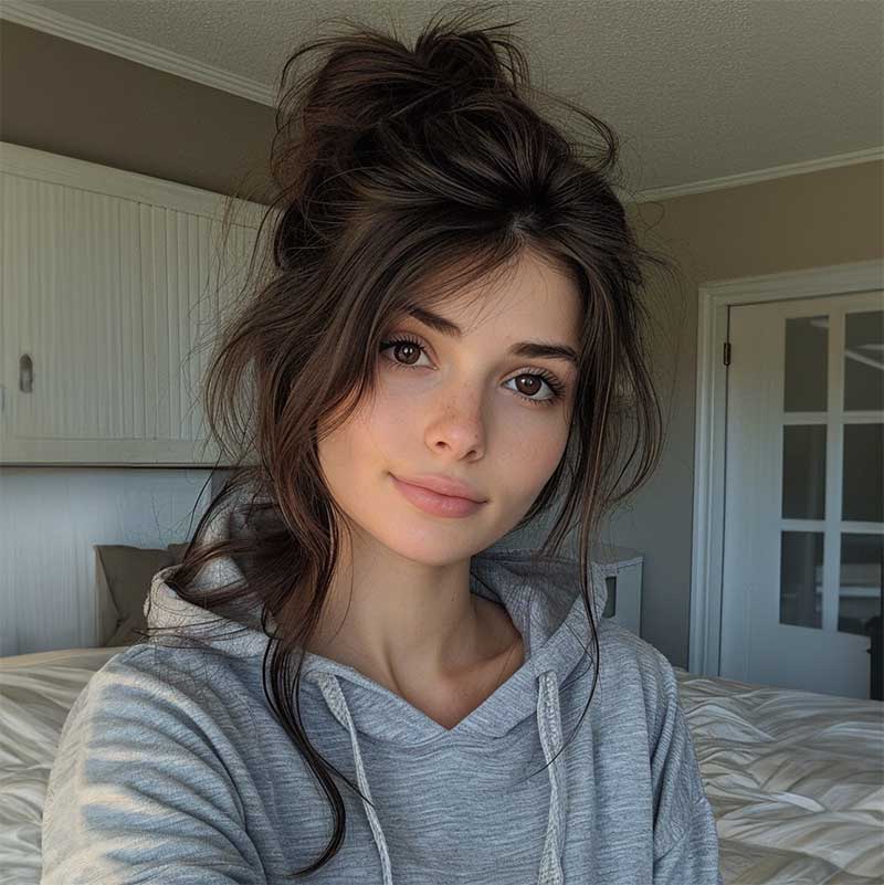
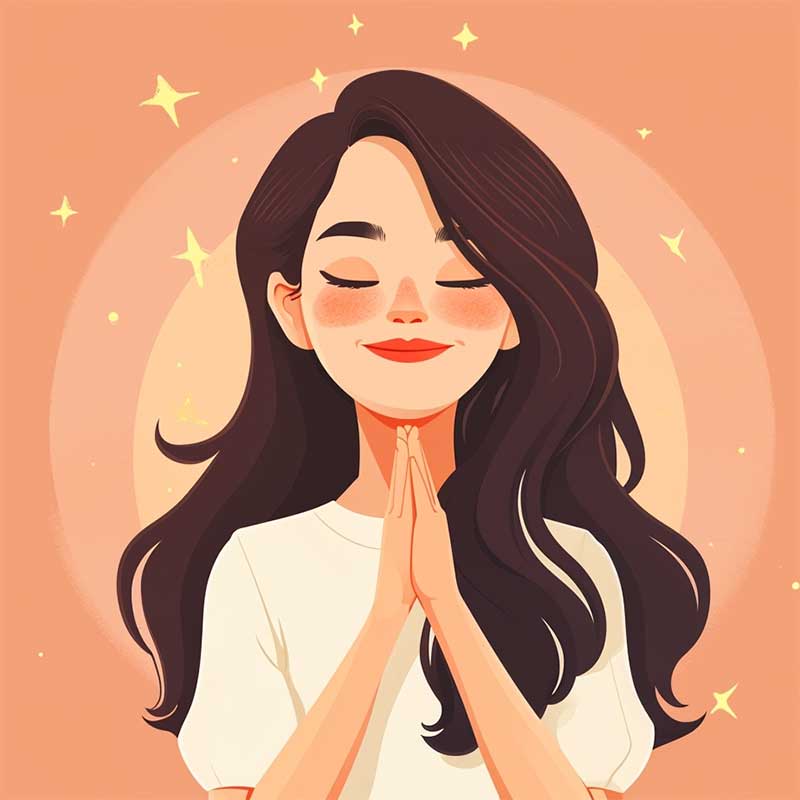
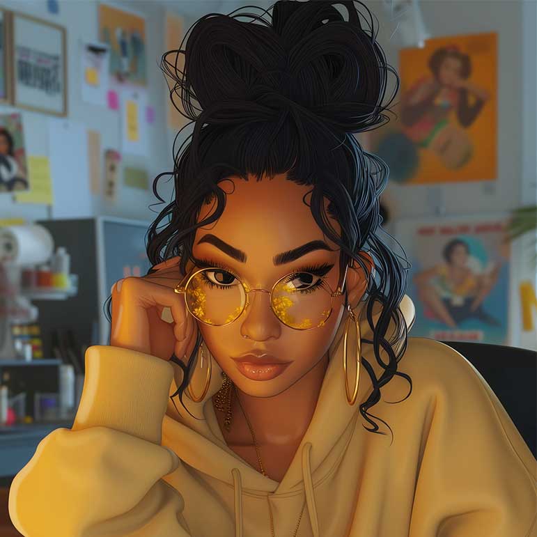
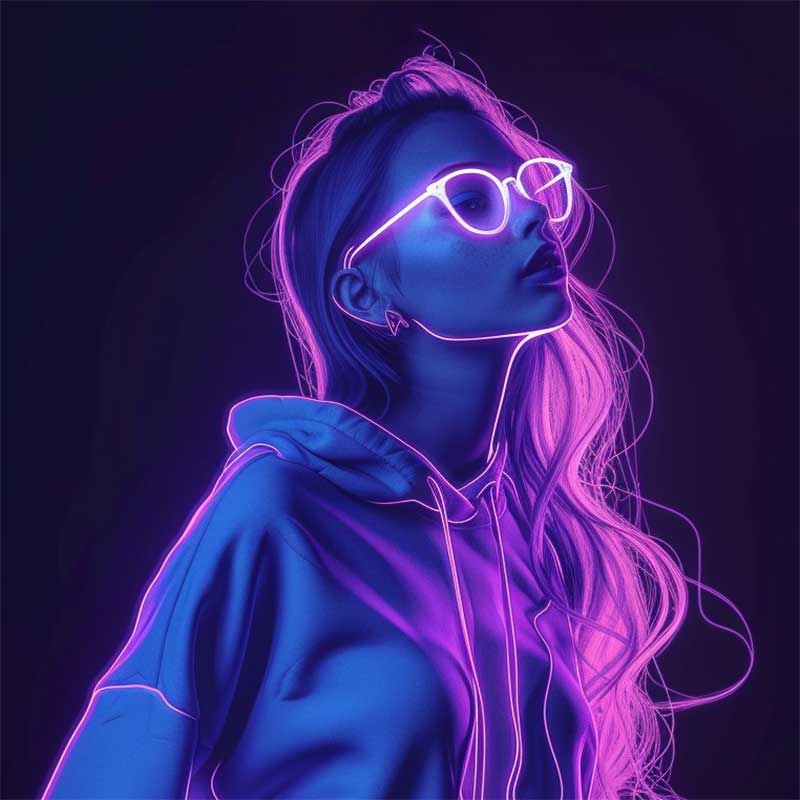
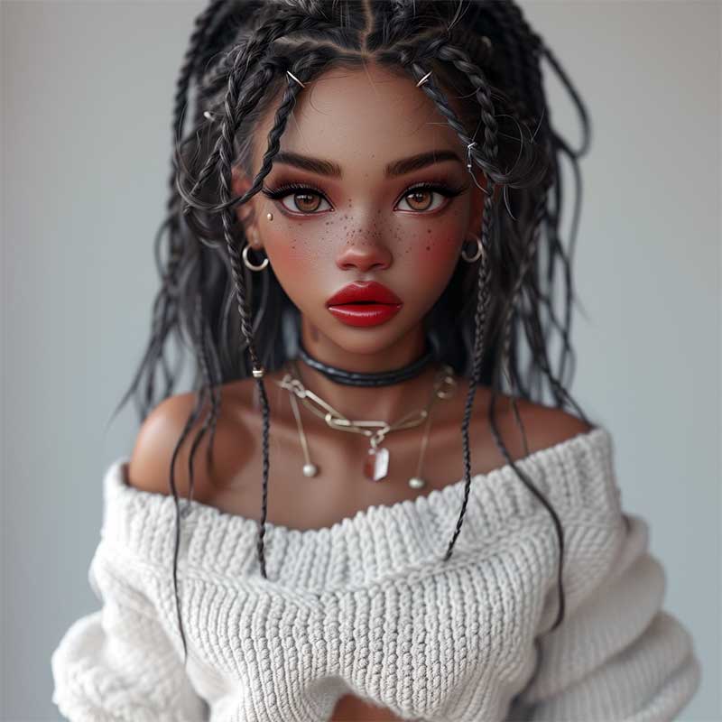
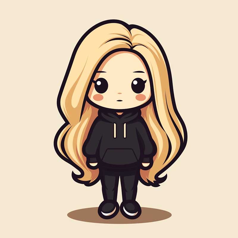
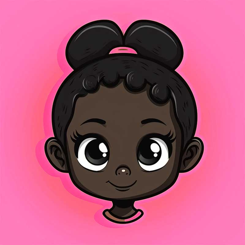
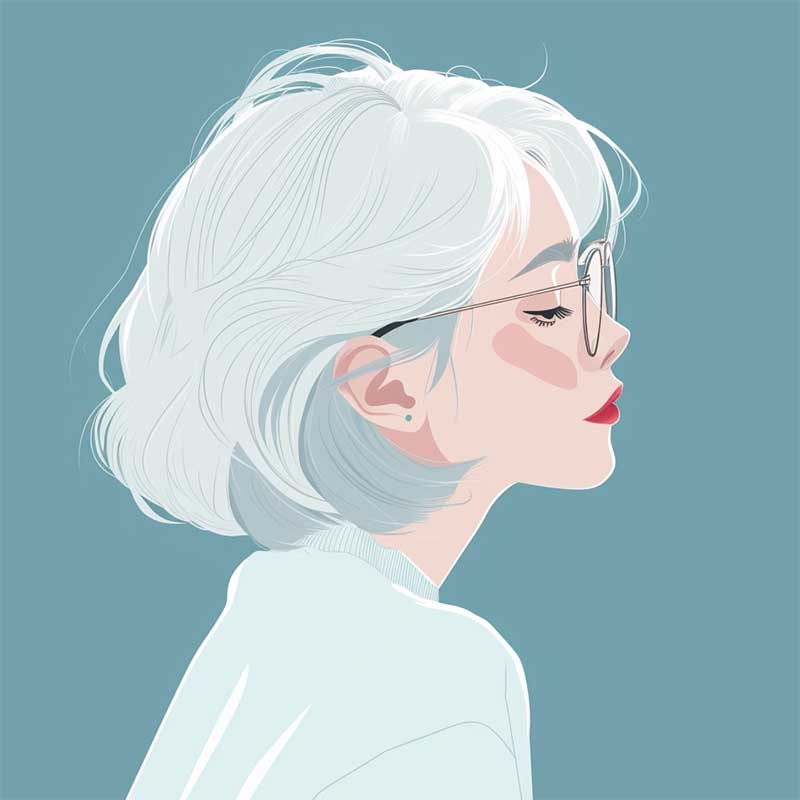
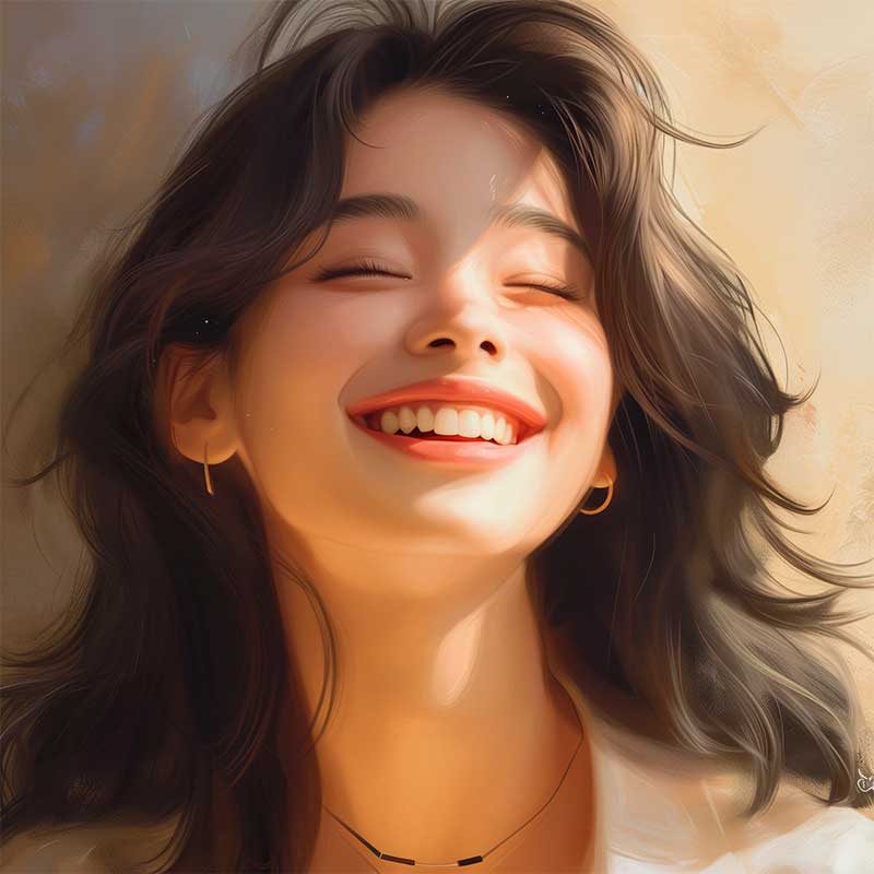
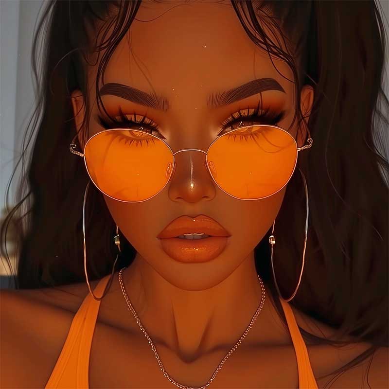
TIPS: AESTHETIC PFP
Hey there social media superstars!
Let’s talk about that killer profile pic of yours – it’s basically your front-cover look in the online world, right? So, getting it spot-on is super important. It’s like this sweet spot between kicking back casual and owning it like a boss. Ready for a quick rundown on how to be the head-turner of the virtual bunch? Let’s get started!
Tips to nail the perfect aesthetic profile picture
- First and foremost, lighting is your best friend. Natural light reigns supreme, providing a soft and flattering glow that enhances your features. Opt for the golden hour—the magical period shortly before sunset or after sunrise—for that warm, radiant vibe. Experiment with different angles to find your best side, and don’t shy away from shadows for a touch of mystery.
- Next up, it’s all about expressing your personality. Whether it’s through a genuine smile, a subtle smirk, or an enigmatic gaze, let your profile picture reflect the real you. Embrace your interests and hobbies – perhaps incorporate your favorite movie poster or showcase your love for music with a strategically placed instrument. Authenticity always shines through and catches the eyes of those who share your passions.
- When it comes to framing, less is often more. Keep the focus on you by avoiding cluttered backgrounds and distracting elements. A simple backdrop or a well-composed environment will elevate your aesthetic game, allowing your followers to appreciate the artistry of your profile picture without unnecessary distractions.
- Filters can be your secret weapon for achieving that polished and cohesive look. Experiment with different filters to find the one that complements your style and enhances the overall vibe of your profile. A carefully chosen filter can tie together your aesthetic and create a visually appealing feed that leaves a lasting impression.
- Lastly, never underestimate the power of a good edit. Fine-tune your profile picture to perfection by adjusting brightness, contrast, and sharpness. Don’t be afraid to play with color tones to achieve that Instagram-worthy finish. A well-edited photo not only enhances your features but also reinforces your commitment to curating a visually stunning online presence.
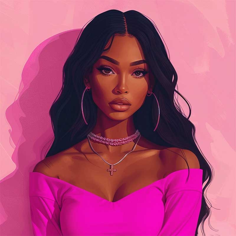
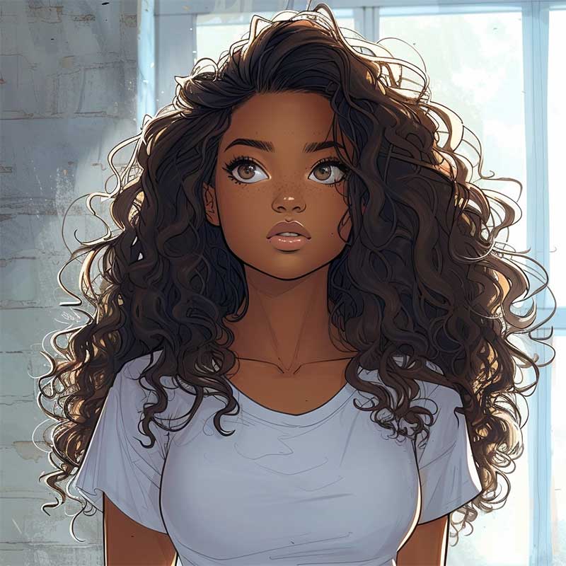
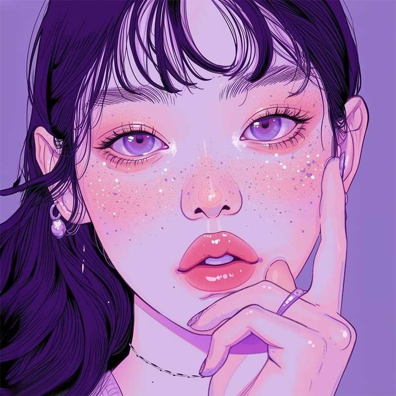
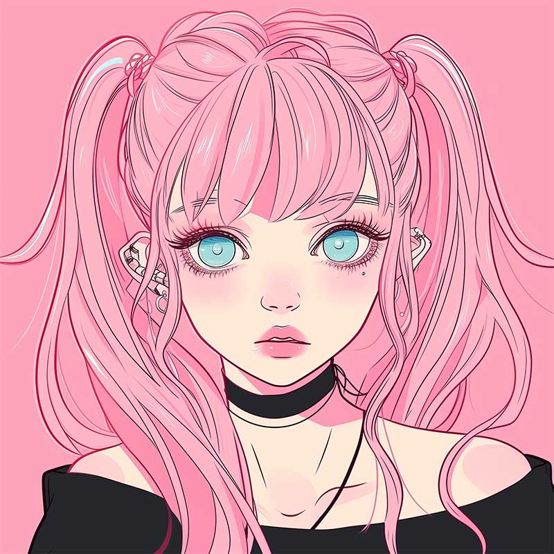
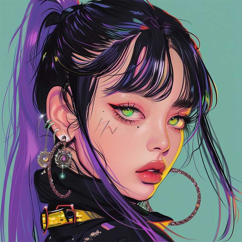
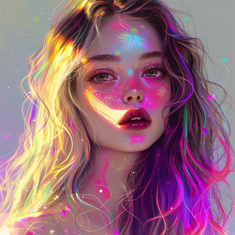
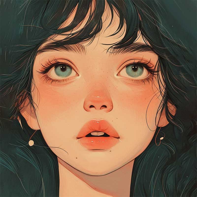
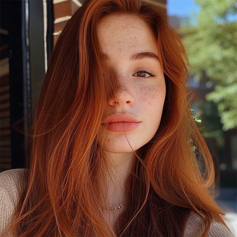
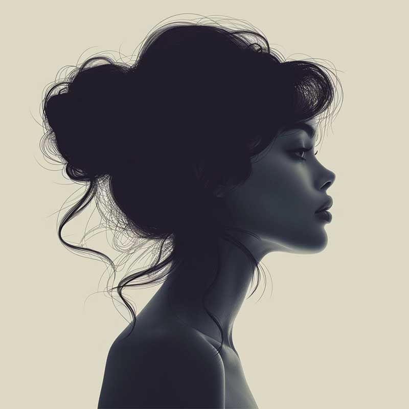
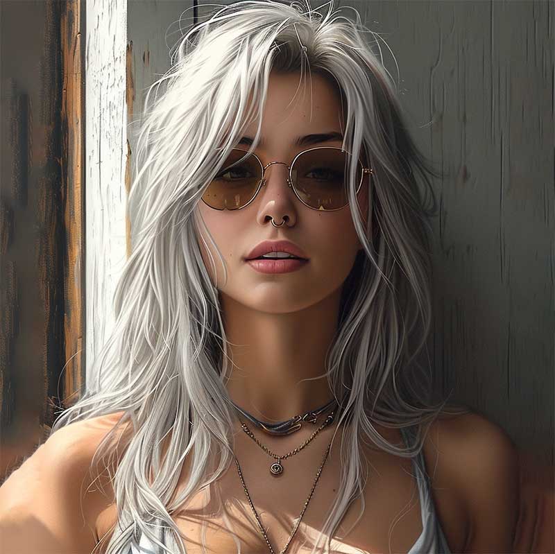
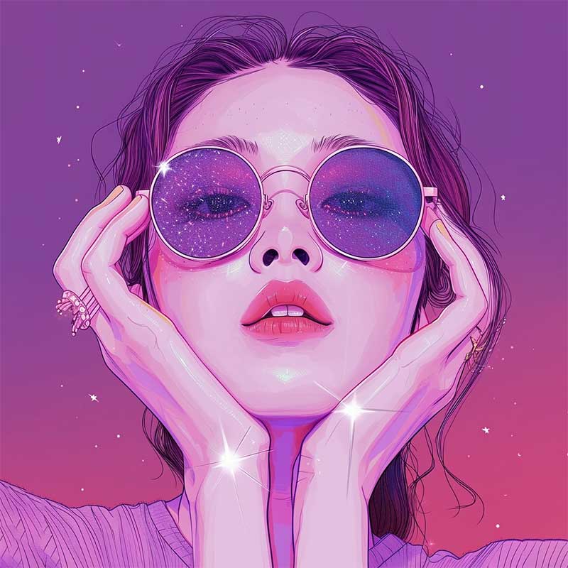
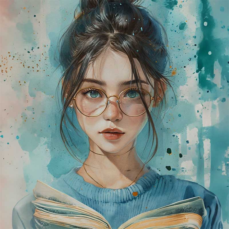
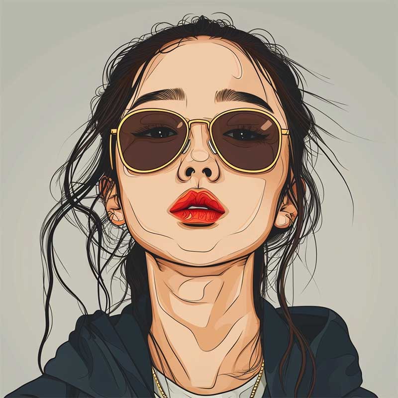
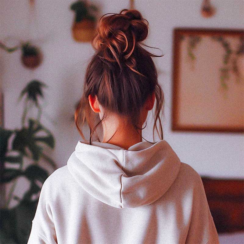
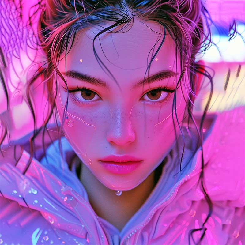
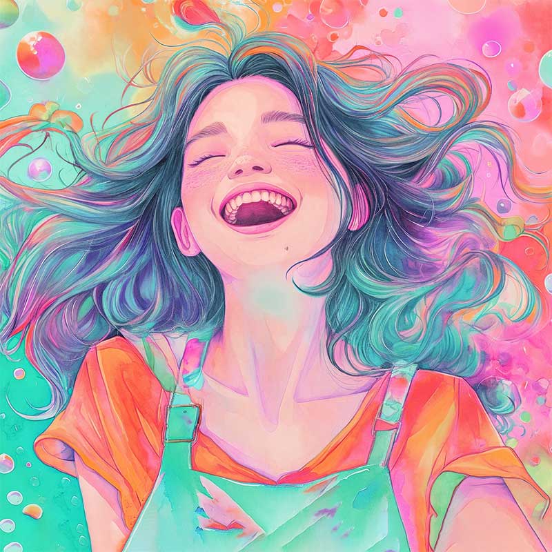
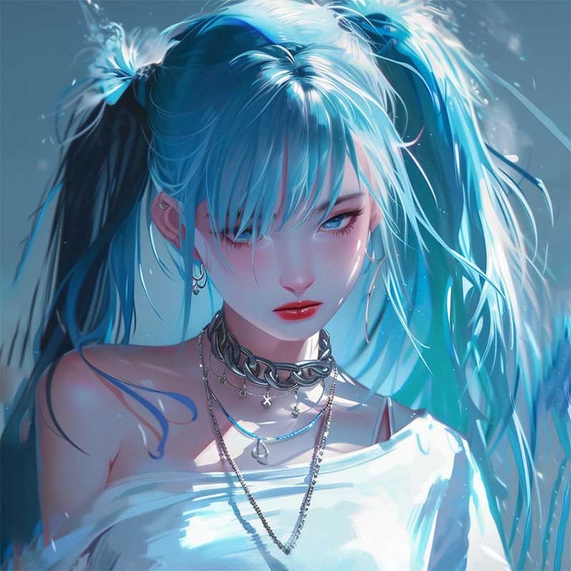
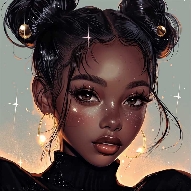
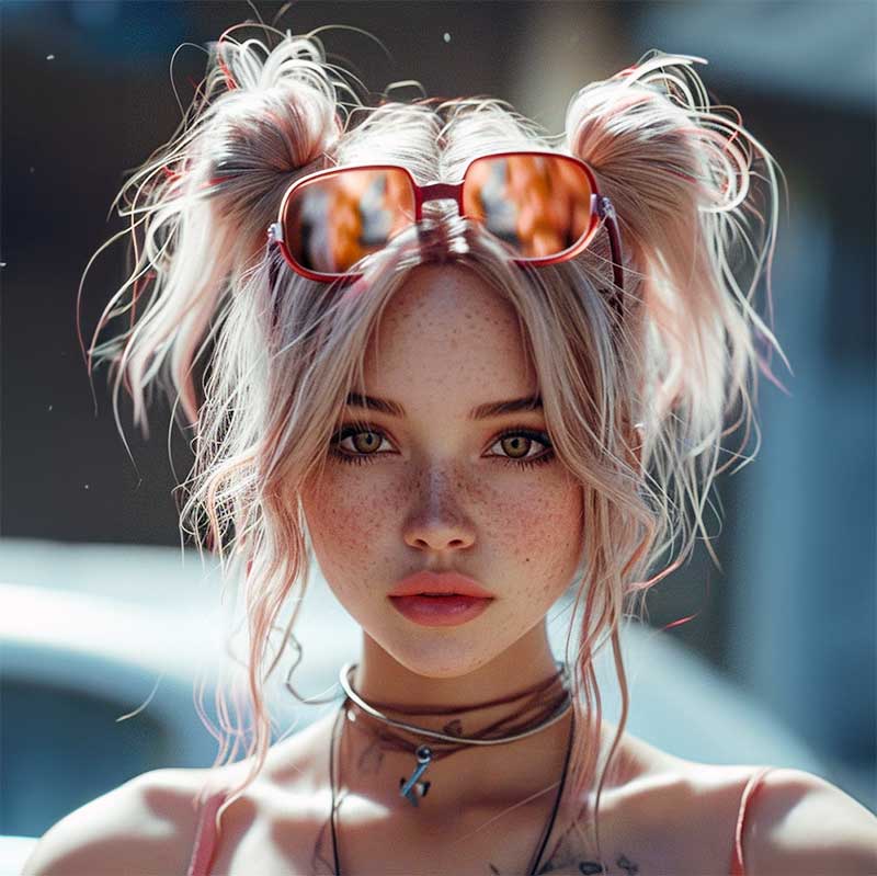
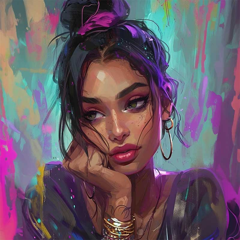
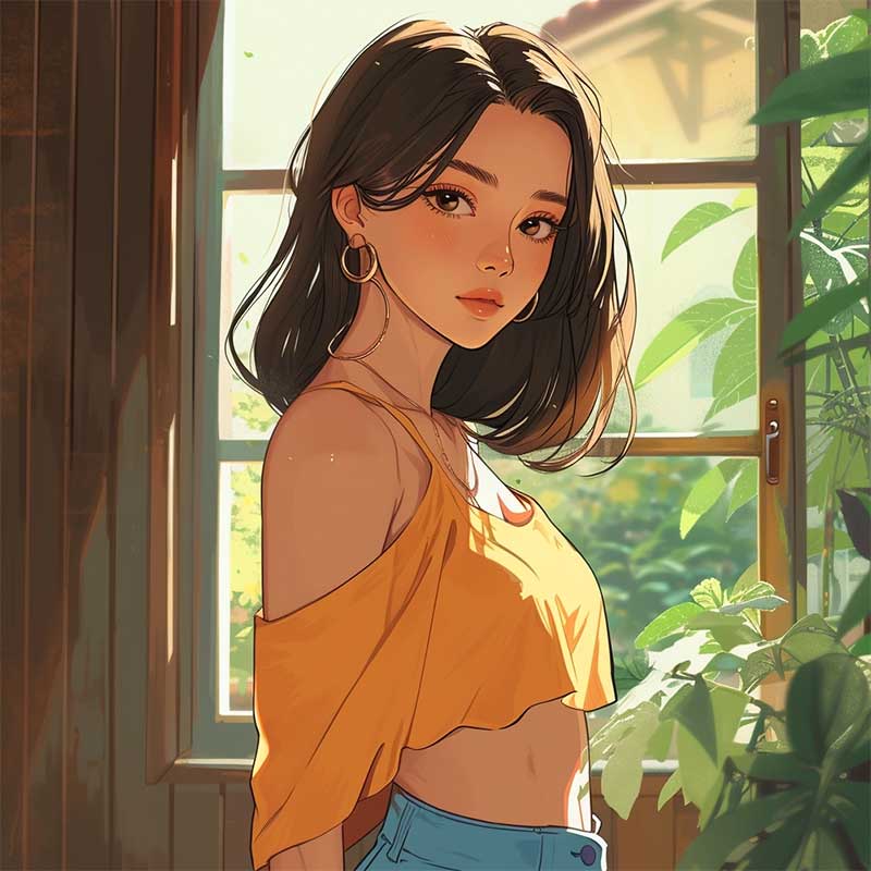
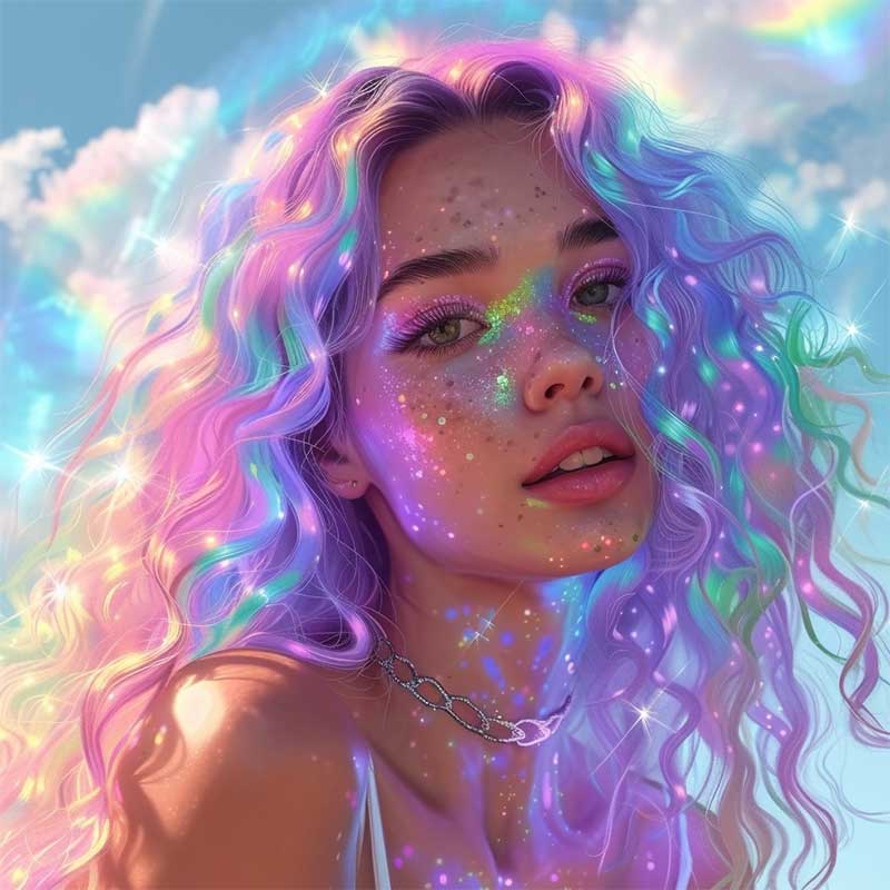
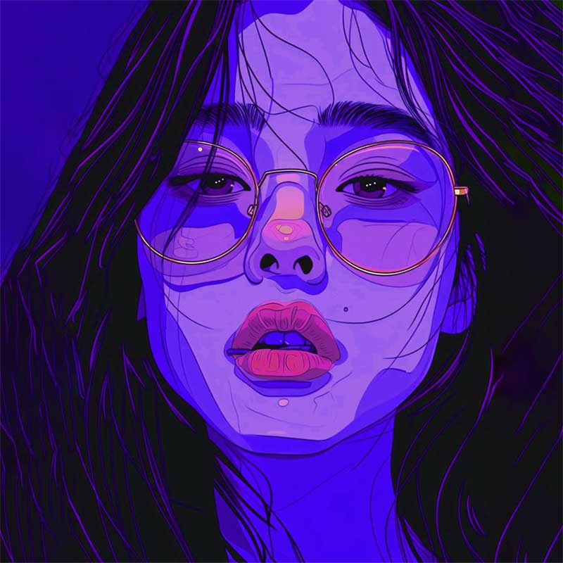
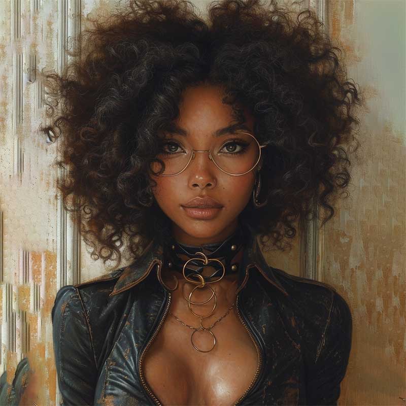
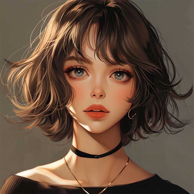
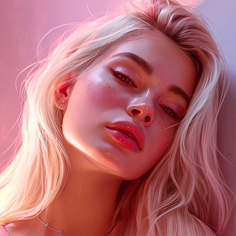
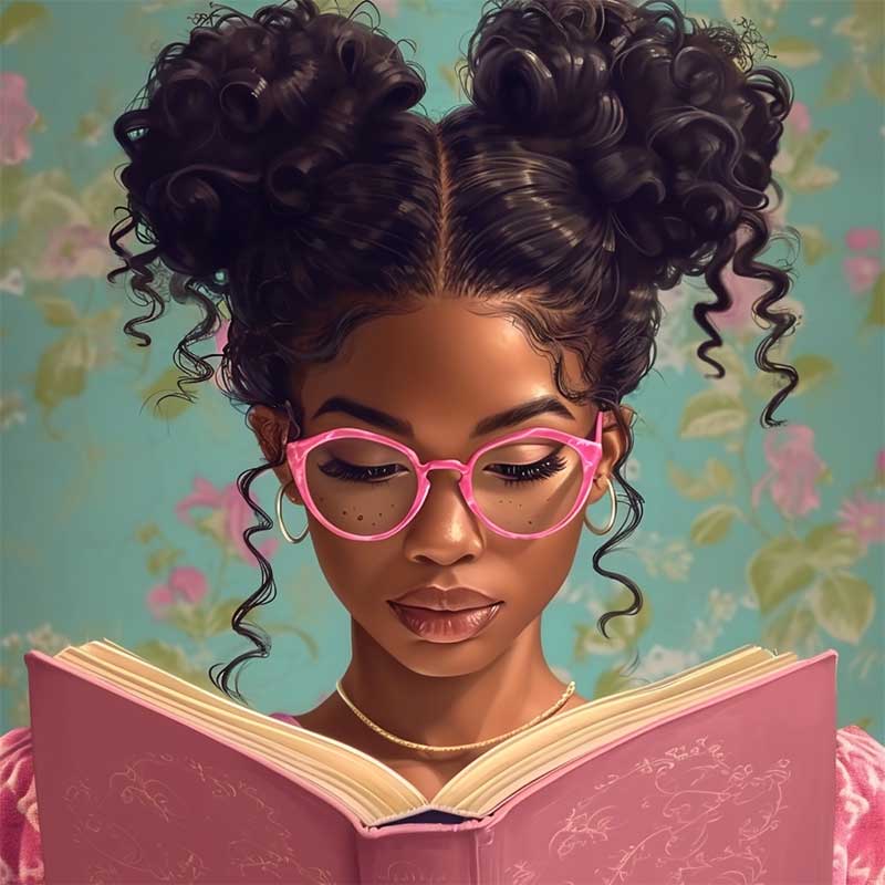
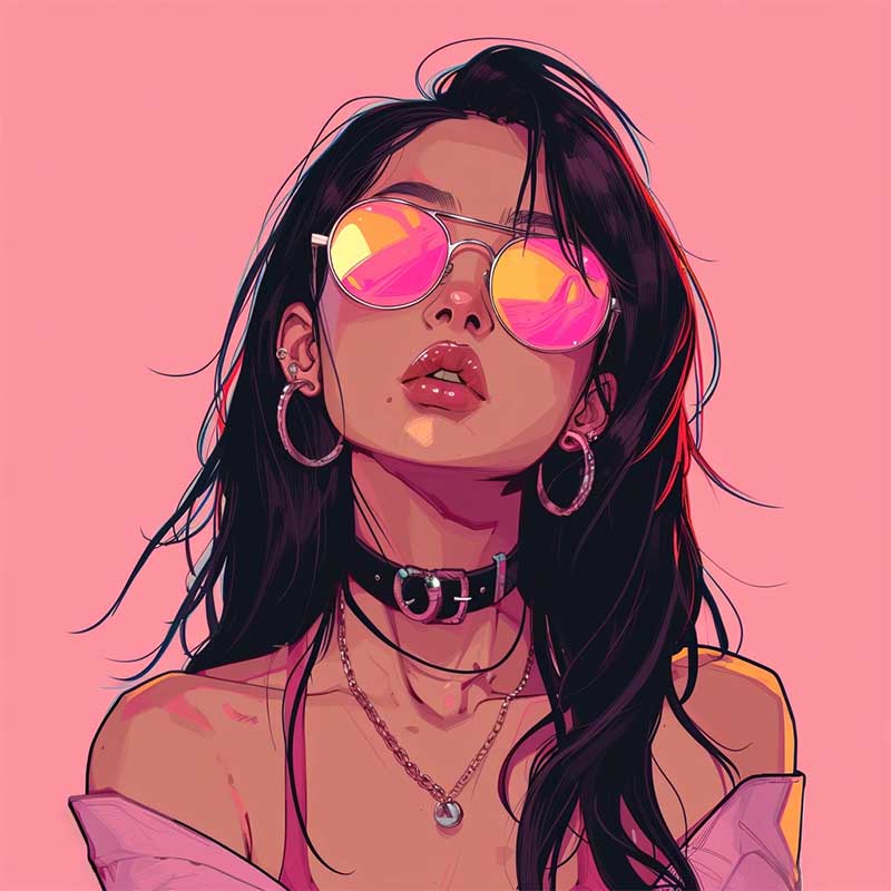
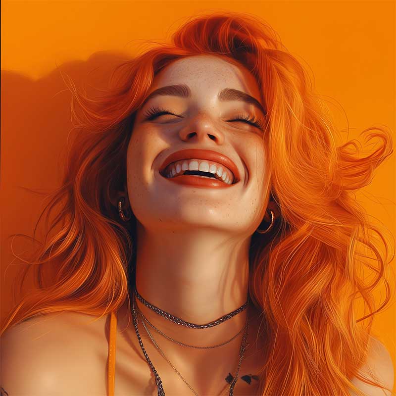
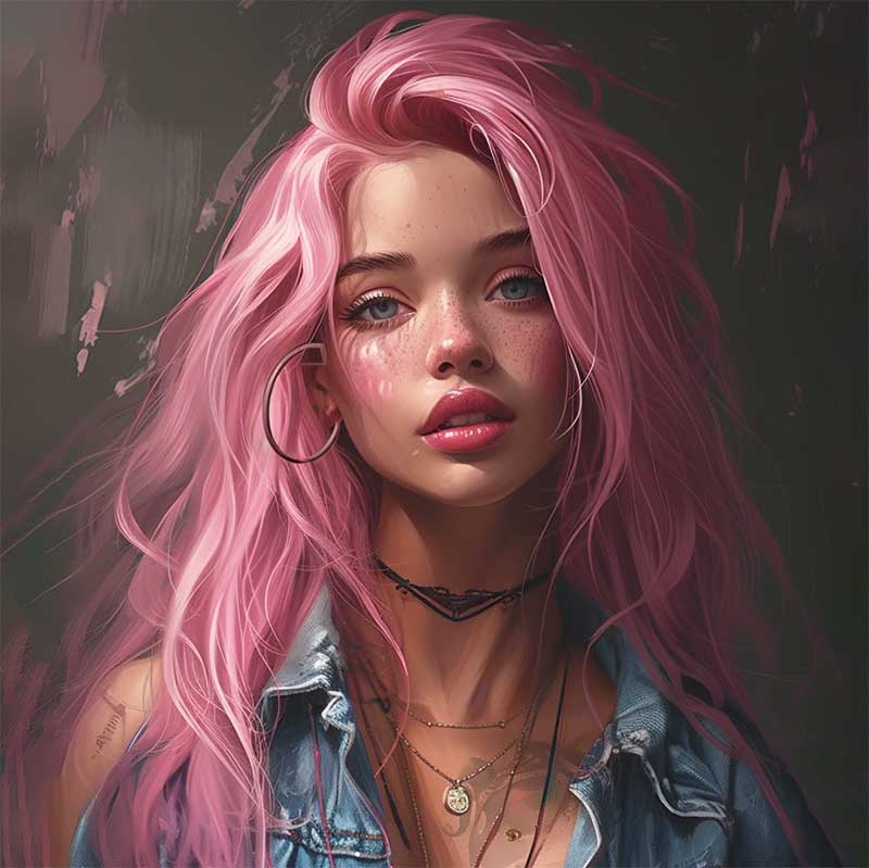
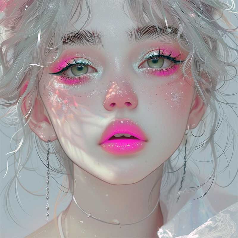
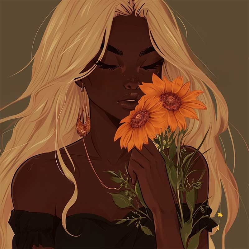
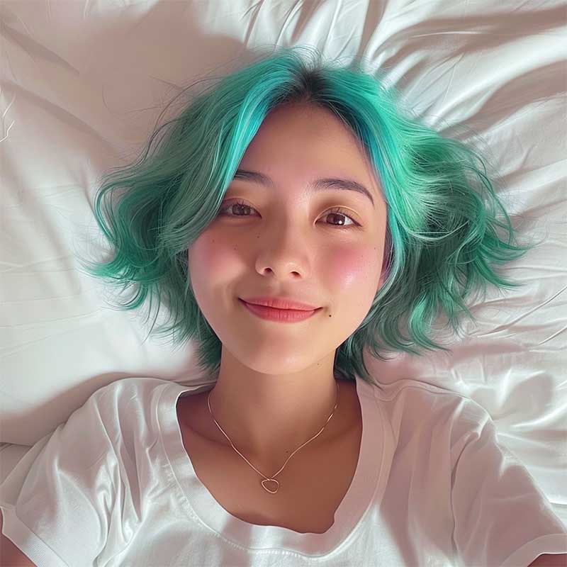
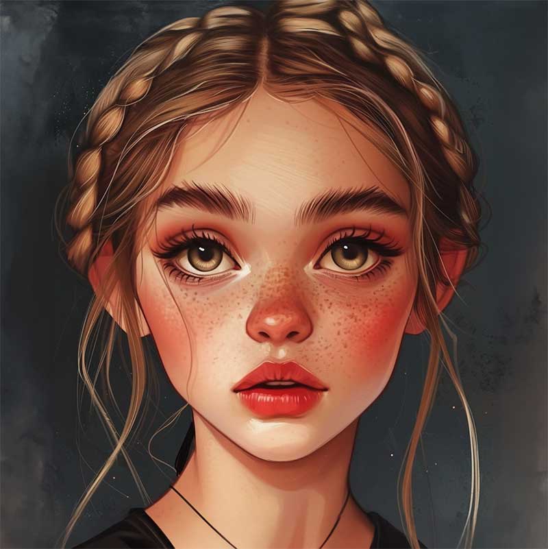
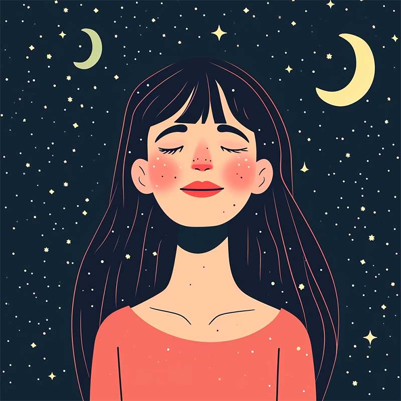
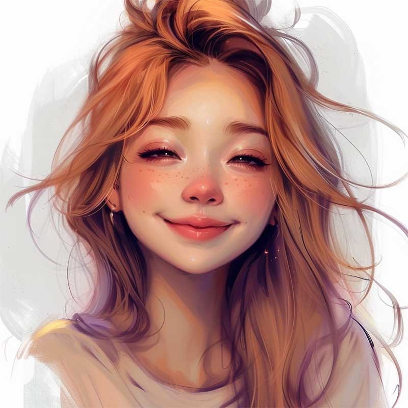
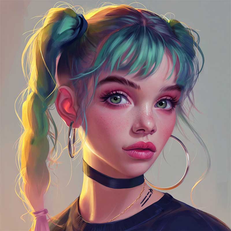
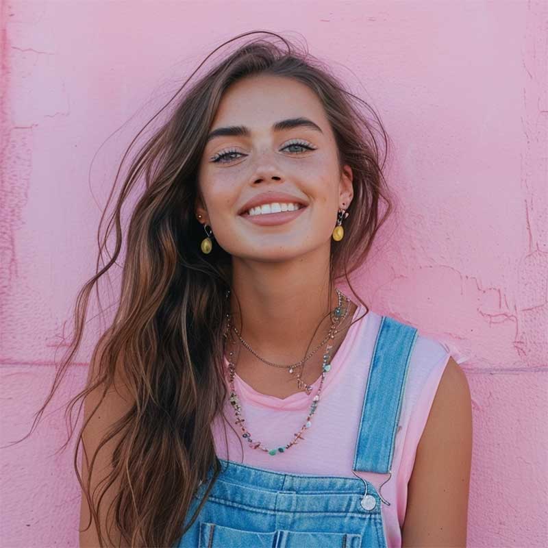
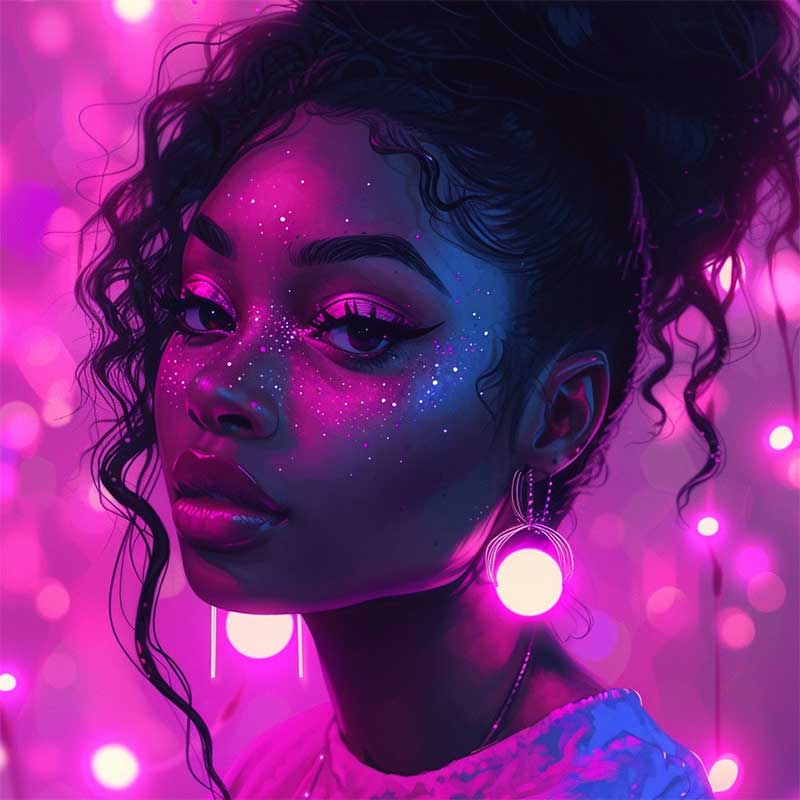
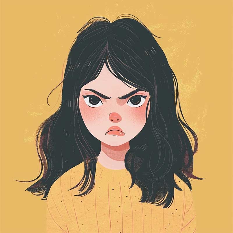
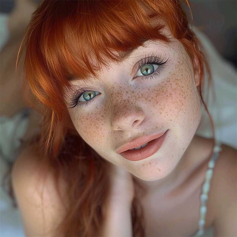
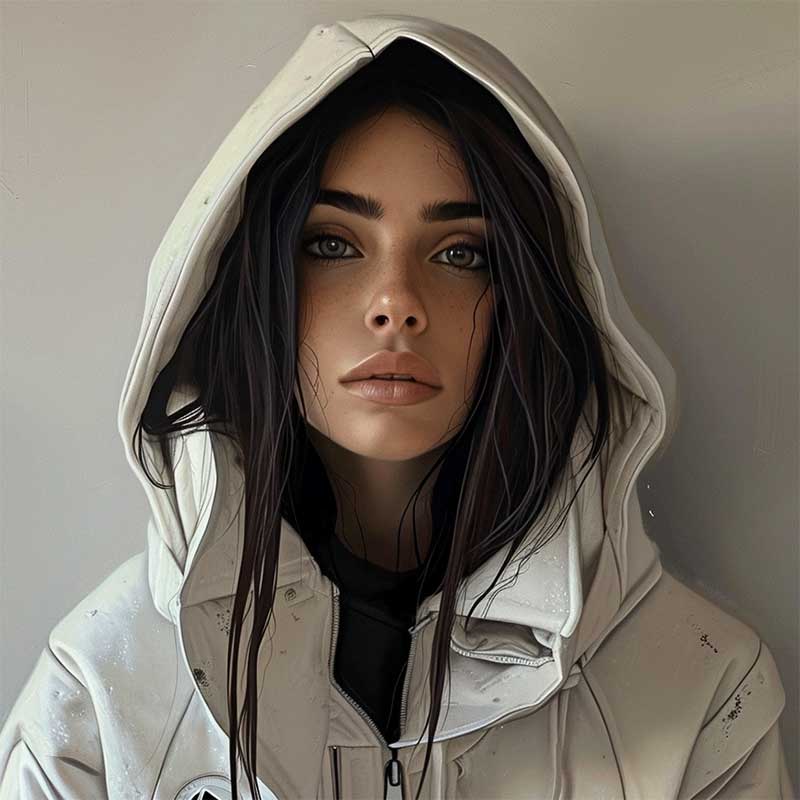
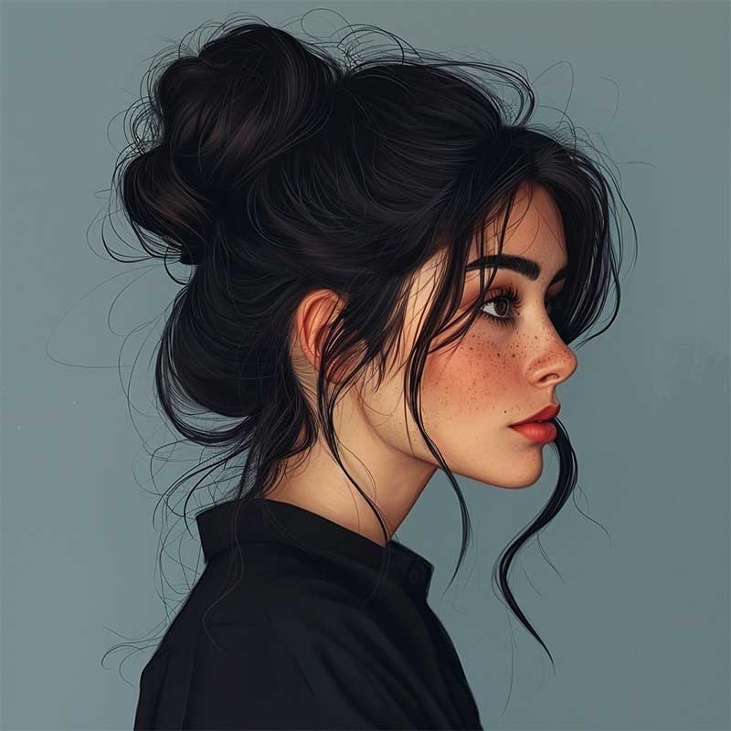
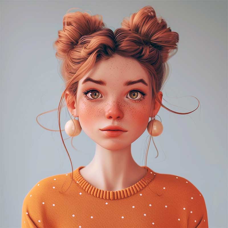
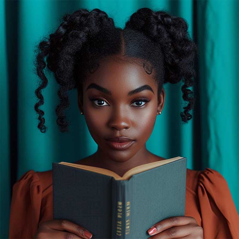
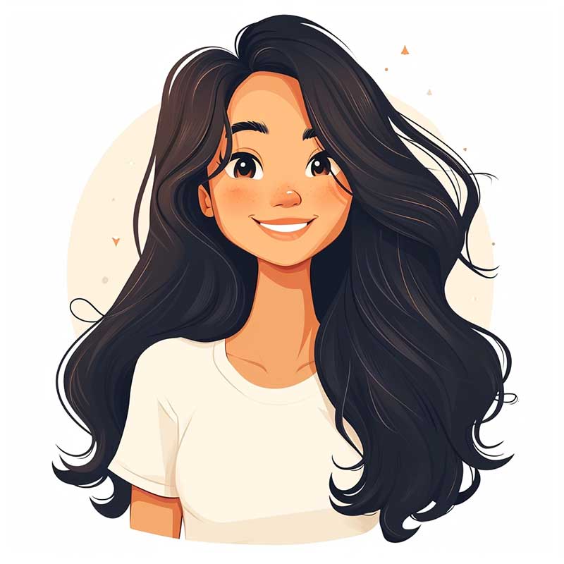
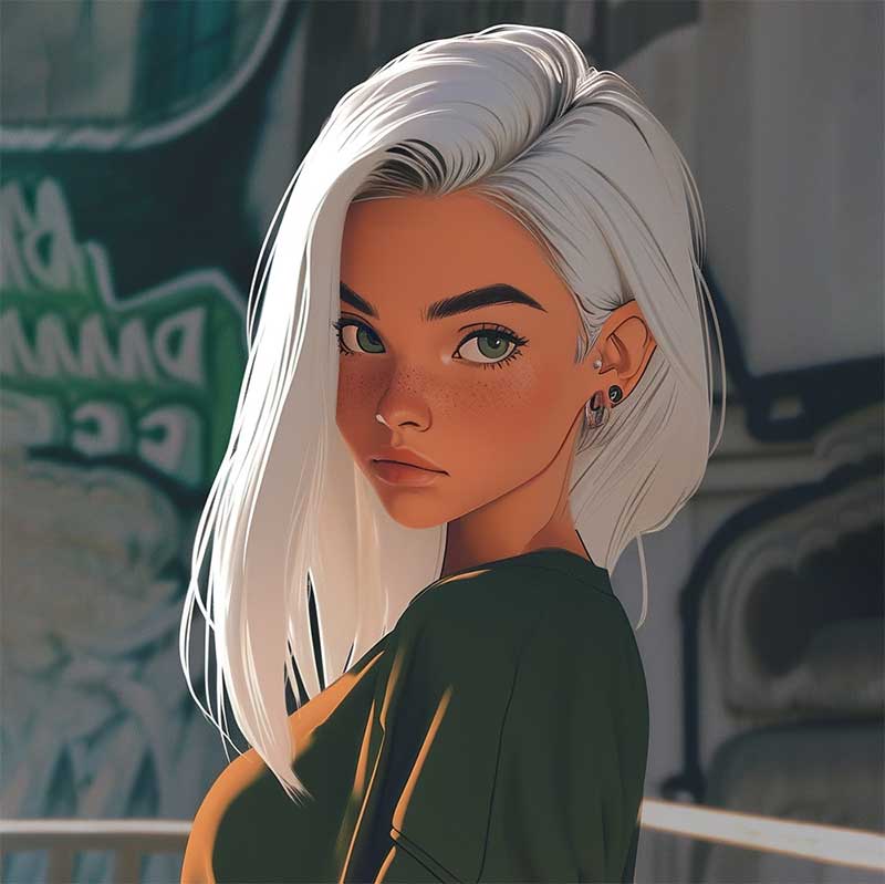
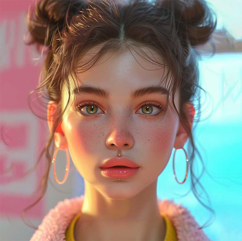
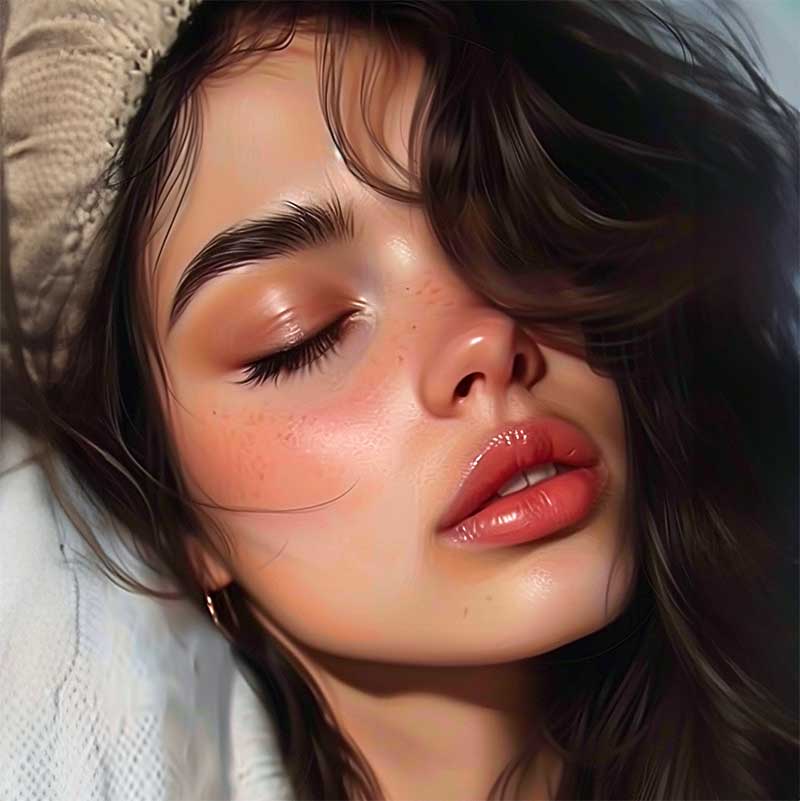
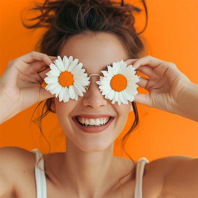
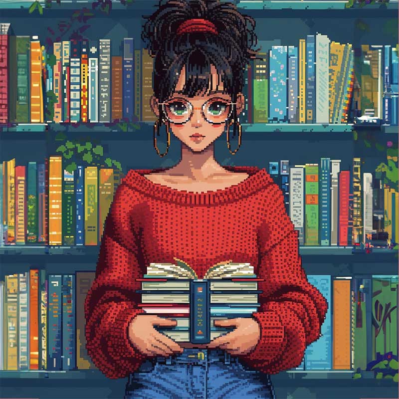
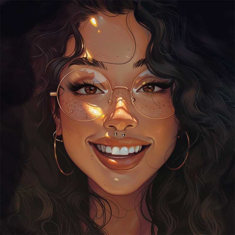
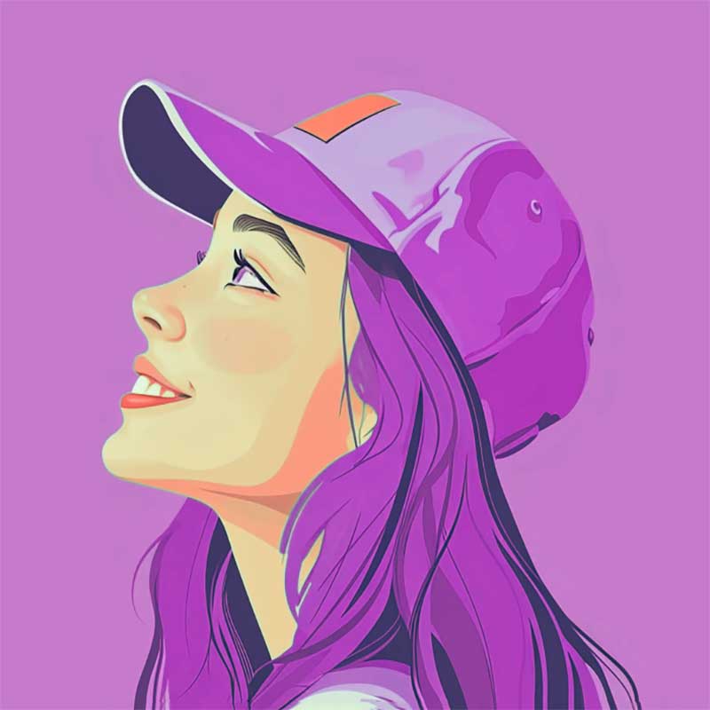
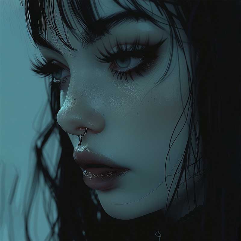
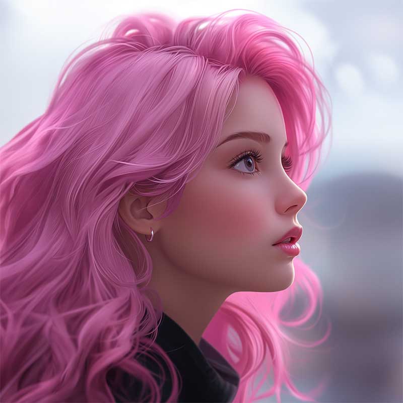
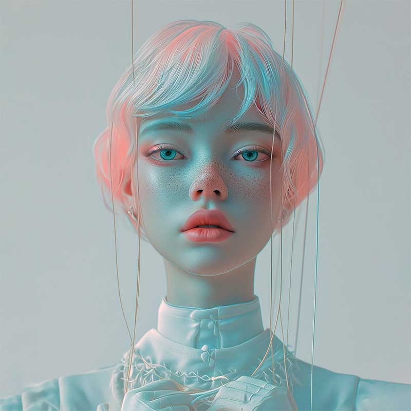
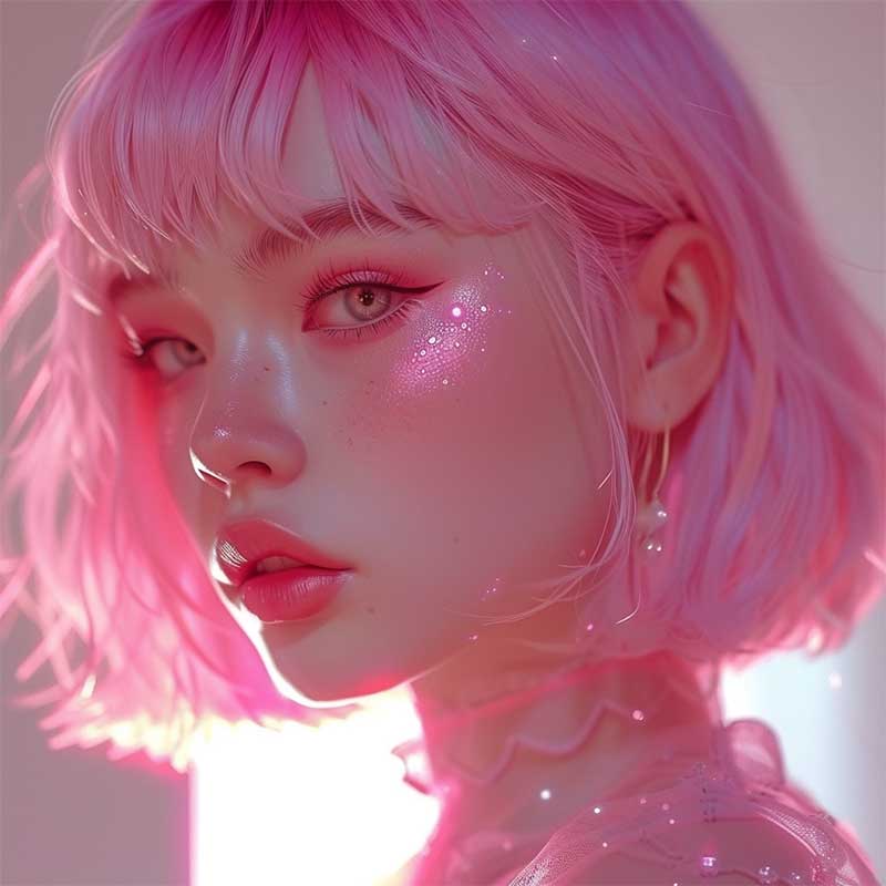
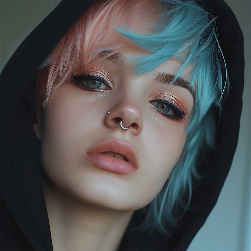
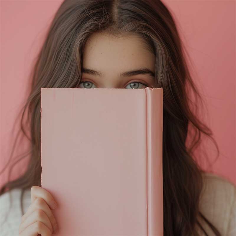
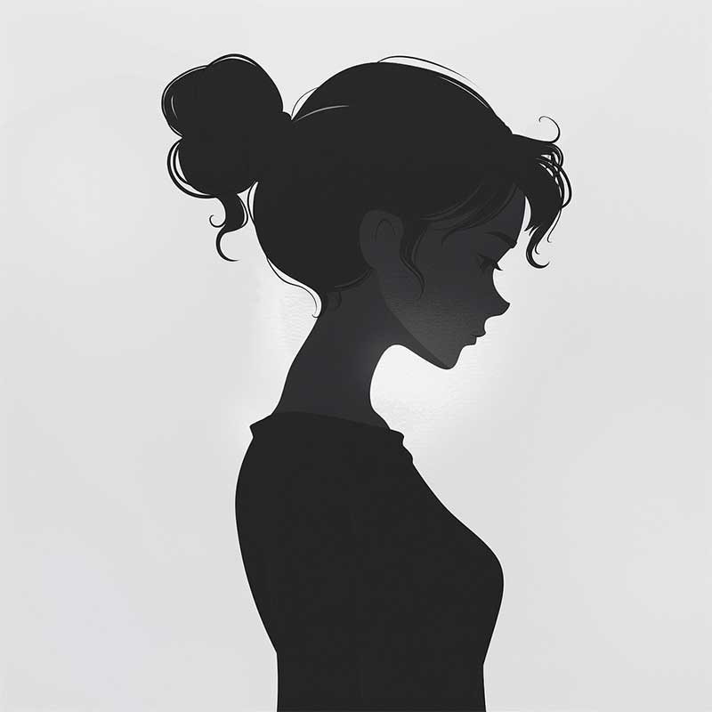
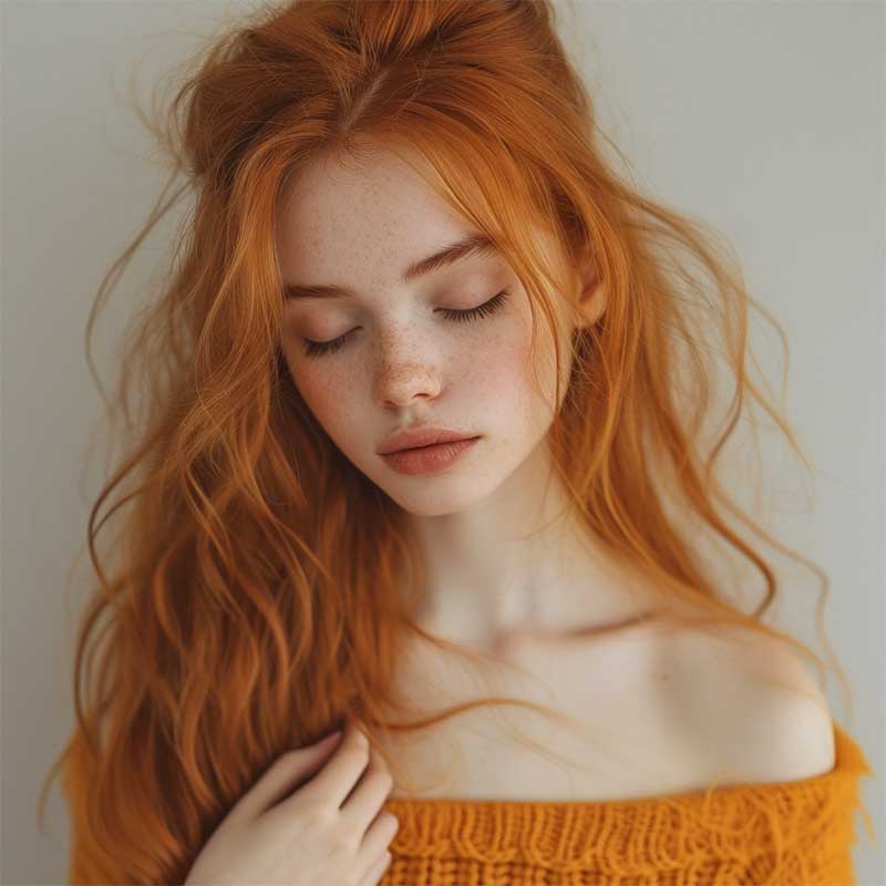
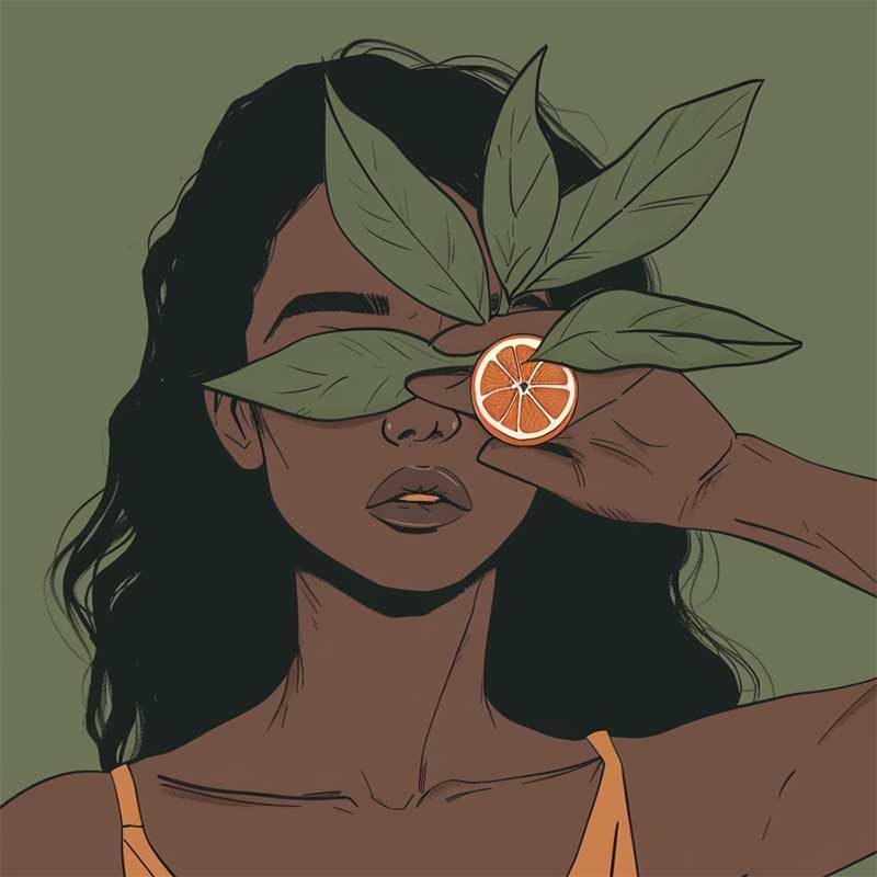
Need some visual inspo? Looking for a cute aesthetic pfp to grab and use? Here are some cute ai generated pfps I love:
Aesthetic profile pictures


Alright, let’s wrap this up! Making the ultimate profile pic is pretty much like creating a masterpiece—it’s all about keeping it real, getting creative, and having an eye for what looks good. Stick to these five killer tips and you’re going to wow your peeps while flaunting the cool, gorgeous you that shines bright online.
Now, go ahead, strike that pose, and let your profile picture speak volumes about the incredible young woman you are!
Beijos,
Lu

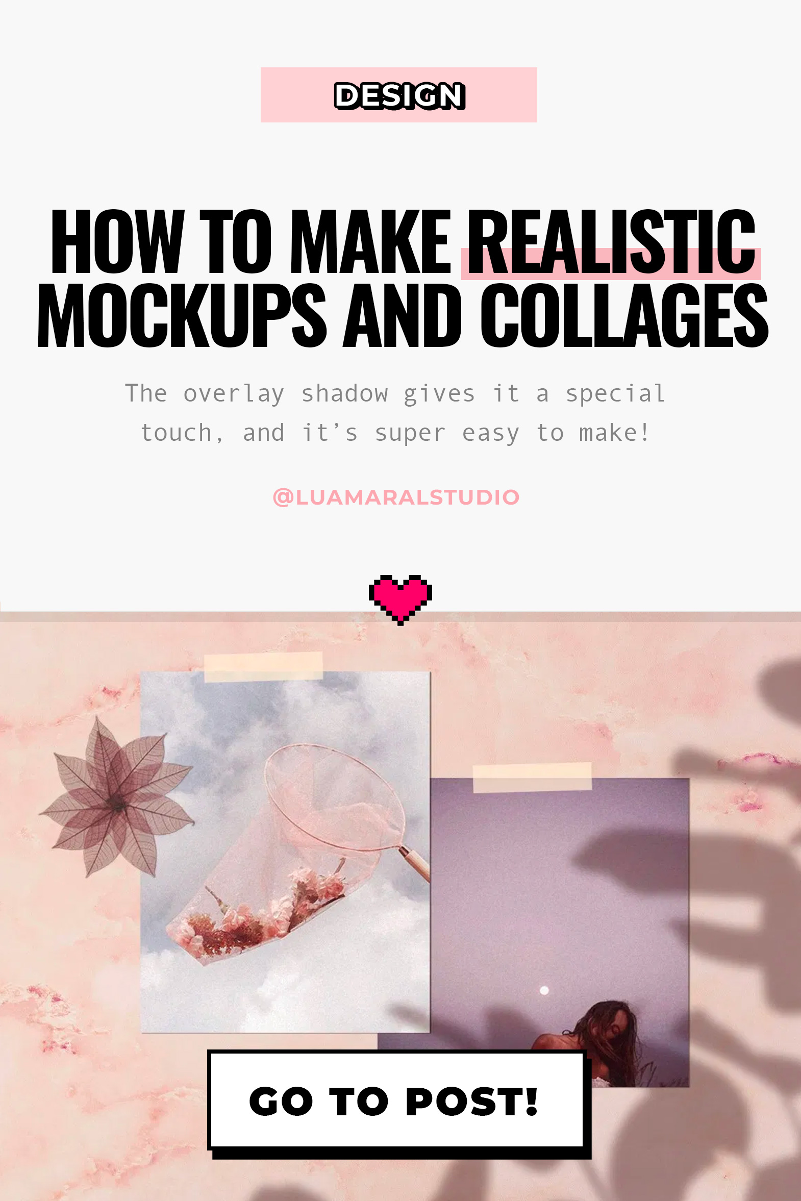
HOW TO EDIT: MOOD BOARDS
Hello loves!
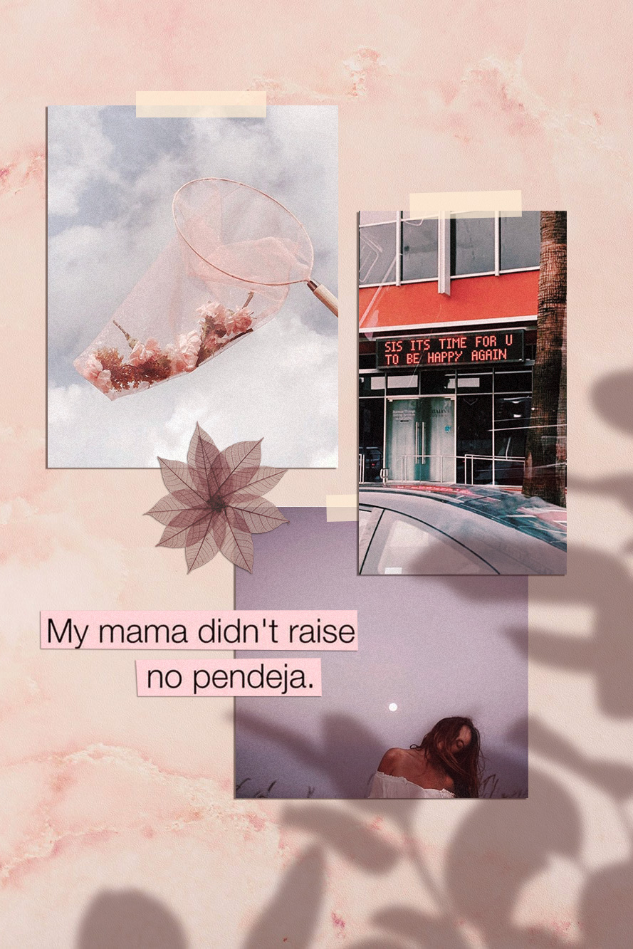
I got a comment from Thalyta on Insta about the mockups I use to display some of my designs or blog posts. It was my cue to finally write this post, that was already on my list for this month. Thank you, Tha! 🦋😇
The type of design she refers to is this one below. That’s also the post she commented on 🙂
You may have noticed – specially if you’re a designer or aspire to be one – that this kind of composition has become a big trend recently. It’s beautiful, and can be used for anything; what really matters is the content included in the mood board.

-
Dark Academia Long Sleeve DressPrice range: $55 through $65
-
Dark Academia T-shirtPrice range: $21 through $26
-
Oversized heavyweight sweatshirtPrice range: $61 through $67
💡In my opinion, the reason this type of mood board is trending is because it makes the whole image look more human and real. That is, people like seeing actual photos, instead of digitally created graphics. And mockups or mood boards that emulate light and shadow (as if it was a photograph and not a digital design) captures our attention more and creates instant human connection. And that can be both rare and valuable nowadays in the social media world. Right?

Stylishcreative Morgan Brewer Romy Collective Jade Brand Studio You’ll probably find online websites giving away mood board templates like this for free. All you have to do is download them and replace with your own content. Mockup World for example has has amazing pieces.
I prefer to create my own mood boards from scratch because it’s super easy and I can implement my favourite aesthetic. Also, I just enjoy making them.. hahaha 💖👩🏽💻💖
Truth is, even though it looks like advanced, difficult design work, it’s actually pretty easy.
Here are the little tricks you should know:
I created the design above for the purpose of this educational post. And I’ll walk you through the process down below. You can add your personal touch by changing details to match your favourite style, ok?
Take a look at the screen recorded video first:
The essentials
Software: Photoshop. It can work with Picsart and other image editing apps too. You should have at least a moderate familiarity with PS to work on the project.
Design elements you’ll need:
🖌 a background with some texture (you can download one for free, take a picture or create it on Photoshop.)
🖌 the content, which is the main subject of your collage or design.
🖌 shadow image to overlay your content softly.Interesting extras:
➕ something to “stick” your content to the surface, like scotch tape, pins, clips…
➕ cutout objects in the composition, like flowers, leaves, stickers, etc.Step by step:
1 Pick a background in the aesthetic you want to use. You can download one for free on Unsplash, they have so many options. Search for “background” or “texture”.
If you prefer to create your ow texture, make a rectangle in the color you want and go to Filter / Noise and choose the intensity.

Chose my bg! 2. Import or drag your content to the project. I can be a photo, another design you’ve made, or even a bunch of images to create a collage (like I did here). If you’d like, you can also type some text, width a rectangle behind it to look like a magazine cutout. You should let your imagination flow at this stage!
In my example, I used only 5 elements to simplify the process.
3. Your content needs 2 main styling edits: shadow and textures. The shadow should be solid, dark and short. It’ll look like there’s a lot of light shinning on your design. If the shadow is too blurry and clear, it’ll look like the object is floating.
Double click the layer and configure your shadow:

1: dois clicks na camada 
2. regular a sombra For the texture, I usually just go to Filter / Noise and add the amount of grain I think is necessary. I posted about that here, if you’d like to know more.
4. Now this is the best, magical, step! hahaha! The shadow overlaying the content will make your mood board look like a photo os a real scene. The two most common shadows I see are plants and window bars. Soooo beautiful and lovely… and ridiculously easy to make! 🙂
If you’re going for a plant, just google image “plant png” and look for results with clear background. Then import it to your project!
Here’s the editing I suggest:
- Image / Ajustments / Hue Saturation and remove all brightness.
- Select the layer and reduce the opacity to 30%
- Last, go to Filter / Blur / Gaussian blur and configure as you wish.

1. import png image 
2. make it black 
3. opacity change 
4. blur After making those edits, place the shadow wherever looks best. You can also make it bigger or smaller to adapt. If you wish to make it look more realistic, I recommend adding a bit of noise and change the hue of the shadow a little bit.
Instead of grey, the shadow should have a more similar color to the one of the background. Go to Hue / Saturation, click “colorize”, and find a good color to match.
If you’d like to add some tape or pin, it’s super easy and, in my opinion, looks great. I usually get some tape image on Google or just draw a rectangle with 70% opacity.

1. Criar o retângulo e escolher a cor 
2. mudar a transparência Important: The shadow layer has to be above al the others. Otherwise the design wont work.
There it is! 🤸🏽♀️✨
Isn’t it super easy and gorgeous?
On my designs, I use the same filter on all the elements, to make them all look uniform. On Photoshop the filters are called “actions” and you can read more about them here.
Phew! Finally. I hope you guys are not intimidated by the length of this post.
If you like the tip, and put it to practice, I’d love to see the results. And if you have any questions or comments, please let me know ok? 💜🙏🏽
Beijo,
Lu
-


