Hello my beautiful chicas! How are you all doing?
I know you’re looking forward to this fourth step of our special, so I have prepared this content with a lot of love and dedication ✨💖💫
If you haven’t checked out the first posts, this is the beginning. Start there 🙂
And now let’s talk about your highness, the filter 👑
I think if you’re looking for information on how to improve your Instagram feed visuals, you already have a pretty good idea how important it is to have cohesive aesthetics for all your posts. That means, they should be integrated visually by the same style, editing and, most times, have the same color palette. So at the very least, it is crucial to use the same filter for all the images you post. But I’m sure you’ve got some questions…

🙍🏽 I use the same filter but my pics still look different, what am I doing wrong?
I get asked that a lot! It’s important to keep in mind that just applying the same filter to every pic might not be enough, girls. To get that uniform look with all the photos really integrated, you might need to regulate brightness, intensity, contrast, individually. Because the filter might get to different results depending on how the original image is.
So go ahead and use your awesome VSCO filter, and, after that, take that extra step and adjust whatever is necessary on each image to make sure it fits your whole aesthetics. That’s how users that have amazing feeds do it!
🙎🏽 And how do I know which filter is right for me?
The perfect filter for you will depend on your personal taste, of course. But to find which one suits you the most, you will need to try some options. And there are so many possibilities that we actually get overwhelmed with options and it paralyzes us. Have you noticed this weird phenomenon? hahaha! 🙈🙈🙈
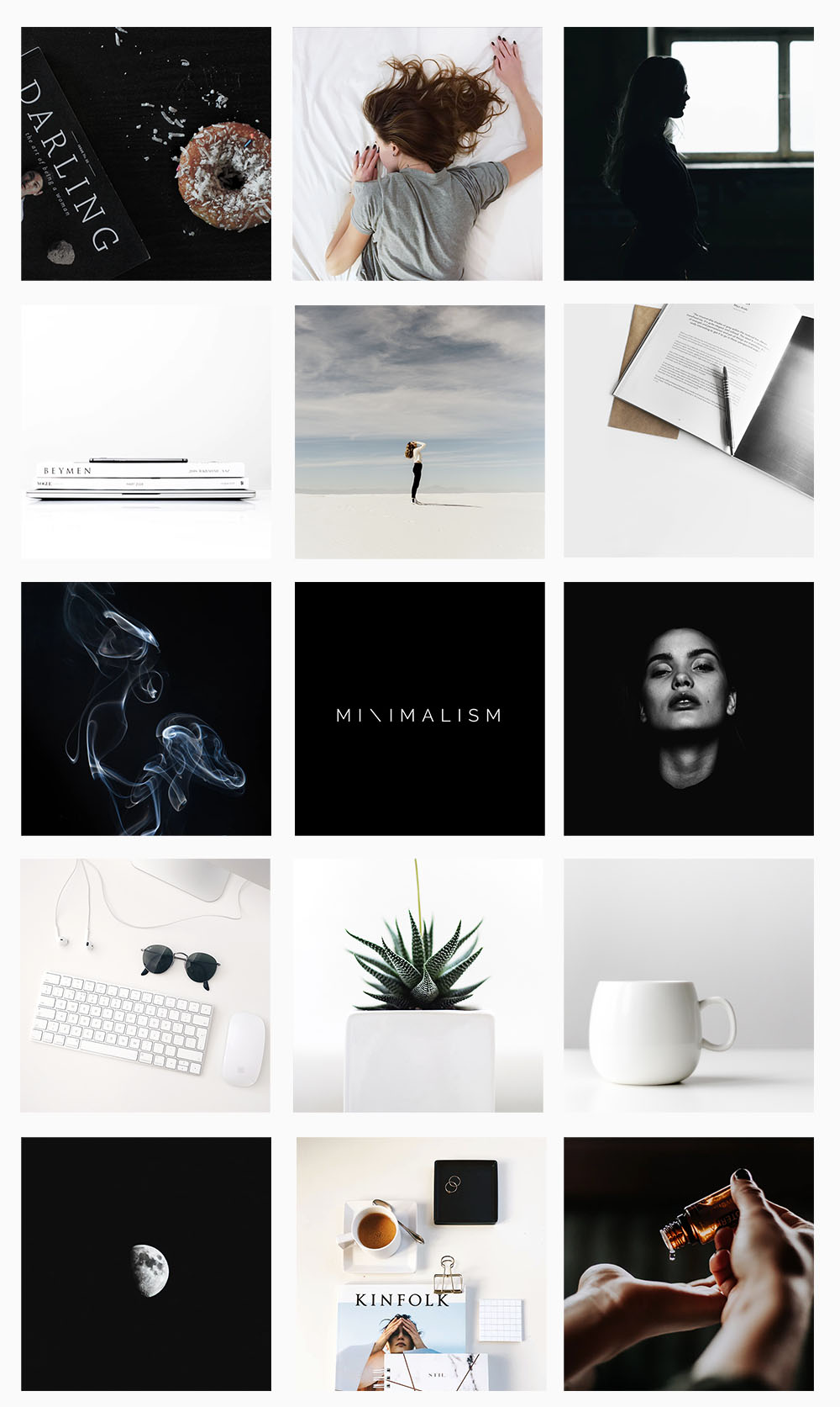
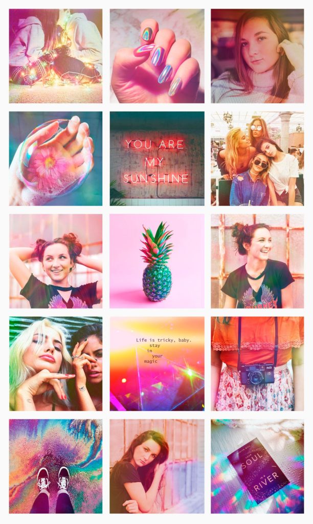
Be honest with yourself. What do you really like? Full of color or little saturation? Cold or hot temperatures ? Super light or darker? Indie aesthetics or more of a pop kinda vibe? Girlie pink? Super minimalist? Retro? You’ll have to pick your aesthetics and stick with it, love 👽

Search on the Insta, Pinterest, even here on my blog for pretty feeds. Which one makes you feel like “this is so me!” ? I have a whole post fullll of VSCO filter ideas right here, you can go through those for this experiment!
If you haven’t already done so, create a board on Pinterest and pin the references that match your ideal feed. Doesn’t mean you’ll copy someone’s style, but that you’ll have a better sense of what kind of feed you want, and define your 💖 THEME 💖
🙋🏽♀️ And can I have an exclusive filter?
Sure! My recommendation for this would be the VSCO app, probably the best and most popular one out there for image editing. You can use a native filter from the app, regulate the intensity, and then calibrate each tool, editing more or less brightness, saturation, etc.
The intensity you choose for each tool is at your discretion, so the result will be really unique. But my favorite thing about VSCO is that you just need to create it in one photo. After that one is ready, you can click on it, go to the three dots that are on the right underneath, click on “copy” and then select the other photos and in the same place select “paste edits”. ABRA CADABRA! ✨🦄
To be honest though, several other apps also have super cute filters. I love Meitu’s and Unum’s, which are the other two image editing apps I use a lot and, despite having another main focus on image editing/feed planing, they have surprisingly cool filter options and I use them a lot. Check this one out:
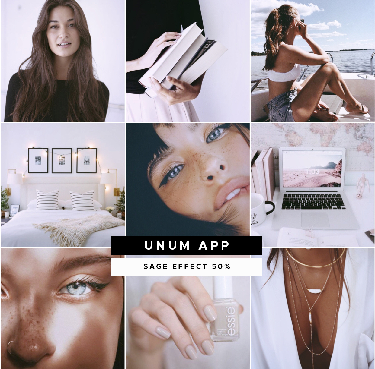

➡ Important: I said this at the end of the first post (about brightness) and promised to elaborate on this one. If you want, for example, the famous and so craved white feed, the filter will not do the magic alone. At the time of taking or choosing the photos, this has to be taken into consideration. Like, if the goal is a whole pink feed, the more photos with actually pink stuff on it, the better.
Might sound obvious, but it’s really not, sometimes! 😅
💁🏽♀️ Great, now how do I get a feed with the theme I chose?
So your feed theme will be a combination of the content of your posts + the filters or edits you apply on them. The more specific your theme, the more you’ll have to limit your content to that one subject.
If that’s your case, the first thing you’ll need to do is to get used to giving up some photos, and create enough content that matches the style. Once you’ve done that, you apply the filter that will visually unify them even more. Before you pick yours, check out this posts I wrote about difficult Instagram feed themes. I think it will give you some light! 😇💡
The greater your commitment to photos within your theme, the greater the chance of it being consistent. But that will mean giving up nice photos and special moments just because “it doesn’t match the feed” hahaha. So think about how much this commitment is worth to you.
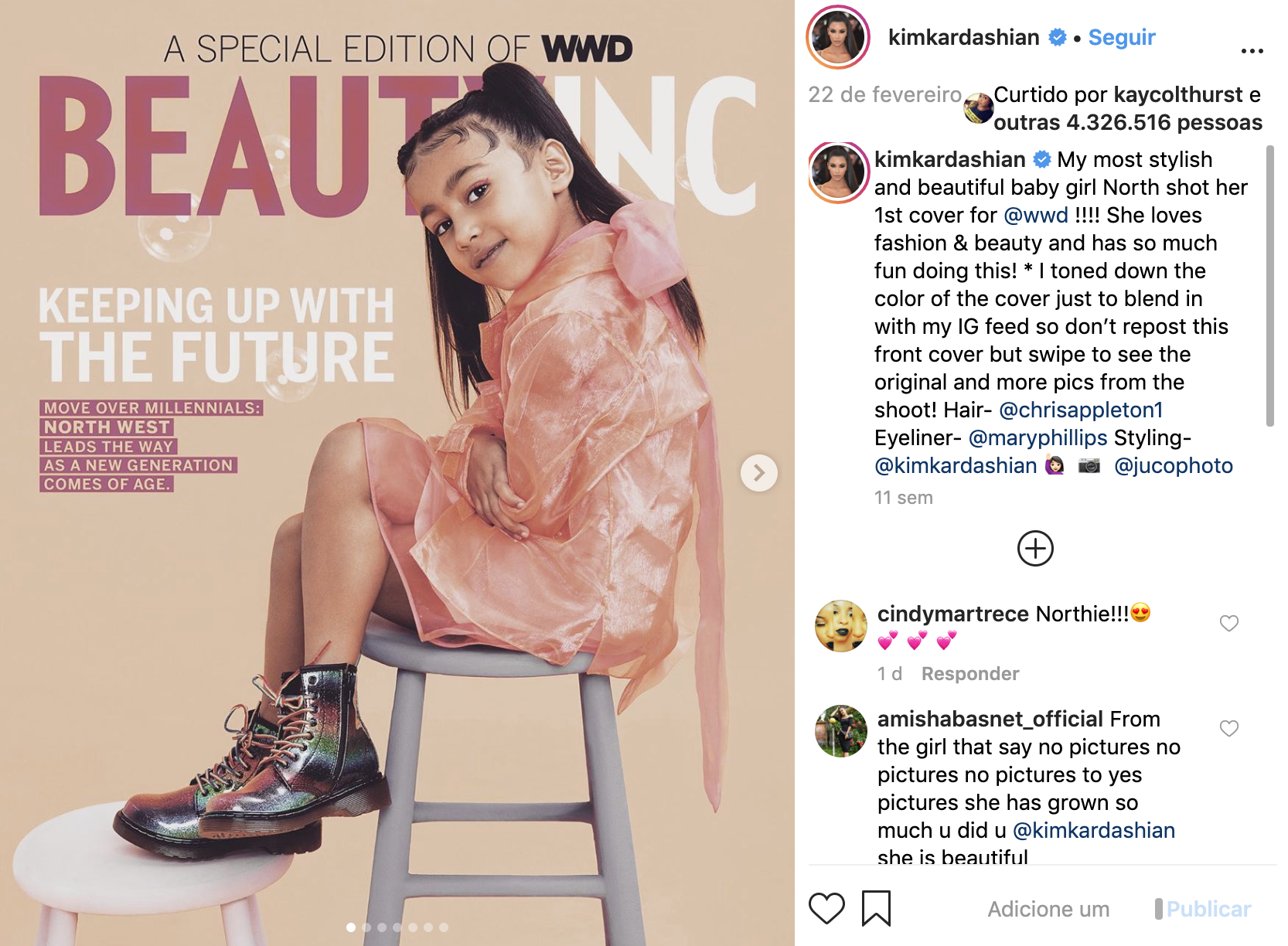

But remember: it is possible to have a good feed without any extreme theme limitations. No one wears a pink piece of clothing every day of their lives, or manages to take an ultra minimalist photo everyday, or has a Californian summer landscape available for photoshoots every sunset hour 😂😂
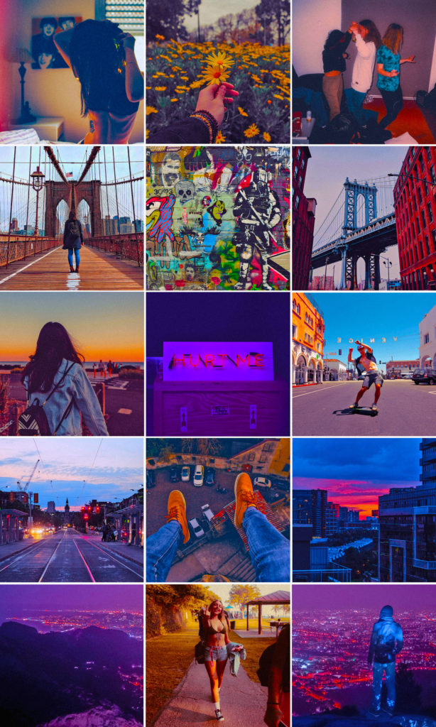
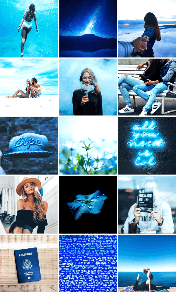
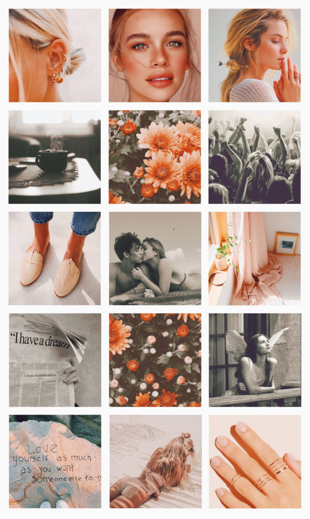
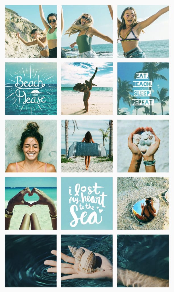
Moving on, I made 4 filter options as suggestions for you guys, exclusively for this post. You can use them as they are, or change some detail (and keep it a secret hehe) to make it your own! (Update: I made a post with all the VSCO filters I’ve ever created, check it out here):
Two very important considerations on these 4 examples:
💡 All these pics are from Unplash, all taken by professionals with professional cameras. Photo quality greatly influences the effect of the filter. But even with a medium quality phone nowadays you can take AWESOME photos. So no excuses, ok? 😇💖
💡 Before applying the filters, brighten up all of the photos a bit. But I guess I have said that enough through this special already, right? hahaha
🤷🏽♀️ Ok, but seriously, which filters are better?
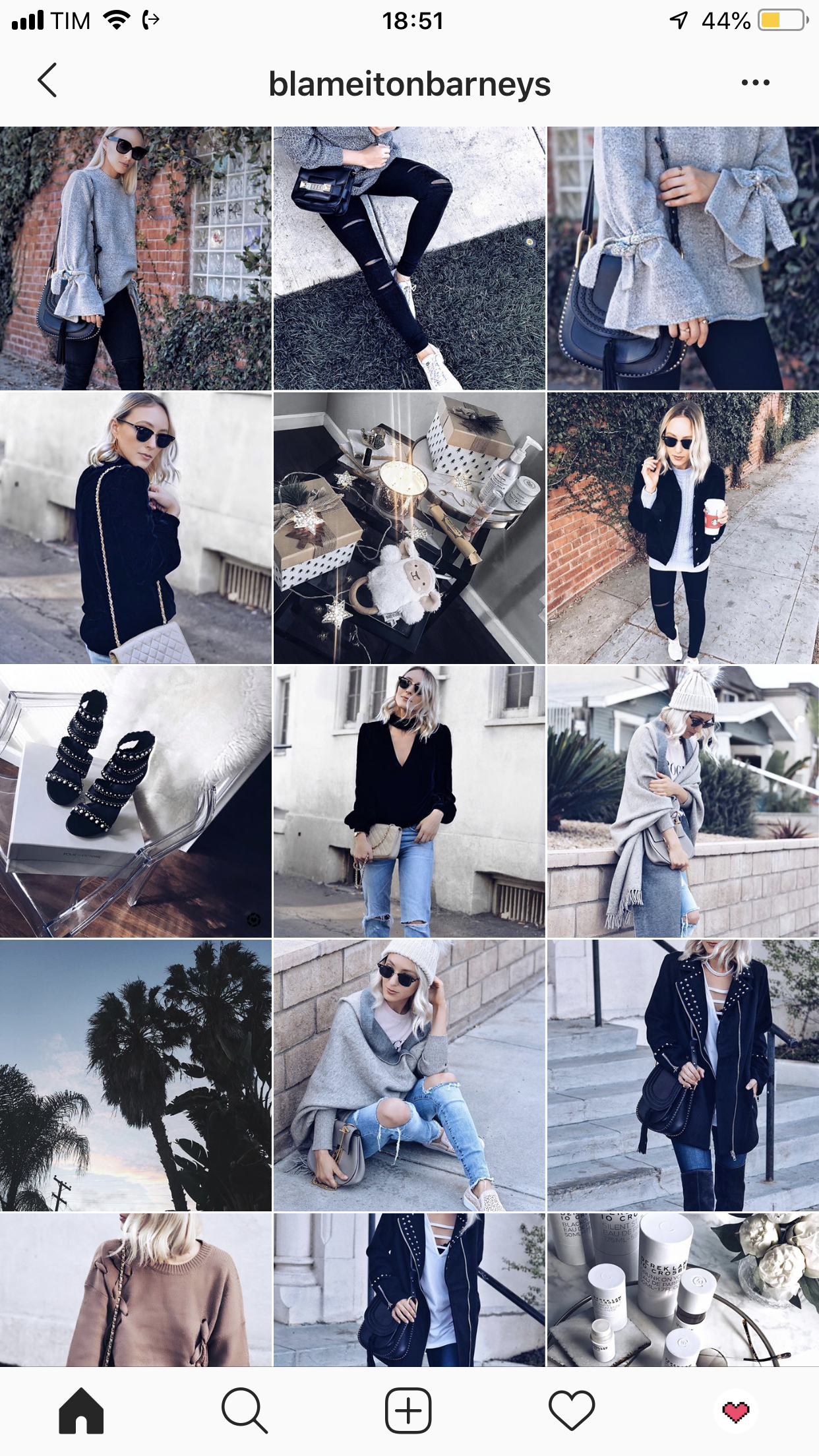
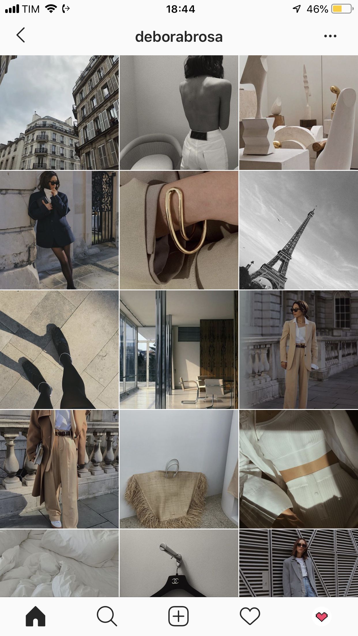
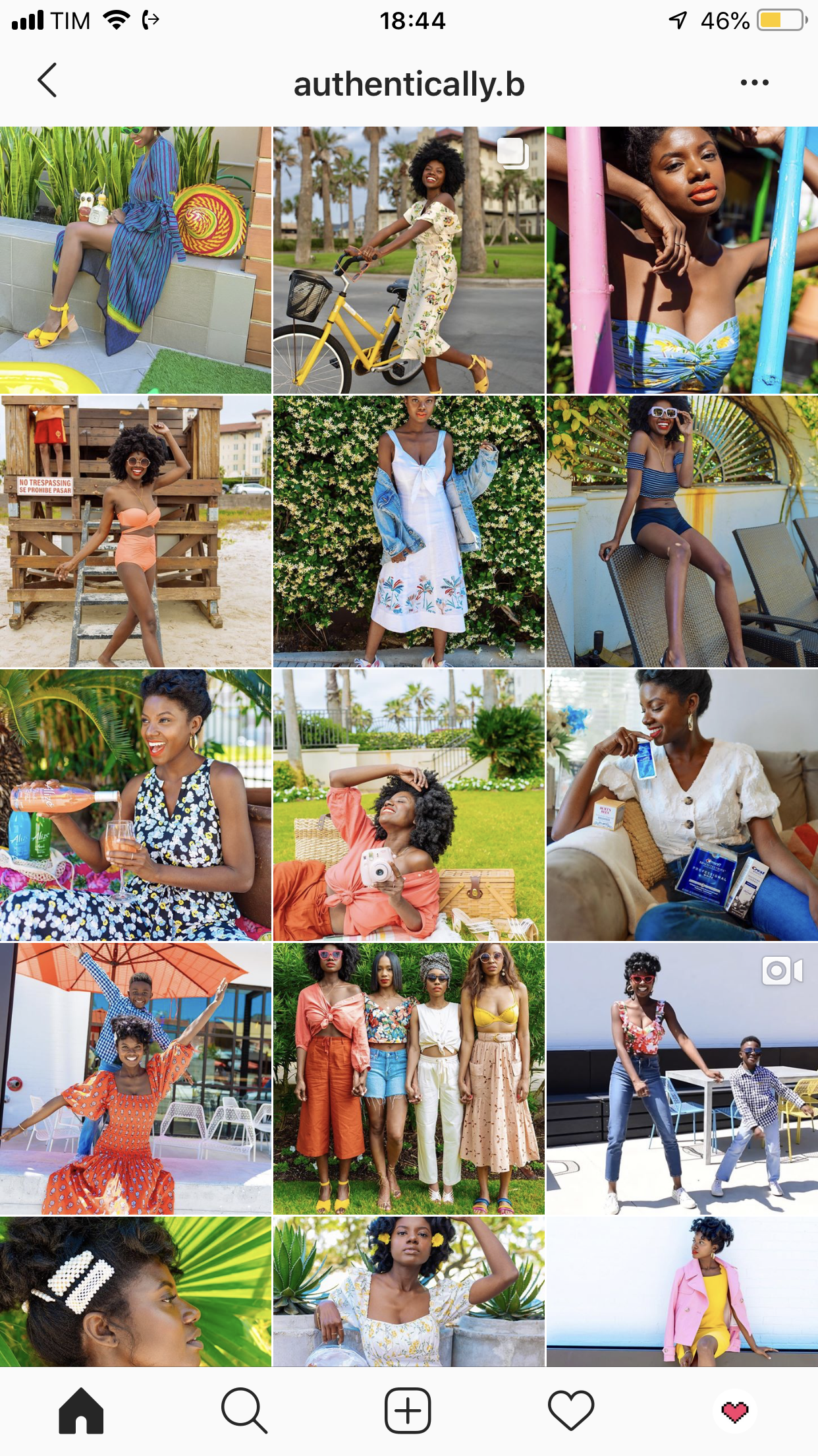
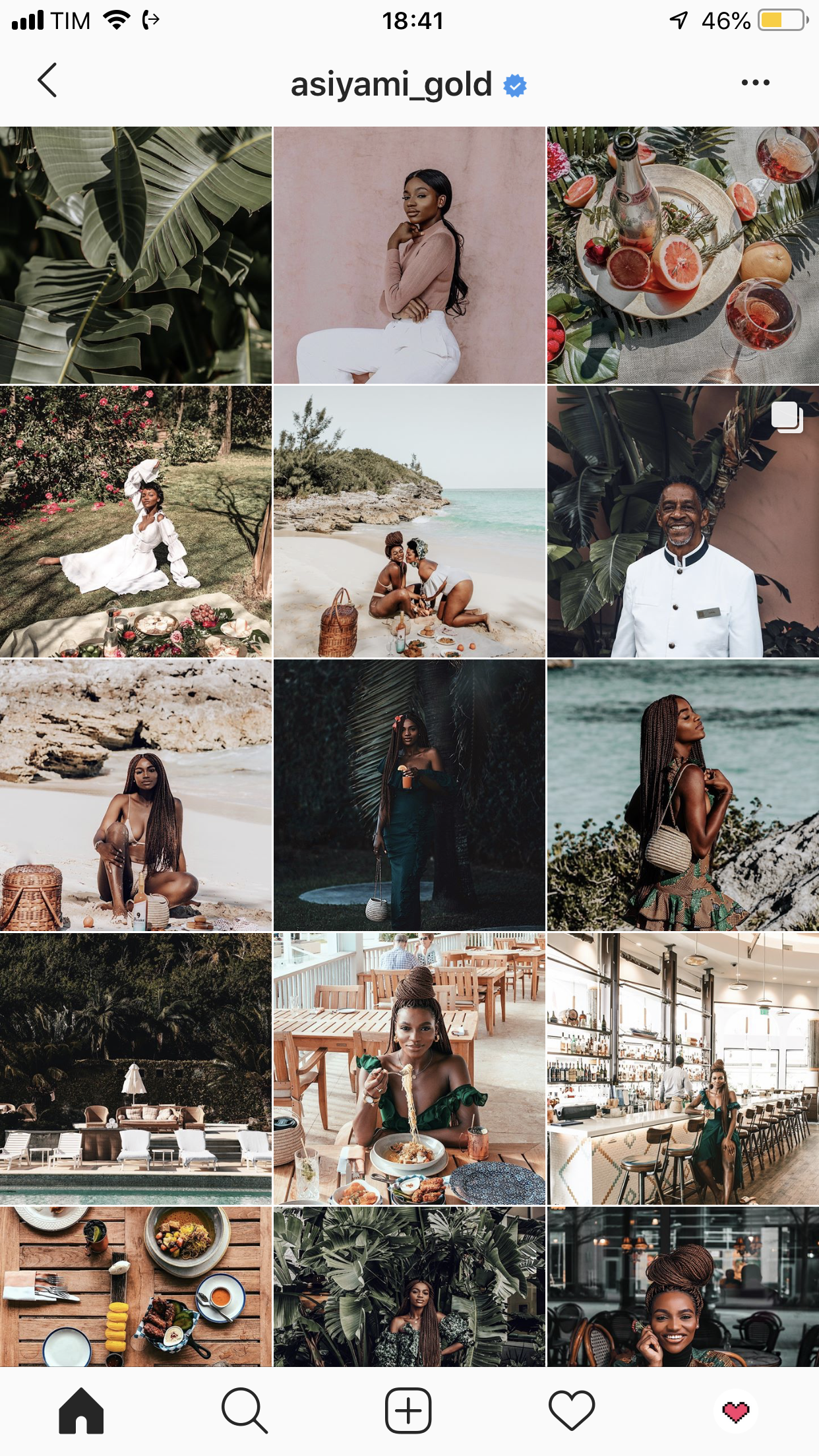
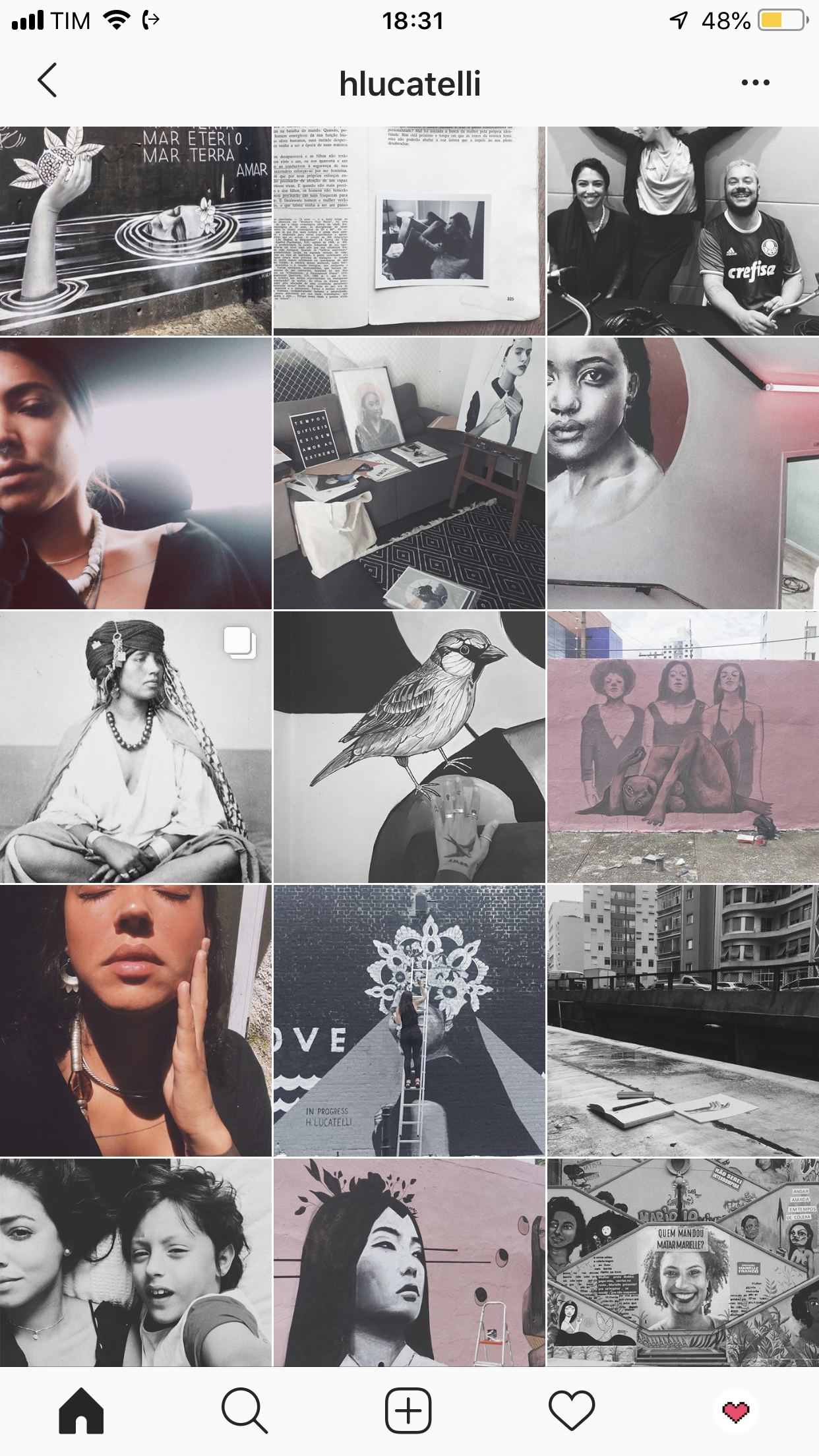
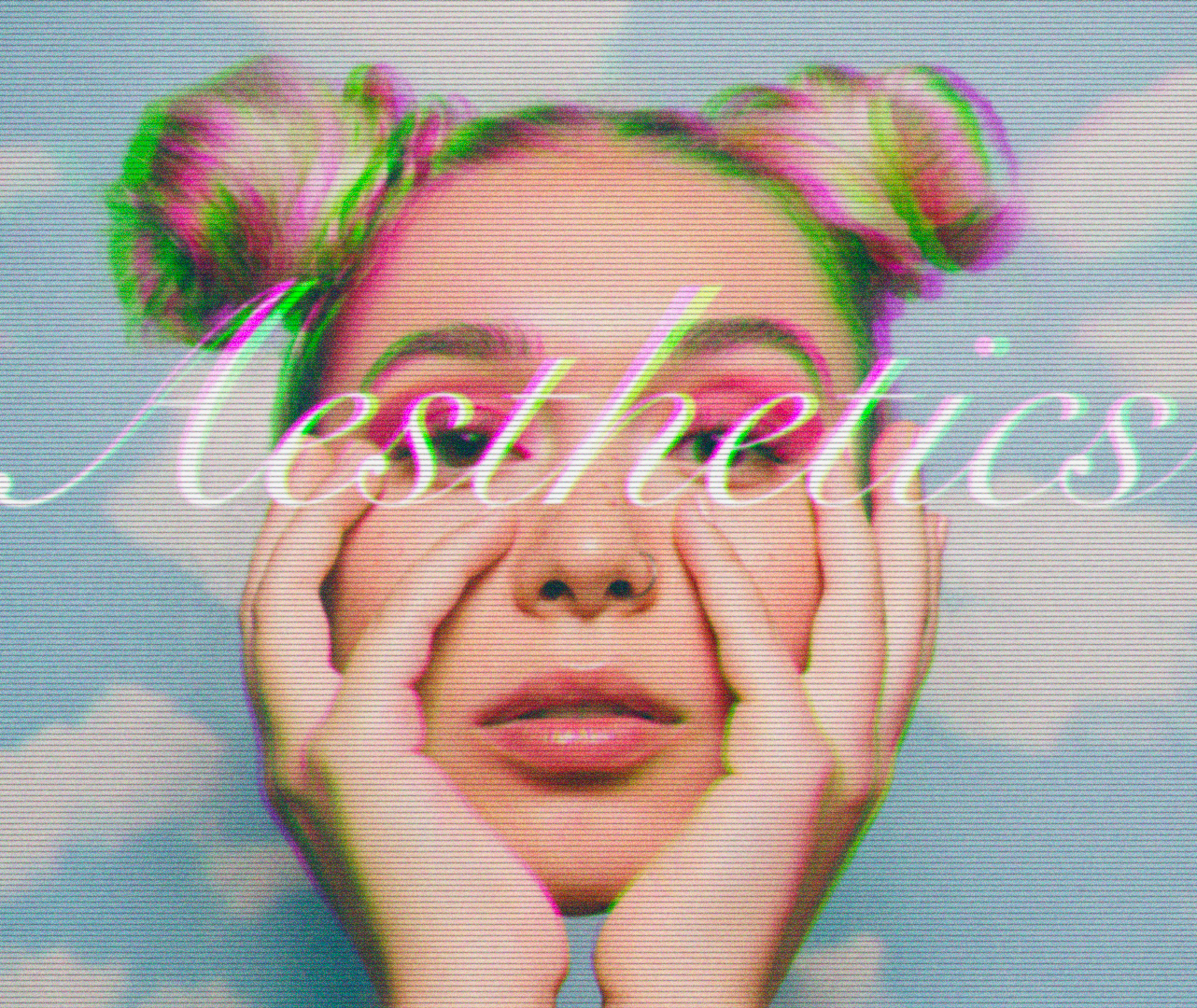
I can give you 1 trillion examples of amazing filter options. I’ve read that bluish undertone filters generate more likes, but I don’t have an actual source to corroborate that right now. I do see many influencers decreasing the saturation of the photo (makes colors less vibrant and less colorful), and increasing the contrast and the brightness. So if that’s the style you’re going for, you could maybe use the aesthetics.
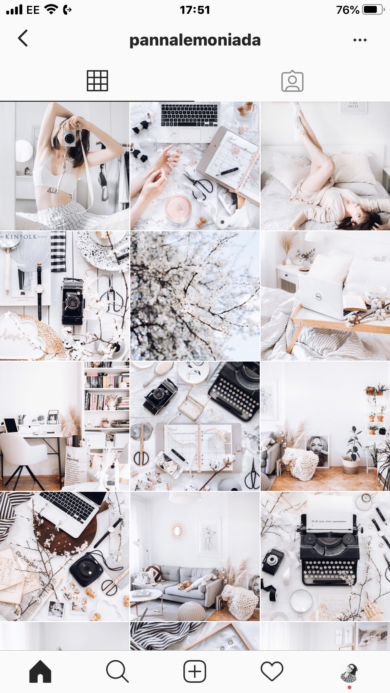

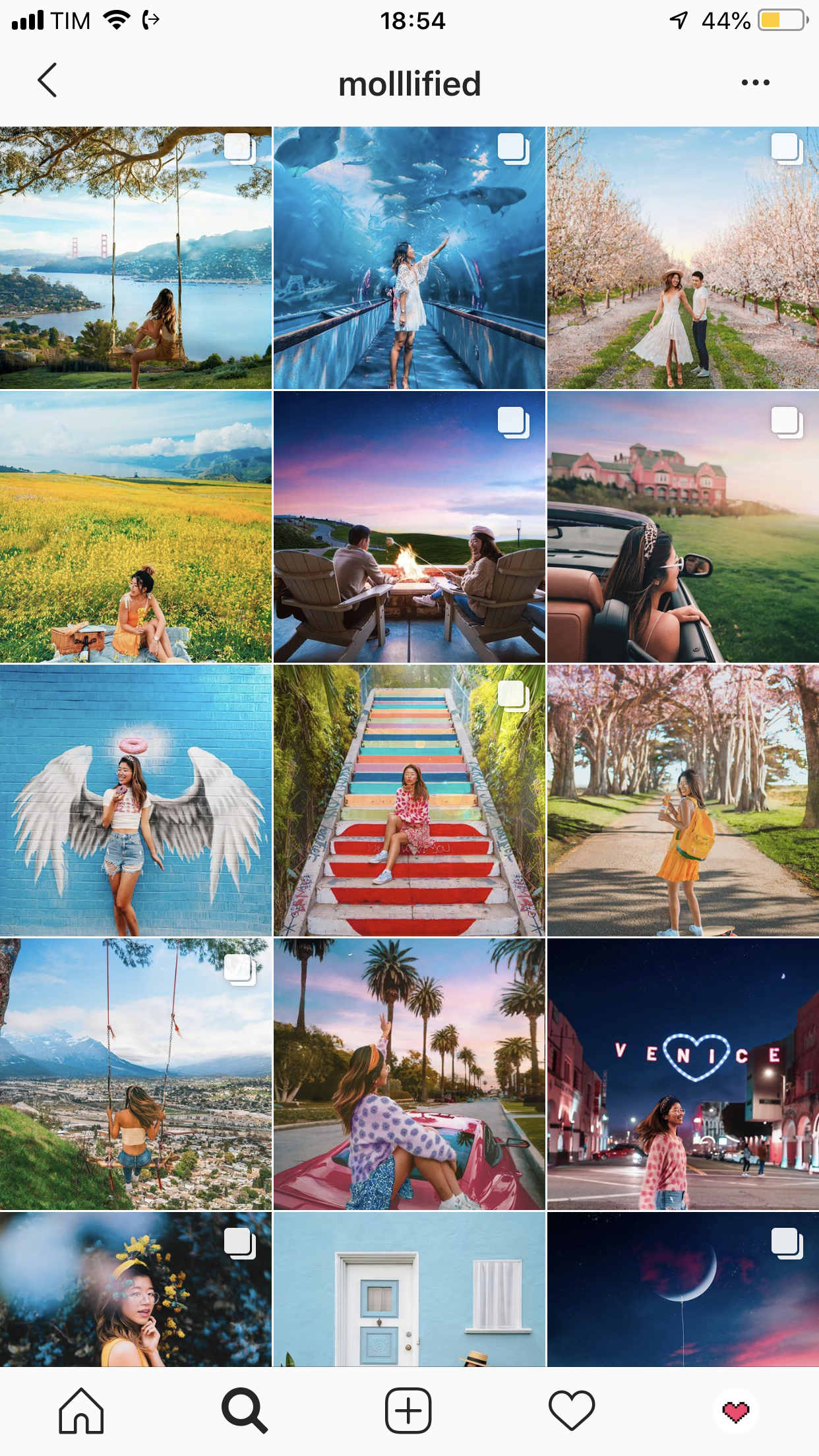
I’ve had a bluish undertone insta theme for years and I really loved it. The main color was pink, but the undertone was cool, because I always lowered the temperatures of the images. I truly thought it was beautiful, but it just wasn’t me. So after a lot of thinking and honestly speaking to myself, I realized I just wanted to go warm. And I did.
Nothing better than just following your own style! 😌💞
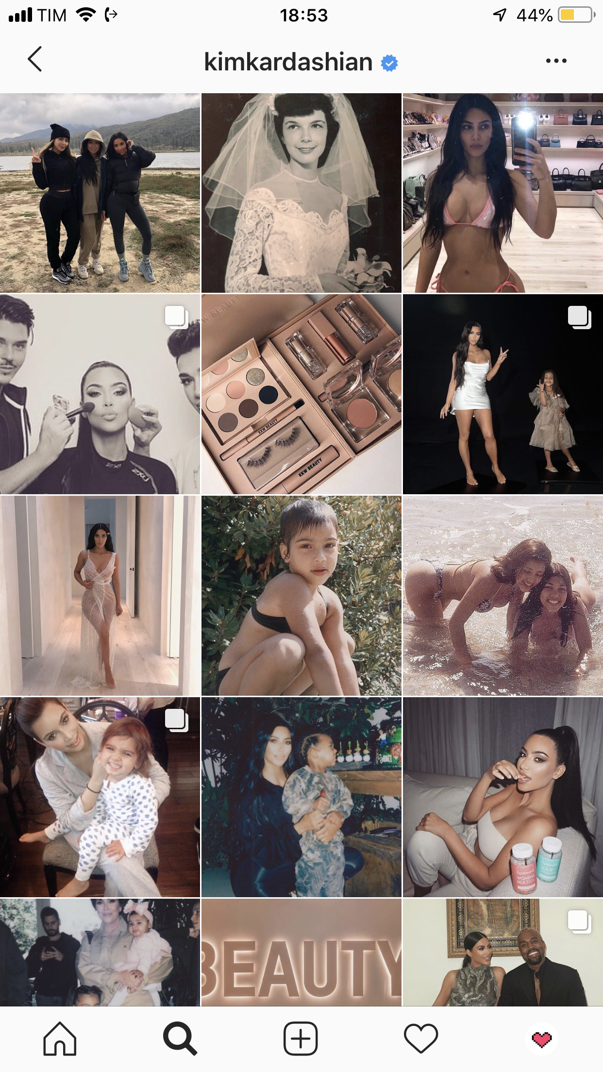
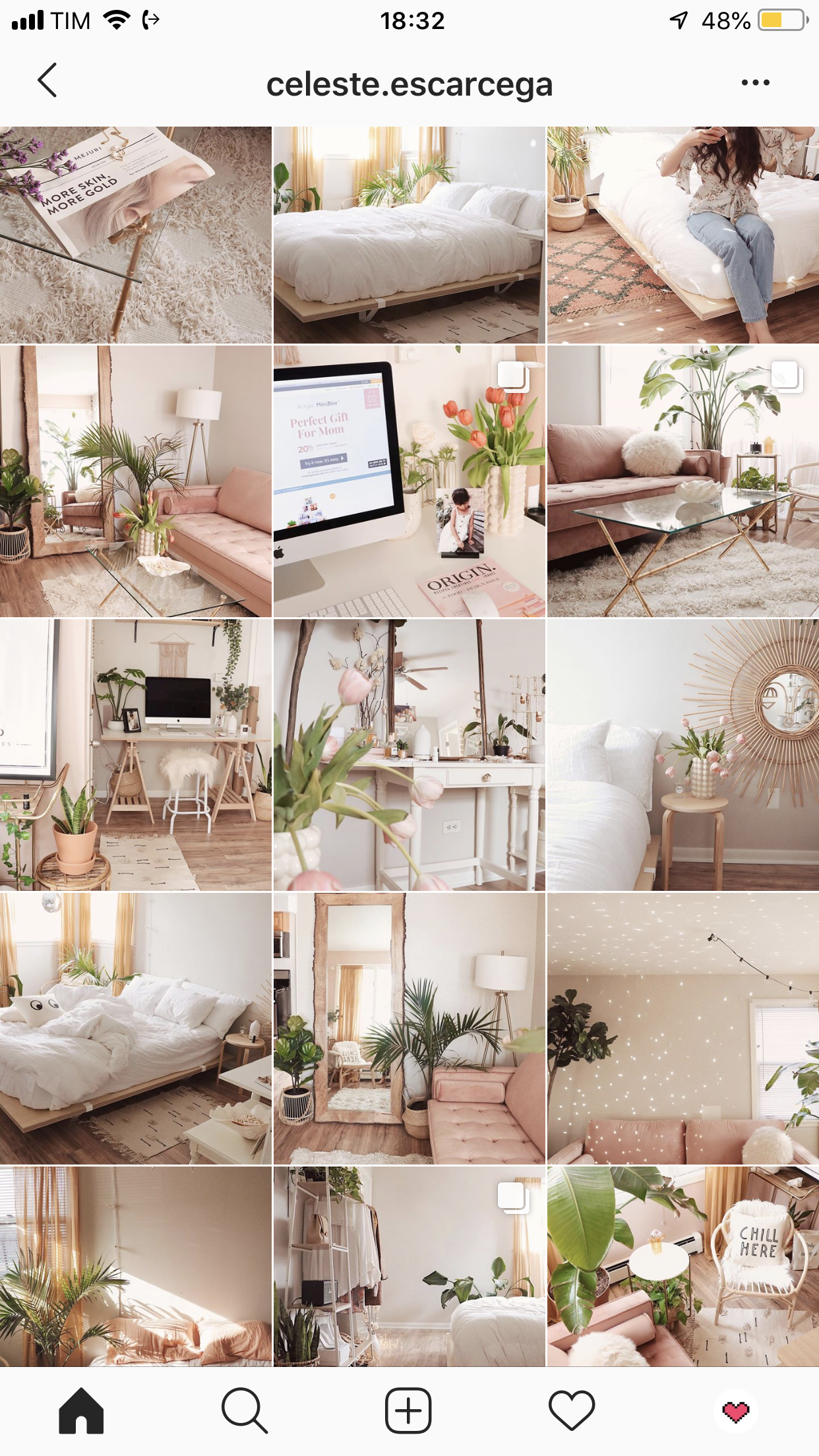
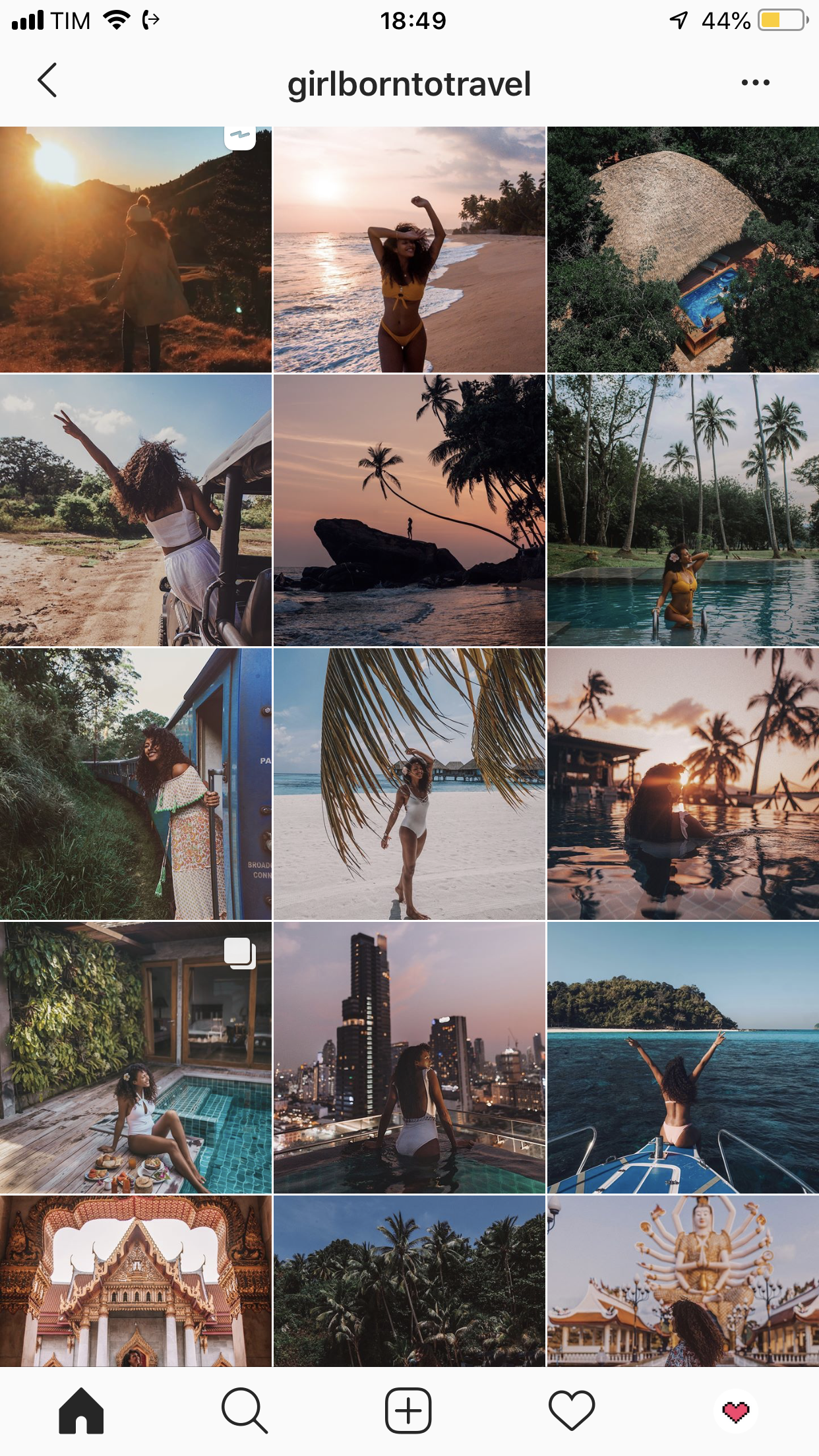
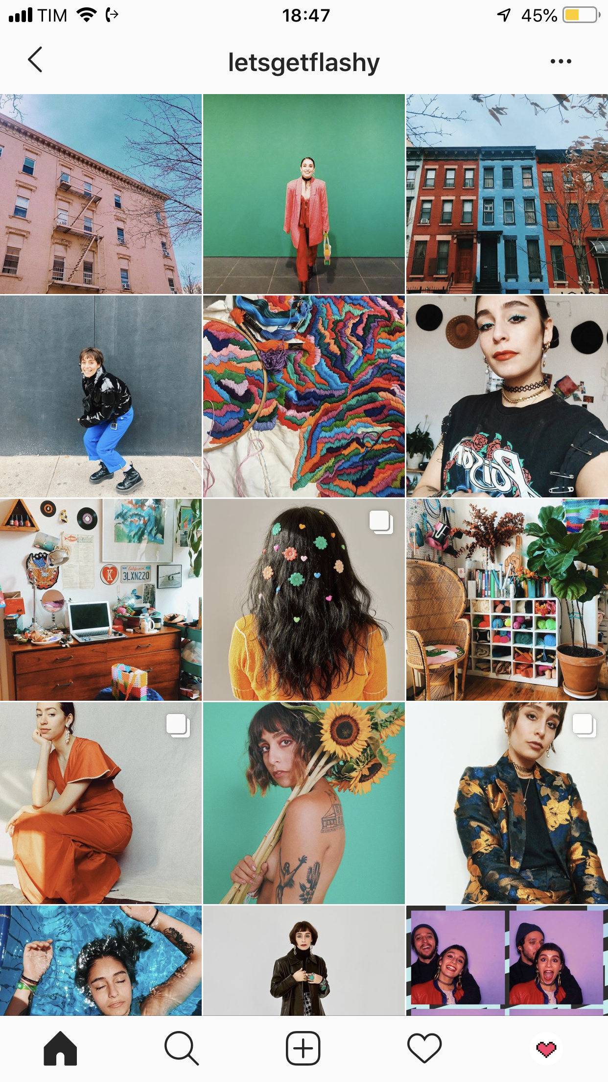
Here’s some theme/filter inspo straight from Insta:
Instagram feed theme ideas:
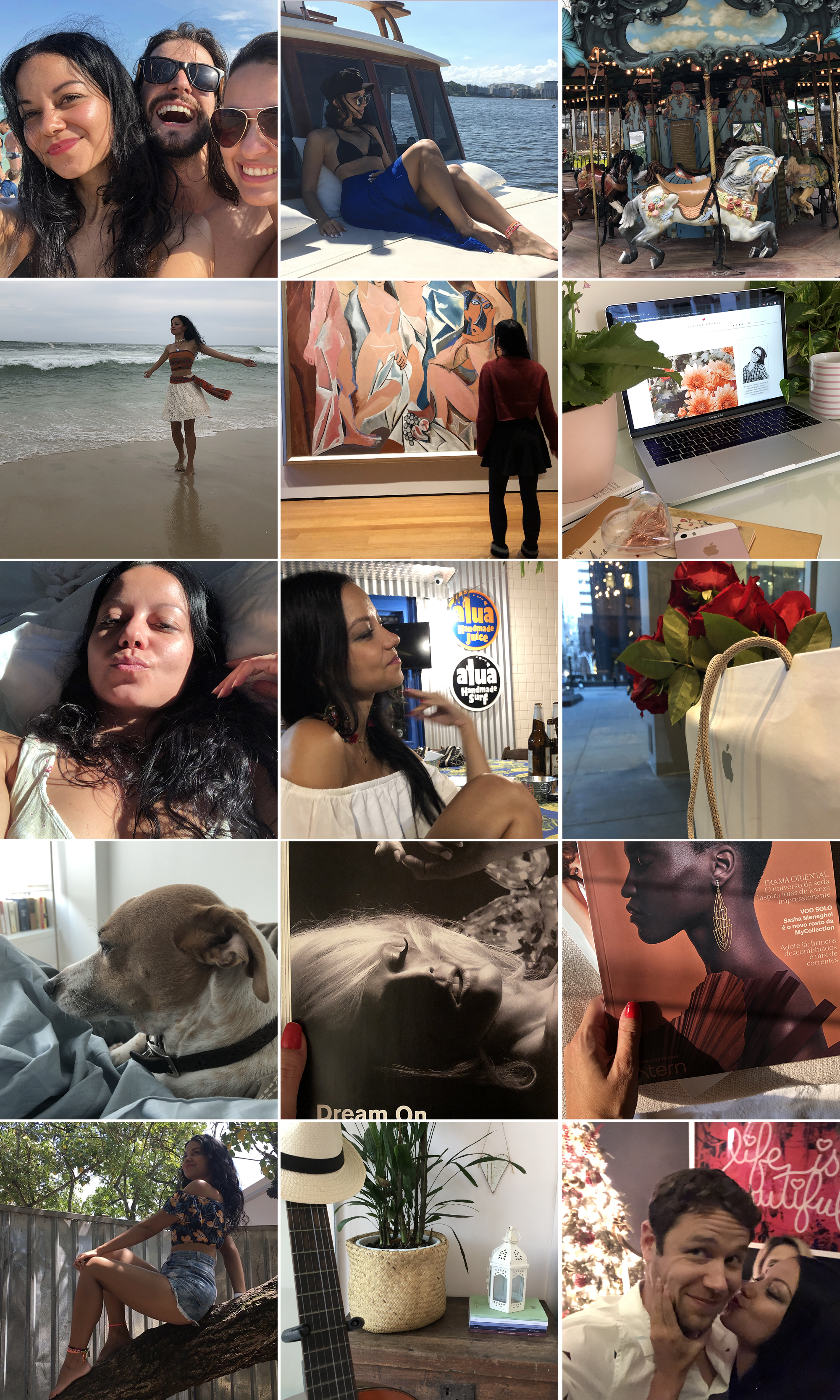
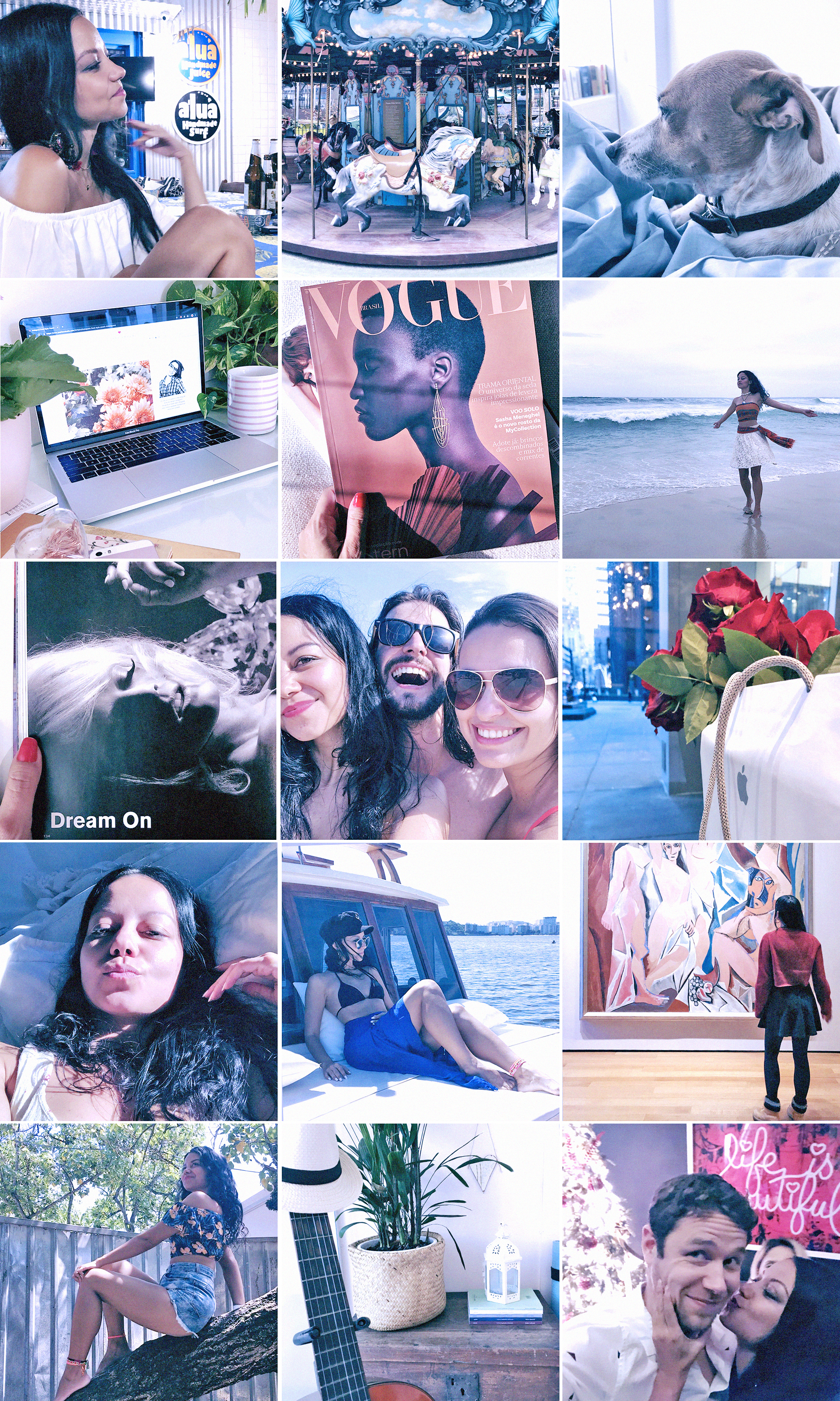
So now let’s see how this step works in real life? 🦋 I used a very simple blue filter on our practising feed, just to show you the difference:
What do you think? 🙂
Ohhh wow! What a looong post. I hope it’s useful, guys. Any questions, comments or inputs, the comment box is down below 💗💗 Please use it 😛
See you tomorrow for the last post of this Instagram feed special!
Update: Check out the other posts of the series below:
1. Brighness
2. Alignment
3. Disposition
5. Uniqueness
Beijos,
Lu


Discover more from The Aesthetic Shop
Subscribe to get the latest posts sent to your email.
