
Hello loves!
I got a comment from Thalyta on Insta about the mockups I use to display some of my designs or blog posts. It was my cue to finally write this post, that was already on my list for this month. Thank you, Tha! 🦋😇
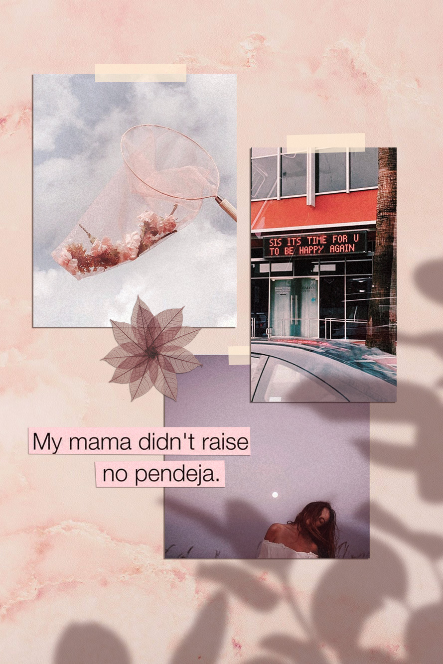
The type of design she refers to is this one below. That’s also the post she commented on 🙂
You may have noticed – specially if you’re a designer or aspire to be one – that this kind of composition has become a big trend recently. It’s beautiful, and can be used for anything; what really matters is the content included in the mood board.

-
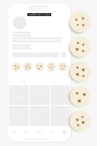
 Vanilla Girl aesthetic stars Instagram highlight covers ready to use – includes editable Canva templates$6
 -
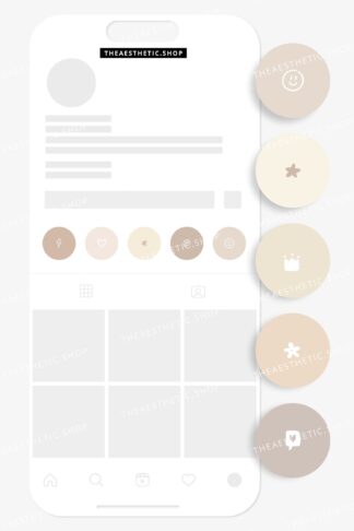
Vanilla Girl aesthetic photograph Instagram highlight covers ready to use – includes editable Canva templates$6
-
Vanilla Girl aesthetic doodle Instagram highlight covers ready to use – includes editable Canva templates$6

💡In my opinion, the reason this type of mood board is trending is because it makes the whole image look more human and real. That is, people like seeing actual photos, instead of digitally created graphics. And mockups or mood boards that emulate light and shadow (as if it was a photograph and not a digital design) captures our attention more and creates instant human connection. And that can be both rare and valuable nowadays in the social media world. Right?
You’ll probably find online websites giving away mood board templates like this for free. All you have to do is download them and replace with your own content. Mockup World for example has has amazing pieces.
I prefer to create my own mood boards from scratch because it’s super easy and I can implement my favourite aesthetic. Also, I just enjoy making them.. hahaha 💖👩🏽💻💖
Truth is, even though it looks like advanced, difficult design work, it’s actually pretty easy.
Here are the little tricks you should know:

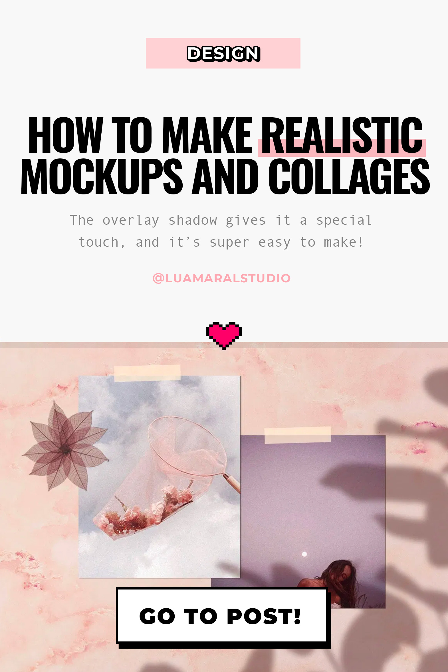
I created the design above for the purpose of this educational post. And I’ll walk you through the process down below. You can add your personal touch by changing details to match your favourite style, ok?
Take a look at the screen recorded video first:
The essentials
Software: Photoshop. It can work with Picsart and other image editing apps too. You should have at least a moderate familiarity with PS to work on the project.
Design elements you’ll need:
🖌 a background with some texture (you can download one for free, take a picture or create it on Photoshop.)
🖌 the content, which is the main subject of your collage or design.
🖌 shadow image to overlay your content softly.
Interesting extras:
➕ something to “stick” your content to the surface, like scotch tape, pins, clips…
➕ cutout objects in the composition, like flowers, leaves, stickers, etc.
Step by step:
1 Pick a background in the aesthetic you want to use. You can download one for free on Unsplash, they have so many options. Search for “background” or “texture”.
If you prefer to create your ow texture, make a rectangle in the color you want and go to Filter / Noise and choose the intensity.

2. Import or drag your content to the project. I can be a photo, another design you’ve made, or even a bunch of images to create a collage (like I did here). If you’d like, you can also type some text, width a rectangle behind it to look like a magazine cutout. You should let your imagination flow at this stage!
In my example, I used only 5 elements to simplify the process.

3. Your content needs 2 main styling edits: shadow and textures. The shadow should be solid, dark and short. It’ll look like there’s a lot of light shinning on your design. If the shadow is too blurry and clear, it’ll look like the object is floating.
Double click the layer and configure your shadow:


For the texture, I usually just go to Filter / Noise and add the amount of grain I think is necessary. I posted about that here, if you’d like to know more.
4. Now this is the best, magical, step! hahaha! The shadow overlaying the content will make your mood board look like a photo os a real scene. The two most common shadows I see are plants and window bars. Soooo beautiful and lovely… and ridiculously easy to make! 🙂
If you’re going for a plant, just google image “plant png” and look for results with clear background. Then import it to your project!
Here’s the editing I suggest:
- Image / Ajustments / Hue Saturation and remove all brightness.
- Select the layer and reduce the opacity to 30%
- Last, go to Filter / Blur / Gaussian blur and configure as you wish.


After making those edits, place the shadow wherever looks best. You can also make it bigger or smaller to adapt. If you wish to make it look more realistic, I recommend adding a bit of noise and change the hue of the shadow a little bit.
Instead of grey, the shadow should have a more similar color to the one of the background. Go to Hue / Saturation, click “colorize”, and find a good color to match.
If you’d like to add some tape or pin, it’s super easy and, in my opinion, looks great. I usually get some tape image on Google or just draw a rectangle with 70% opacity.

Important: The shadow layer has to be above al the others. Otherwise the design wont work.
There it is! 🤸🏽♀️✨
Isn’t it super easy and gorgeous?
On my designs, I use the same filter on all the elements, to make them all look uniform. On Photoshop the filters are called “actions” and you can read more about them here.
Phew! Finally. I hope you guys are not intimidated by the length of this post.
If you like the tip, and put it to practice, I’d love to see the results. And if you have any questions or comments, please let me know ok? 💜🙏🏽
Beijo,
Lu


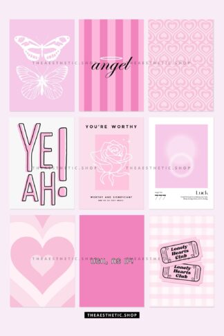
&url=https://www.theaesthetic.shop/product/30-perfect-pink-aesthetic-high-resolution-digital-images-with-editable-canva-template/&media=https://www.theaesthetic.shop/wp-content/uploads/2023/08/30-Perfect-Pink-aesthetic-high-resolution-DIGITAL-images-with-editable-Canva-template-2.jpg)