Tag: resources

  • ✷ What is Canva and why it’s one of the coolest graphic design tools EVER!

    ✷ What is Canva and why it’s one of the coolest graphic design tools EVER!

    Update: this post was written around 2016/17. Much has changed on Canva since then, and I plan to write about it soon. So many cool, useful changes! I still love Canva and use it more than ever now. But this is just.a heads up if you’ve arrived here in 2020 that the information below might be outdated 😘

    Hey guys, how are you doing?

    As always, I will start the post by going straight to the point, for those who want a simple answer!

    Canva is a very popular website and app that offers resources to create graphic and digital design pieces such as social media posts, flyers, business cards, invitations and more. It has a VERY easy and pleasant interface, useful tools for the development of elaborate or simple layouts, and templates (models) of very beautiful graphic pieces in the most used formats in everyday life.

    Canva is free, but it has a paid version (Canva for Work) that can be very worthwhile in some cases. It can be accessed from both your computer or your phone, although, depending on the need, it is much better to use it on the computer.

    I admit that when I first heard about Canva, I was afraid, thinking that the design profession would end now that such a tool was offered so easy to use, and with templates of such good taste. But the truth is that the designer’s vision remains the great differentiator. Nowadays it is a great ally in my work! 💖💫

    Now let’s elaborate on the subject !

    Is Canva a replacement for Photoshop? Which one is better?

    Yes, Canva replaces Photoshop in creating everyday designs. It has features that are good enough to create countless types of layouts without having to learn PS. In addition, Canva is highly recommended for entrepreneurs, bloggers, freelancers and amateurs who want a practical and simple alternative to develop graphic arts in good taste. It’s easy to start and finish a beautiful design in Canva with a few clicks.

    This does NOT in any way mean that Photoshop loses its value. Photoshop is still the best graphics editing software out there, it has fantastic tools that are much, much more advanced than Canva and achieves unparalleled results. It’s not that with Photoshop you can do the same things you do on Canva, only better. Photoshop actually has way more advanced options 🤩💫

    It is not possible to register any design created in Canva, for example, something inconceivable for professional creations for major brands or projects. In Canva, you can’t edit images (just some very basic controls), nor create gifs among the million possibilities Photoshop offers. For a professional graphic designer in the 2020s, mastering Photoshop is still essential, and knowing how to work with Canva alone is not enough to have a competitive advantage in the profession.

    I don’t even think that Canva’s intention is to replace PS entirely. It is just a simplified alternative, specifically focused on making layouts, specially for business owners who are not full time designers.

    To sum up, each one is better in one sense, and knowing how to handle both with ease is ideal for any designer.


    How to use Canva?

    The interface is all intuitive, like almost everything these days. Create an account, select the type of design you want, choose a template and edit the content with your texts, images, graphic elements, etc. On the left side, the site offers several options of resources to use. Some are free, others paid.

    My tip for those who don’t want to pay for premium images is to search for images on google and upload them to your account, when Canva doesn’t offer the option you want for free.

    Is it worth it having a premium Canva account (Canva for Work)?

    I hate to give this vague answer, but each case is different. Before hiring my professional plan, I read many posts and professional designer reviews. I confess that opinions were divided. About half of them love Canva for Work and highly recommend it. Another half say they have not seen so much advantage.

    I think it’s worth it. For entrepreneurs, bloggers etc who, as I mentioned above, can have Canva as their main ally in marketing and design, I would super bet on the premium option for sure.


    Guys, I really hope this was helpful somehow! 🥰💖✨

    Don’t even think twice before creating your account to start making awesome designs on Canva.

    beijos!

    Lu

  • ✷ Cute aesthetic emoji combinations to copy and paste: The ultimate collection

    ✷ Cute aesthetic emoji combinations to copy and paste: The ultimate collection

    Hey there chicas! 💝

    Emojis have truly revolutionized the way we express ourselves in writing. These colorful and expressive symbols have transcended the boundaries of language, allowing us to convey emotions, convey humor, and communicate more effectively in our digital conversations.

    Whether it’s a simple smiley face 😀 to convey happiness or a crying face 😢 to express sadness, emojis have the power to add a touch of personality and emotion to what would otherwise be a plain text message. They have become an integral part of our daily interactions, helping us to connect, relate, and understand each other better.

    But emojis are not just limited to emotional expressions. They have expanded into a vast array of categories, ranging from food and animals to weather and activities. Want to share your love for pizza? 🍕 Or perhaps you’re feeling nostalgic and want to reminisce about the good old days? 📼 Emojis have got you covered there too.

    Moreover, emojis have made communication more inclusive and accessible. They transcend language barriers, allowing people from different cultures and backgrounds to understand and relate to each other without the need for translation.

    It’s fascinating to see how a simple combination of pixels on a smartphone screen can capture the essence of our emotions and convey meaning in a way that words alone sometimes cannot. So, the next time you reach for your keyboard, don’t forget to sprinkle some emojis in your messages. After all, a picture is worth a thousand words, and an emoji is worth a thousand emotions. 🌟🌈✨


    That’s why I prepared these combination ideas, to help you decide which ones to use on your status, on a special post or text, or your Instagram bio, for example.

    instagram-bio-design-ideas-3
    Check out more bio ideas here!

    Remember: emojis look different depending on your type of device and system. So I apologise if come of the icons look different, or it seems like it doesn’t match. I used the iOS emojis as reference, since i had to pick one. But you’ll see there are many options, so if one emoji is not good, you can replace for another one.

    You can just copy and paste them if you want! And there’s also an image below the list, if you want to save or pin all of them for the future.

    [If you like aesthetic symbols too, I’ve posted my favorites here.]


    Emoji combinations by color

    🏹🤎✌🏽🚪🧸🍂🍪⏳🙈🍗🐌🪵🐿
    🦋💦🚰💎🌐💧🩵📧🐬🥶🌧👕🐋
    💕🧠🌸🩰🎀🩷🌸💓🐷🦩💗🌷👛
    🔮💜⚛🧞🪻☂👾👩🏽‍🎤🟣🌂☮🎆🧘🏽‍♀️
    🌻💛☀👑🍋🌙✨🎗🐥🍌🌼🌜
    ❣🚗🚨🎒🌹🌶❤🍎🖍♦️❗️❌
    📙🍑🧡🌅🏵🐌🥐🟠✴🦊☄🦐🍁
    ❇🧪🍏🌿🌵🦖🥒🔋💚☘🐸🪲
    🍷🐙🥀🧨🚩🪭⛑🥊🍓🛢🌹♥️🩸💃🏽
    💝😛💖✨💐👨‍❤️‍💋‍👨✏💞🤪🛍💛💕
    💣🕷🖤🎱🎧♟🔜👣🕶♣🐈‍⬛🐾
    🔗⏱⚔🗒🩶🥈🪽💿📁⛓💍🛒🪙🪦
    🎈🍒🌺🫀👠📕🌶🎟📌🐙🦩🪱
    🏆🔑🛎🔱🪐🍺🎷📀👑🍯🐱🍂
    🟩🌲🐊🥦🦖🫛🚛🟢💶🥬🧟‍♀️🐢🫑
    🐘🦾🌪🤍📃👟🖋⚓🌫🦏🪨🐀
    😡☄🦀🌇🏜🥕⛵💥🔥🦞🍟⛺️🎁
    🦢☁🌬🐚🪽🥛🚽🗒💭🏳🖱🦙🤍
    🎣🏙👖🌊💙🪼🗣🚙🧿🌀🔹🧢🫐
    🏳️‍🌈🎉💐🦄🌈🪸🎨🤹🏽‍♀️🍡🎊🍭🛼🪁


    Emoji combinations by mood

    🌪🎶💋🎆🖤🍸🌃✖️🎈😈
    📺🍪🤍🦦💤🧦🥽☁️🧸🛌
    🪁🦄🔫🏰🎠👩🏼‍🎤✨☂️🍬🎡
    🕰🗝👒📜🕯🖋⚜️🧳🎻⏳
    ⛲️🖌🌻🎨🏜🌅👨🏻‍🎨🖍🌈🌩
    🪐☄️🌙🌌🛸👨‍🚀🔊♾✨🚀
    🐚🔱🌊🏝🧜🏻‍♀️🥥🕶🌺⚓️⛵️
    💕💎💘☁️✨🪽🩰🦋💖💭
    🗺⛰✈️🛤🧭🚗👣🎒💨🚌
    🎛👾💿👩🏿‍💻🤖📡💻🏢🔋📂
    🧞🌔🌀😌🔮🍀💜🌙🧘🏽‍♀️✨
    🔥💣✴️🧨⚡️☄️🧟‍♀️☢️🧯💥


    Aesthetic Emojis

    Vanilla girl emojis: 🍦👁️👝🥯💰⭐️🕰️🐈🥂🍰🪴🫶🏼☁️📀🧺👱🏼‍♀️🥨🧁🙌🏼💭👡🏷️🤎🤞🏽🍯📻🧦👜☕️🍪🦙✨🍮💆🏽‍♀️👢🐕👩🏼‍🦱✍🏻🧸🌦️🦶🏼👧🏽🍨👩🏼🫧🤍🥐🧖🏽‍♀️🎞️🧥🐌🍂☀️🐚🪐🥥🥞🧋🏹⏳💳🪑📜📔💛❕

    Academia emojis: 🤓👆🏼🕰🌒❔🎓🪐🪶🪴📖♟🏰🖤🍇☕️📜🔬🦉🍂👁☂️🤍🧠🦆📚👩🏽‍🏫💭🌳🪰🤎🌂🗝🫖🏹🥇🏛🎻🌫🎞👞💼🍷💀✍🏼☁️🎩👓📋🤵🏼‍♀️🧥🔎🌘🫐🥃⏳🕯✒️

    Soft emojis (read my post about soft aesthetic here): 🥺🌸🍦🕯💭🍑🛼🌨🦋💝🧃🤍🎈🍰🕊🍭🥰👼🏼💘🩰🎠🥛📖🍪🌷🌐🍓✨🐇💖💍☁️🔅👗💌🐭💓🧴🌼🌷🧁⛸💎🩹🎀📝💕🧸🪞🩷🏳️🛁🎡🥞🪽🦢🐥🥽❄️🫶🏼🫧

    Cottagecore emojis (read my post about Cottagecore here):⏳😌📚🐮🦌📻🦋🐿🌳🍂🌼💭⌛🕰🍄🌰⛅🌙🍯🍓🪲🌧🥧🌻☕🎻🌱🧚🏽‍♀️⛰🌄🏡🕯📺💐🧺🗝✉📜✒🧶📝🌸🧦👒📬🦆🤎👩🏼‍🌾🐖🌿🍂🌞🍎🥛🛤🕰🖼

    Baddie emojis (read my post about baddie aesthetic here): 🖕🏽👄🗯🤑🍸💘💎🛍💣🏆🎆👙🧋😈✨🖤🌹😛🍒🍾😎 ✴️💕🎧💳👑‼️🌙🎀🥂💲🩷🔮😻🦋💞📣🔪💋💵😉🖕🏻💖✨👠👛🧨💄💅🏾💥🪞💜❌⚡️👸🏽💗🎇🔥🪩

    Artsy emojis: 🤓🧵🖼🎨💡🦋🌻🎫🌜🪐🍂💛☮️📙🎈🌅🍷🎹😉🍃🤹🏽‍♀️🫀🌿🖌🌈💐🌞🐱💎📸🎷🏛📜🪡🎵👏🏼🎼🎪🪴🪄🌄🕯💸🧶✌🏼🩰🐞🎬📚🧳🧡🪶🌙🍊🧘🏽‍♀️🎟🎭📒✏️

    Indie aesthetic emojis: 🦶🏼🎵👖🍟🚬📙🍀🐙🎈📒🦋🪐🧨🙃👩🏽‍🎨🌻🔁🍩🎟🧢🧑🏽‍🎤🧣✴️♾🧠🪄👯⚡️📽🪀🔅👓🧡🎨🎧⚠️🍒🧵🔫📻😀🦄🙌🏽🦑🥸🍄⭐️🆒🧋🛸🪴🔮🍕💛🎒👽🕺🏽🤓🌈👾🌼🤘🏿🫀🖖🪲🎶🌞💥♻️🍔☮️🧃✏️🛼🏳️‍🌈🤹🏻‍♀️🚲🌆📀☎️🪤🧸🛒

    Lovecore aesthetic emojis: 💗🍓👄💐🆘🫀🦢🌙📕🎀💋📝☎️💕👩‍❤️‍💋‍👨💌💖♾🎟🍒🍷☁️💞😍🌷❤️‍🩹🍦❣️💭🤍😻🎈💓🍰🕊💝🌹🥰💘🥂👠💟♥️🥺🤟🏻👰‍♀️💔💍🥀🎂🗝🎁❤️💞🩷🪽


    Here are the images to save or pin the whole set:


    Thanks for the visit you guys! Please follow me on Insta for lots of cool content and freebies!
    Hope you’ve enjoy these… 🧚🏽💫

    Beijos,

    Lu

  • COLOR PALETTES: SUMMER

    COLOR PALETTES: SUMMER

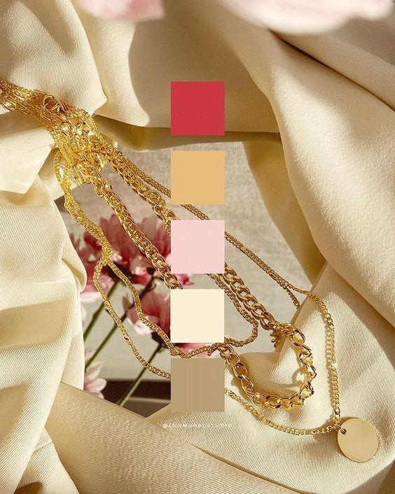
    Summer is so close again… How wonderful is that, guys?

    I don’t know about you, but I can’t wait to enjoy more time outdoors, hit the beach, take some time off work and have tons of picnics and rooftop parties 💛✨☀

    To get the spirits even more in the summer vibe, here’s a collection of beautiful color palettes inspired by the warmest season of the year. Use them to create the color schemes for your summer creative projects or events!

    Here we go:


    Aesthetic summer color palettes


    Want more palettes? Check these ones out: spring color palette, monochromatic color palettes, fairycore color palettes, pink winter color palettes and lovecore palettes!

    Happy summer everyone!! 🥰🧡🍉

    Beijos,

    Lu

  • FONT IDEAS: FALL

    FONT IDEAS: FALL

    Hi!!

    You know, during Fall time, I don’t really talk about anything else in this world but the fact that I LOVE the Fall! hahaha!

    The vibe, the aesthetic, the weather, the feeling inside my heart. All of it. Just pure love. 🧡🍂

    So in that spirit of adoration of these 3 beautiful months where everything is just right in the world, I’ve selected some of my favourite Autumn inspired font combos from CANVA.

    There’s a little bit of coziness, a bit of nature, a lot of orange and brown and, yes, some spookiness because Halloween is one of the best parts about the Fall! 🎃🧡🖤

    Here they are. Hope you enjoy!


    Fall aesthetic CANVA font pairings


    Want more font inspo? We have them! Cottagecore fonts, cute fonts and more 🙂

    And hey, since you’re already here and interested in Fall aesthetics, checkout this post with pretty Fall aesthetic phone wallpapers, this one with Fall aesthetic photo ideas, and this one with beautiful Fall aesthetic quotes for social media, texts, etc 🧡🍂

    Beijos,

    Lu

  • FONT IDEAS: LOVECORE

    FONT IDEAS: LOVECORE

    LOVECORE has been my favourite aesthetic in the last few weeks. Granted, it was February, I know, I know… But still. I’ve been learning more and doing lots of research on this aesthetic, and it’s just fascinating 💌

    If that’ your case too, this post might be useful. Especially if you’re currently creating something beautiful with a Lovecore vibe! Since for the development of any creative project, one of the first things to do is to establish the typography, here’s some help. And check out these lovecore color palettes too!

    These are just a few CANVA fonts that I think totally work with the whole Lovecore theme ❣


    Lovecore CANVA font pairing


    Cute, right? Argh, i can’t get over this aesthetic!! 😩♥💘

    And hey, f you want more font inspiration, make sure you check out this post with cottagecore fonts, this one with cute fonts, this one with fall fonts and this one with different aesthetic fonts for your creative projects! ♥

    Beijos,

    Lu

  • HOW TO EDIT: MOOD BOARDS

    HOW TO EDIT: MOOD BOARDS

    Hello loves!

    I got a comment from Thalyta on Insta about the mockups I use to display some of my designs or blog posts. It was my cue to finally write this post, that was already on my list for this month. Thank you, Tha! 🦋😇

    The type of design she refers to is this one below. That’s also the post she commented on 🙂

    https://www.instagram.com/p/B4A3ZRJlBJq/

    You may have noticed – specially if you’re a designer or aspire to be one – that this kind of composition has become a big trend recently. It’s beautiful, and can be used for anything; what really matters is the content included in the mood board.

    💡In my opinion, the reason this type of mood board is trending is because it makes the whole image look more human and real. That is, people like seeing actual photos, instead of digitally created graphics. And mockups or mood boards that emulate light and shadow (as if it was a photograph and not a digital design) captures our attention more and creates instant human connection. And that can be both rare and valuable nowadays in the social media world. Right?

    You’ll probably find online websites giving away mood board templates like this for free. All you have to do is download them and replace with your own content. Mockup World for example has has amazing pieces.

    I prefer to create my own mood boards from scratch because it’s super easy and I can implement my favourite aesthetic. Also, I just enjoy making them.. hahaha 💖👩🏽‍💻💖

    Truth is, even though it looks like advanced, difficult design work, it’s actually pretty easy.

    Here are the little tricks you should know:

    I created the design above for the purpose of this educational post. And I’ll walk you through the process down below. You can add your personal touch by changing details to match your favourite style, ok?

    Take a look at the screen recorded video first:

    https://youtu.be/Nt2DF6Jdf14

    The essentials

    Software: Photoshop. It can work with Picsart and other image editing apps too. You should have at least a moderate familiarity with PS to work on the project.

    Design elements you’ll need:
    🖌 a background with some texture (you can download one for free, take a picture or create it on Photoshop.)
    🖌 the content, which is the main subject of your collage or design.
    🖌 shadow image to overlay your content softly.

    Interesting extras:
    something to “stick” your content to the surface, like scotch tape, pins, clips…
    cutout objects in the composition, like flowers, leaves, stickers, etc.


    Step by step:

    1 Pick a background in the aesthetic you want to use. You can download one for free on Unsplash, they have so many options. Search for “background” or “texture”.

    If you prefer to create your ow texture, make a rectangle in the color you want and go to Filter / Noise and choose the intensity.

    Chose my bg!

    2. Import or drag your content to the project. I can be a photo, another design you’ve made, or even a bunch of images to create a collage (like I did here). If you’d like, you can also type some text, width a rectangle behind it to look like a magazine cutout. You should let your imagination flow at this stage!

    In my example, I used only 5 elements to simplify the process.


    3. Your content needs 2 main styling edits: shadow and textures. The shadow should be solid, dark and short. It’ll look like there’s a lot of light shinning on your design. If the shadow is too blurry and clear, it’ll look like the object is floating.

    Double click the layer and configure your shadow:

    For the texture, I usually just go to Filter / Noise and add the amount of grain I think is necessary. I posted about that here, if you’d like to know more.


    4. Now this is the best, magical, step! hahaha! The shadow overlaying the content will make your mood board look like a photo os a real scene. The two most common shadows I see are plants and window bars. Soooo beautiful and lovely… and ridiculously easy to make! 🙂

    If you’re going for a plant, just google image “plant png” and look for results with clear background. Then import it to your project!

    Here’s the editing I suggest:

    • Image / Ajustments / Hue Saturation and remove all brightness.
    • Select the layer and reduce the opacity to 30%
    • Last, go to Filter / Blur / Gaussian blur and configure as you wish.

    After making those edits, place the shadow wherever looks best. You can also make it bigger or smaller to adapt. If you wish to make it look more realistic, I recommend adding a bit of noise and change the hue of the shadow a little bit.

    Instead of grey, the shadow should have a more similar color to the one of the background. Go to Hue / Saturation, click “colorize”, and find a good color to match.

    If you’d like to add some tape or pin, it’s super easy and, in my opinion, looks great. I usually get some tape image on Google or just draw a rectangle with 70% opacity.

    Important: The shadow layer has to be above al the others. Otherwise the design wont work.


    There it is! 🤸🏽‍♀️✨

    Isn’t it super easy and gorgeous?

    On my designs, I use the same filter on all the elements, to make them all look uniform. On Photoshop the filters are called “actions” and you can read more about them here.

    Phew! Finally. I hope you guys are not intimidated by the length of this post.

    If you like the tip, and put it to practice, I’d love to see the results. And if you have any questions or comments, please let me know ok? 💜🙏🏽

    Beijo,

    Lu