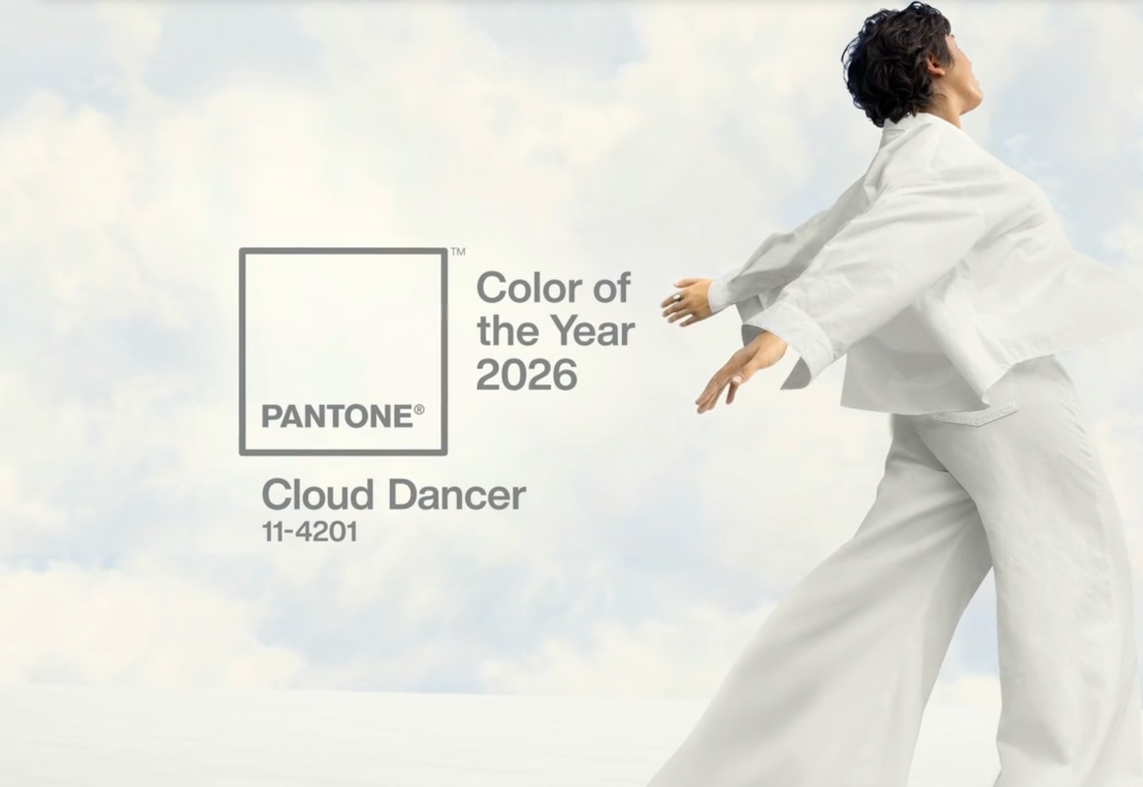
When Pantone announced Cloud Dancer as the Color of the Year 2026, my first reaction was not surprise. It was a quiet, deeply satisfying “of course.”
Months ago, long before the official reveal, I commented on an Instagram post where a company’s staff were sharing their personal predictions. Greens, blues, reds. Everyone went bold, expressive, emotional. I went simple. I said white.
More specific, I said it would be either some type of ligth blue, or off-white.
I cannot, for the life of me, find that comment now. Believe me, I have tried. It is genuinely upsetting because if I had the receipt, I would frame it. But the truth is, prediction does not always come with proof, and intuition rarely leaves a paper trail. What I do have is years of watching aesthetic behavior closely.
And something was clearly pointing in this direction.
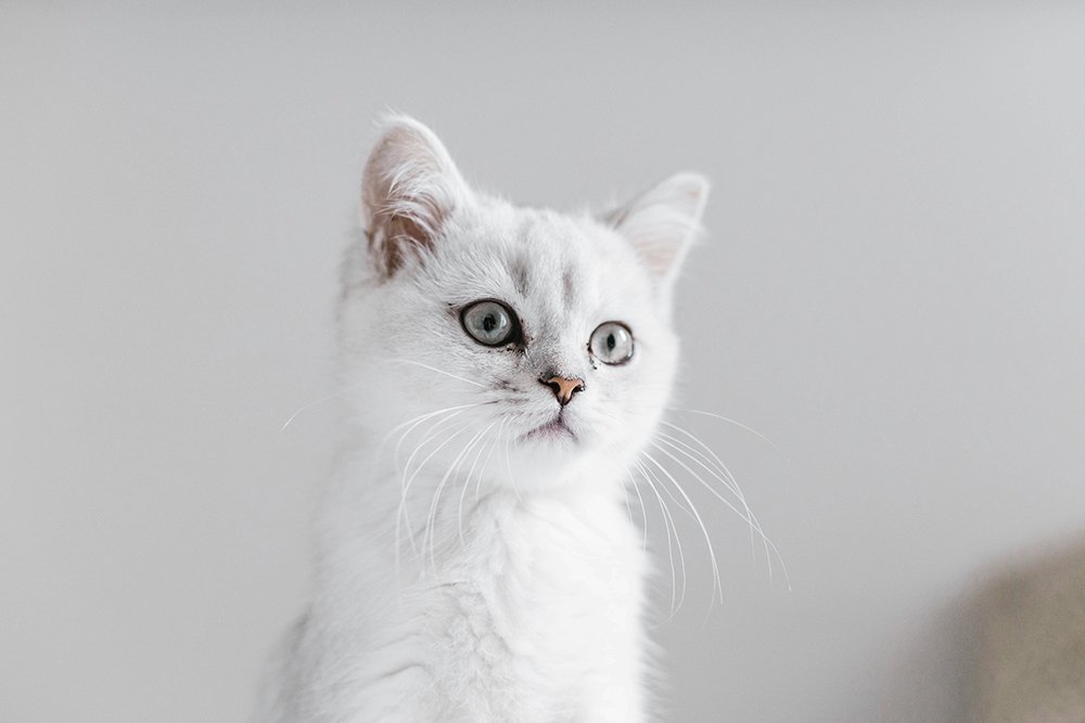
White Never Left, It Just Changed Its Role
We love to say we are “moving away from minimalism,” and in many ways, we are. I’ve said it many times right here, on this blog. Color is back. Ornament is back. Personality is back. But white never disappeared. It simply shifted roles.
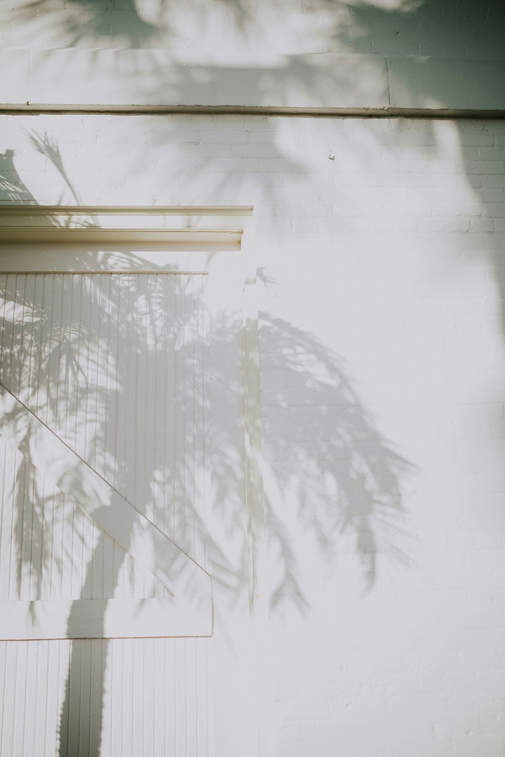
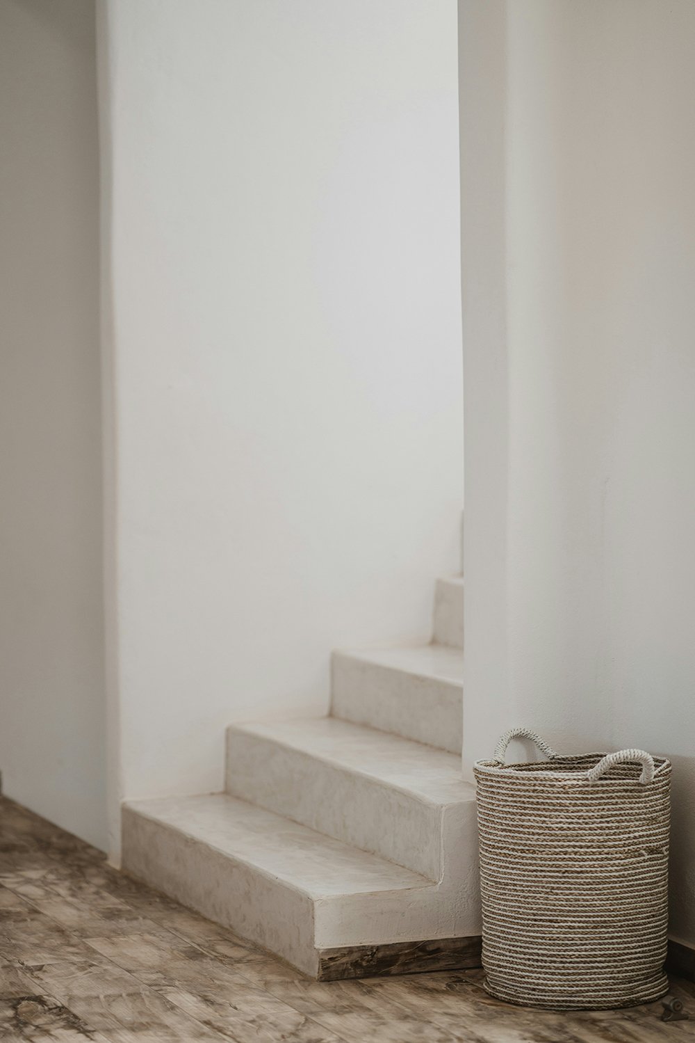
White today is no longer the final statement. It is the foundation. The canvas. The quiet base that allows everything else to exist without chaos.
You see it everywhere. In outfits, in interiors, in branding, in packaging, in digital products. Sometimes it is layered with color, sometimes it stands entirely on its own. And that is exactly what makes it powerful.
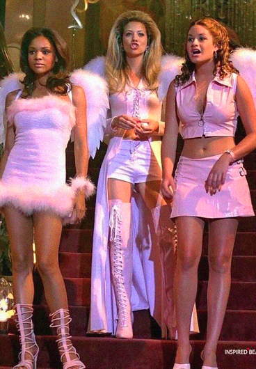
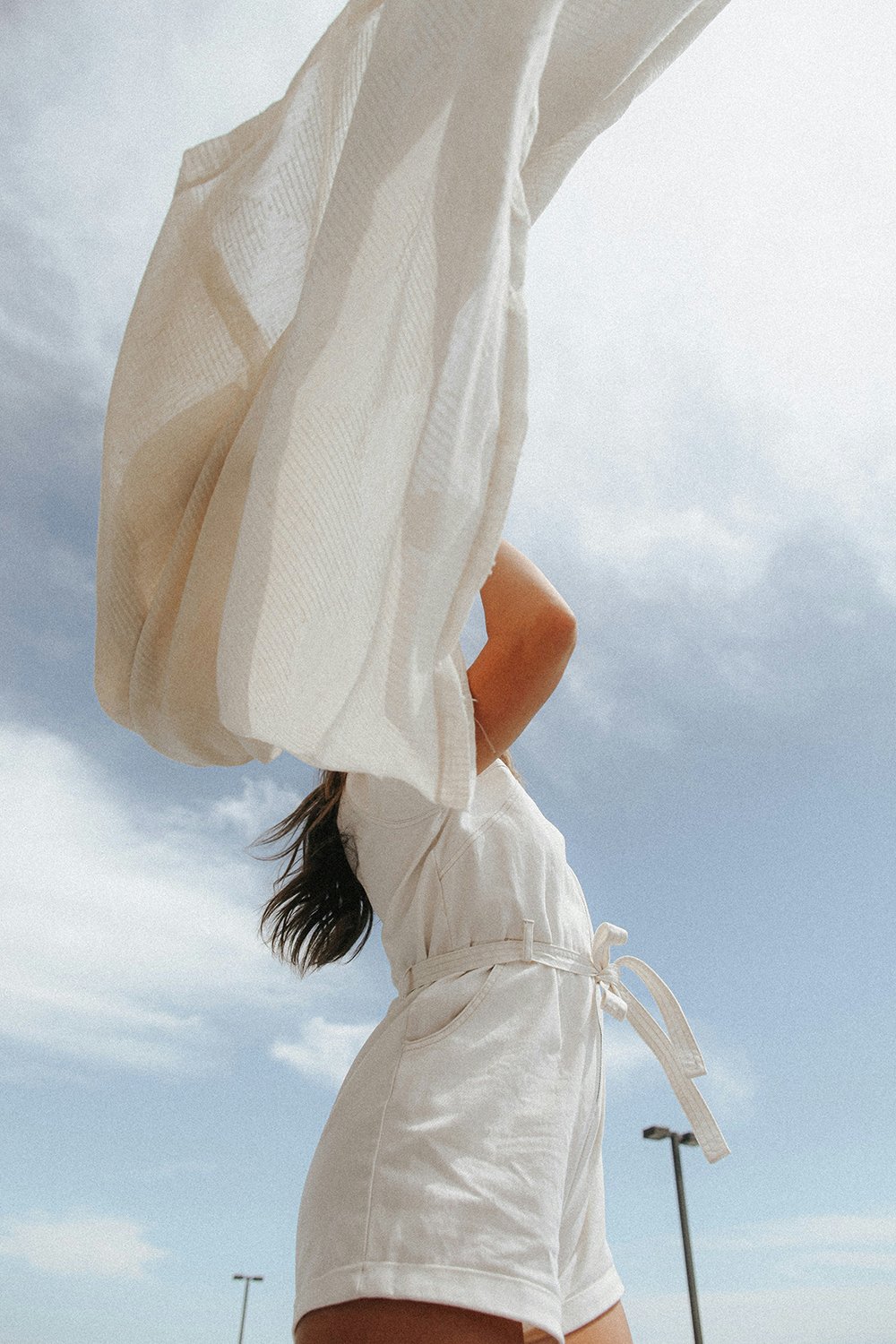
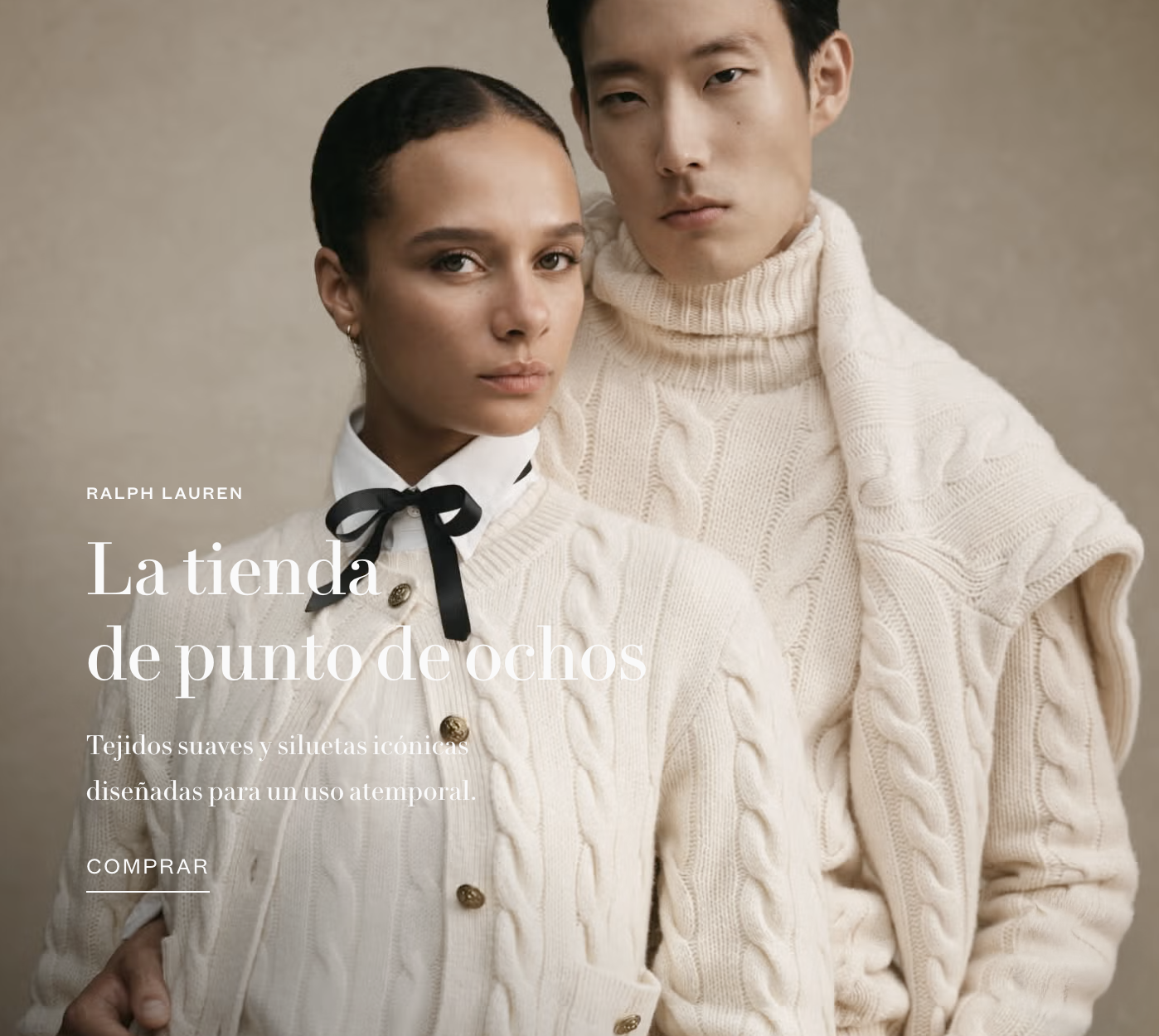
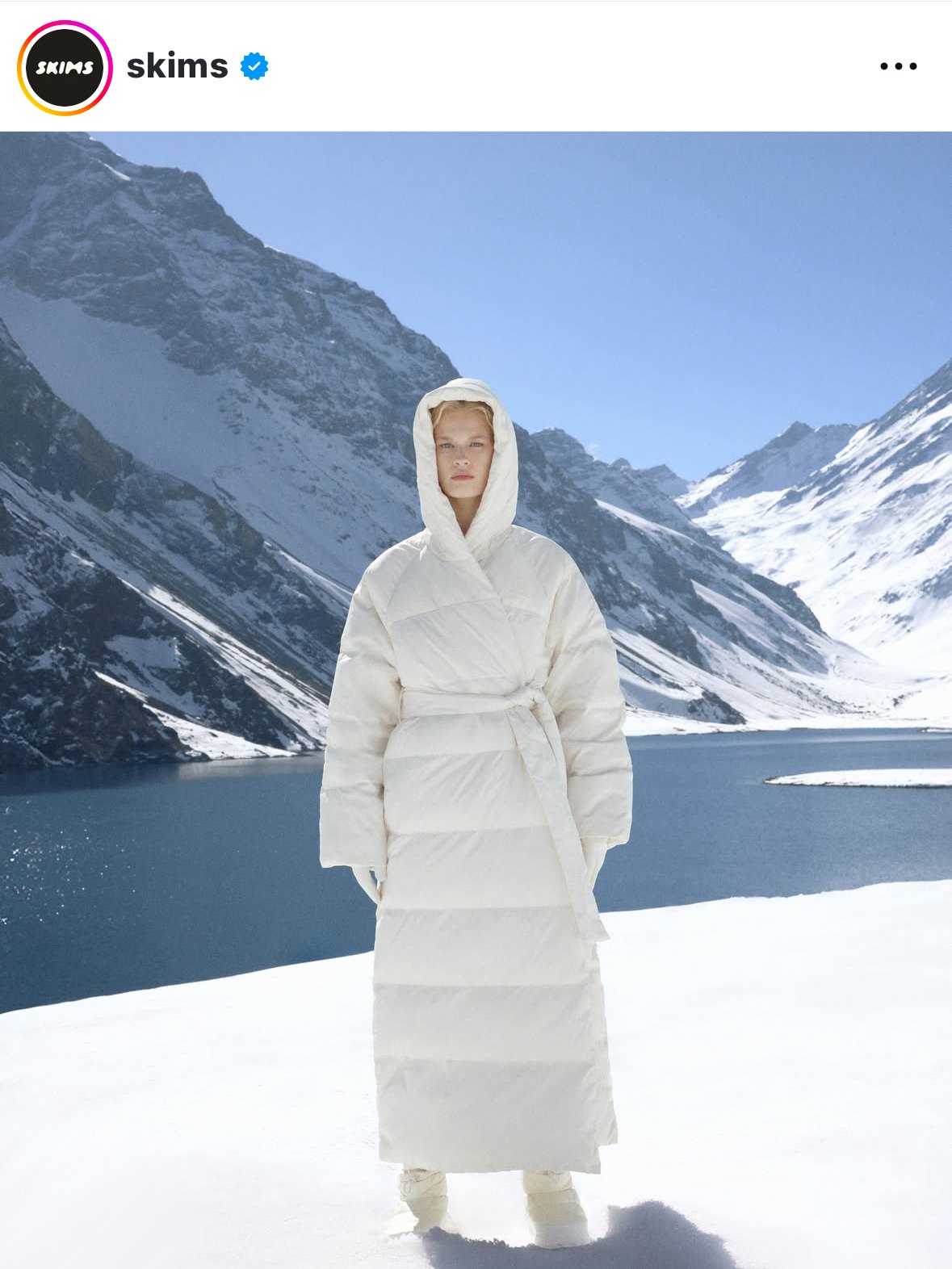
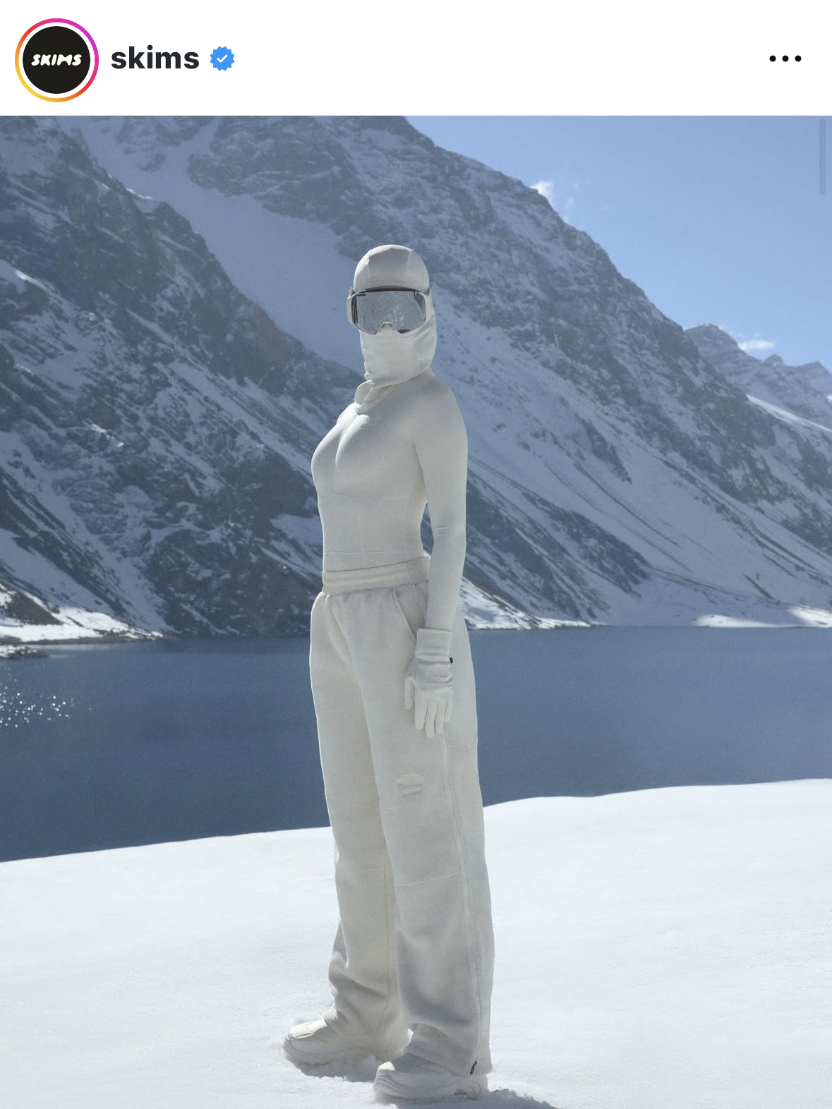
All-white looks are no longer niche or conceptual. They are mainstream, wearable, and widely understood as chic.


Fashion Told Us First
I remember when white clothing came with anxiety. Growing up in the 90s and in the early 2000s, that was the general feeling. It gets dirty too easily. It looks like a hospital uniform. A bride. A ghost. It felt risky, impractical, even awkward.
That mindset is gone.
Two years ago, I walked into an ultra-fancy bar in Stockholm with my husband and some local friends. We were just passing by, not planning to go in. The place was packed. And what stopped us in our tracks was not the music or the crowd, but the color.
Every young, very wealthy person inside was dressed in white. Head to toe. Not because it was a themed party. It was not. It was simply their color of choice.
That image tattooed itself into my brain.
White was no longer precious or fragile, it was confident and dominant.

Why White?
I live in front of a high school. I literally observe it daily from my window. Teenagers are an incredible aesthetic barometer because they adopt trends early and wear them without irony.
For at least three years now, white has been everywhere. White sweat sets. White sneakers. White hoodies with no prints, no contrast, no decoration. Full monochrome outfits, worn casually, without hesitation.
When something becomes that normalized at that age, it is no longer a trend. It is a visual language.
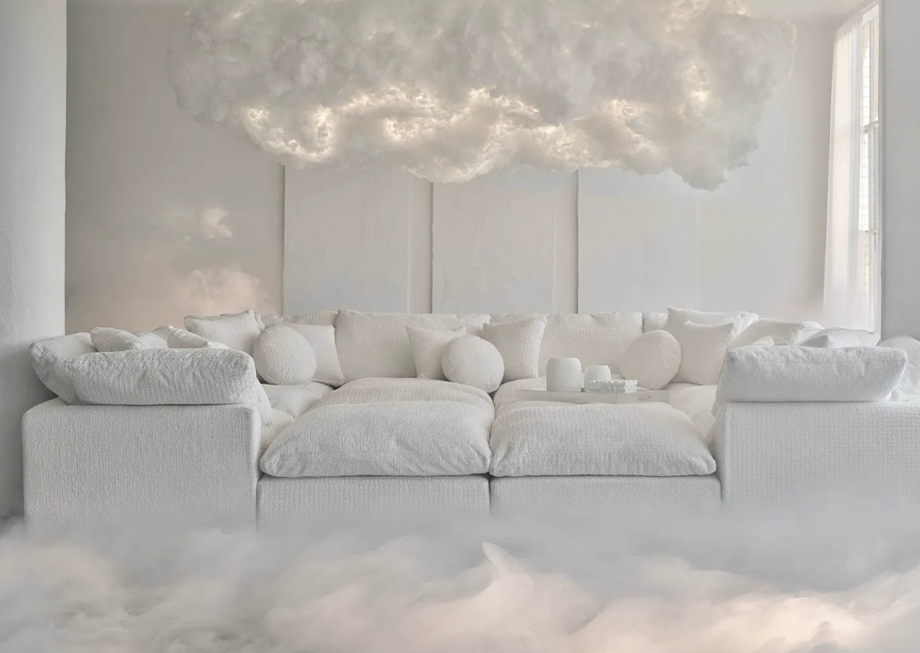
And it’s not just fashion. White couches were once unimaginable, and are now a huge trend. White cars were once rare too. Now they are everywhere. I’m not just saying it, there are plenty of studies and market reports easily findable online confirming that white has become the most popular car color globally.
We now have better products to clean white fabrics. Better detergents. Better materials. But more importantly, we live in a world where objects are more replaceable than they used to be. There is less fear around wear, stains, and imperfection.
We also seem less obsessed with keeping things pristine. A slightly worn white sneaker is acceptable. Sometimes even desirable.
That shift in mindset makes white possible at scale.
Tech Made White Feel Inevitable
Another influence that feels impossible to ignore is tech.
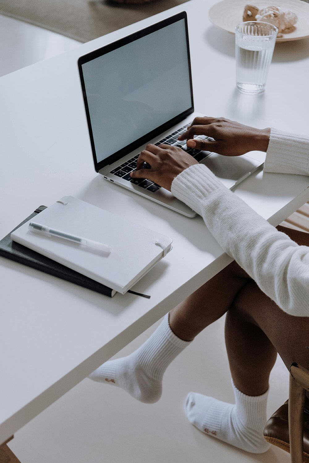
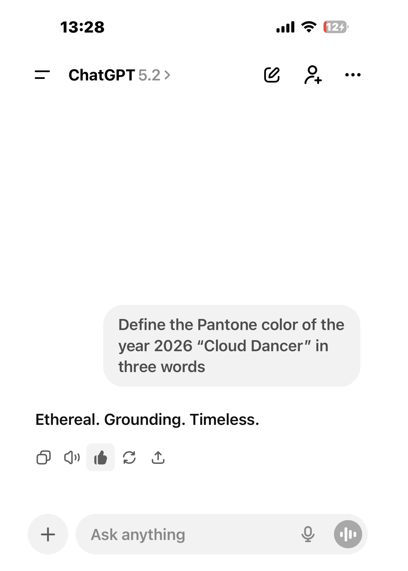
We spend an enormous amount of time staring at white and off-white screens. ChatGPT. AI tools. Productivity software. Interfaces designed to feel clean, neutral, and futuristic without being cold.
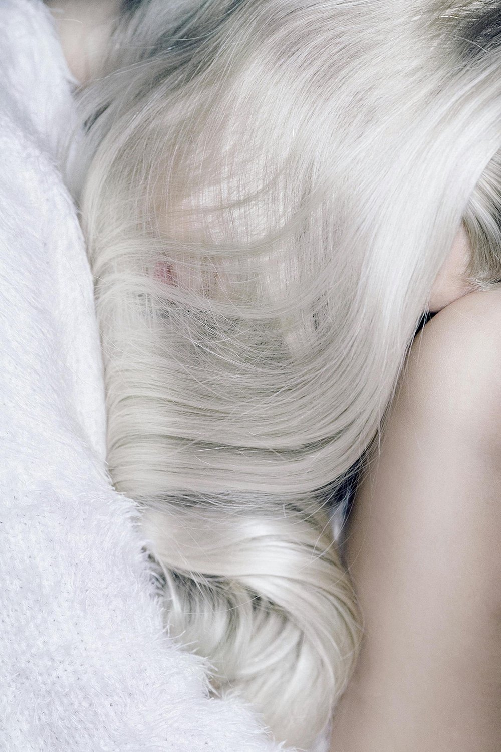
That soft, slightly greyed white is the color of our current digital reality. It is calm, non-invasive, and endlessly adaptable.
With the normalization and democratization of AI, it finally feels like we have entered the future we spent decades imagining in films and books. And that future was never colorful. It was always pale, luminous, almost cloud-like.
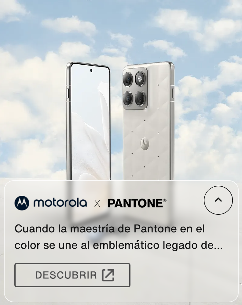
Cloud Dancer fits that perfectly.
The Emotional Reading of Cloud Dancer
If you want to get poetic, and I think Pantone definitely did, Cloud Dancer can also be read as a response to overstimulation.
We are tired. Visually, mentally, emotionally.
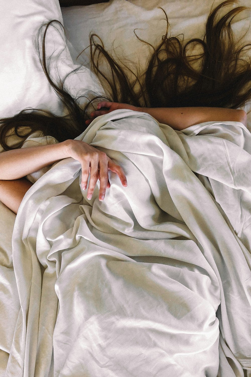
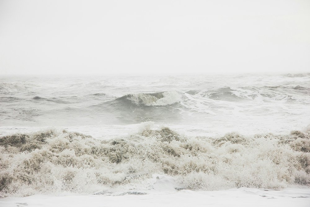
White represents lightness. Space. A pause or breathing room.
In a chaotic world, choosing white feels like choosing peace. Or at least the idea of it.
A Strategic Shock
One last observation. I genuinely believe Pantone wanted to shake things up.
It feels like fewer people were paying close attention to Color of the Year announcements lately. The novelty was wearing off. Choosing a shade of white is bold precisely because it seems obvious and unexpected at the same time.
It sparks debate. Is white even a color? Is this lazy or genius? Is it minimalist or radical?
That conversation alone gives Cloud Dancer weight.
So that’s why I just knew it. Not because I have insider knowledge (I wish!), but because aesthetics always move in patterns. And when you watch long enough, certain choices stop feeling random. And you get an inner voice that tells you things. I’m starting to feel it’s a super power!
Cloud Dancer is not a retreat and definitely not a safe option. It is, I believe, a reflection of how we dress, design, clean, work, and imagine the future right now.
White did not win because it is neutral, but because it is everywhere.
Love,
Lucy ♡₊˚