
Hello there! 🦔💕
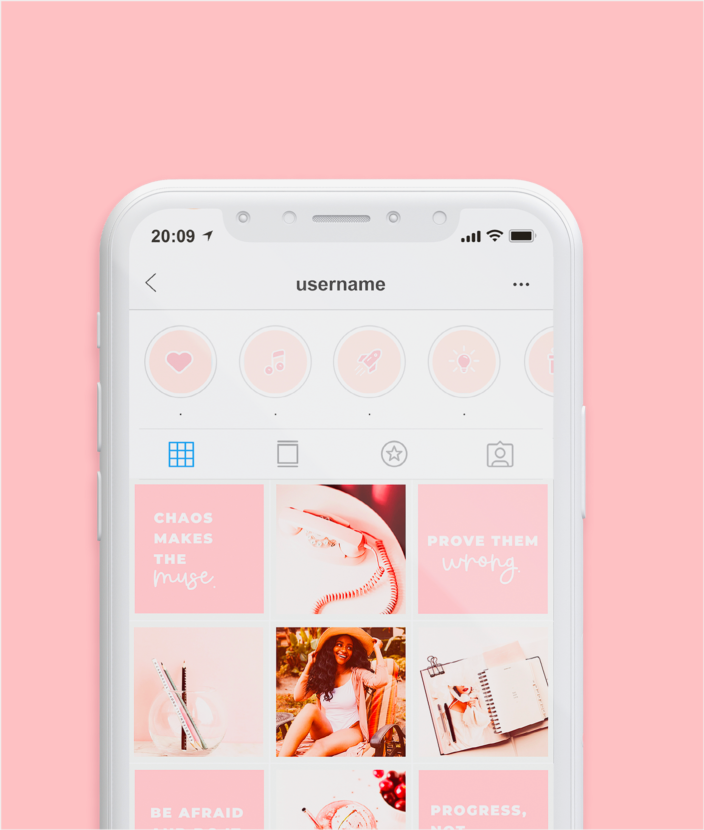
If you’re working to improve your Instagram’s design in a cohesive and unique way, you’ve probably considered matching the highlight covers to your whole aesthetic. They’re perfect to accentuate even more the style you’re going for, no doubt about it!
So here’s a few design ideas I came up with, that I think you should consider. There are so many cute options!
Instagram highlight cover design ideas


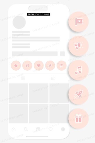
Icons are the most common highlight cover images out there, but still a great option. My suggestion here is to combine them with custom fonts on the highlight’s names, to give it more of a personal touch!
⟡ Get these highlights: ⟡
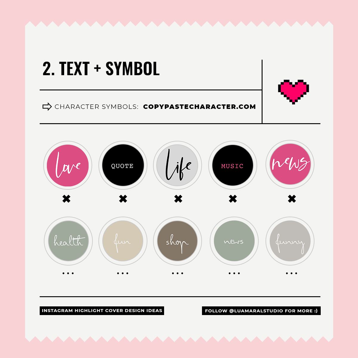

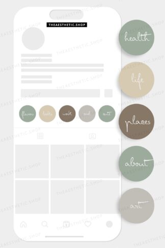
This is the design I chose for my own Insta! Instead of an image, I use a custom text on the cover. In the name, since the highlight is already described above, I use a decorative symbol. So cool 🙂
⟡ Get these highlights: ⟡


I know how you guys love cute minimalistic sparkly things haha! So this is def gonna be a fav, I’m sure. You can use your favorite texture, just placing it in different positions in each cover. As for the name, a single emoji is enough. If you use a nice combination of colors or any pattern you like between emojis and texture, it’ll look fabulous!
💖 These textures will be available in the shop soon 🙂
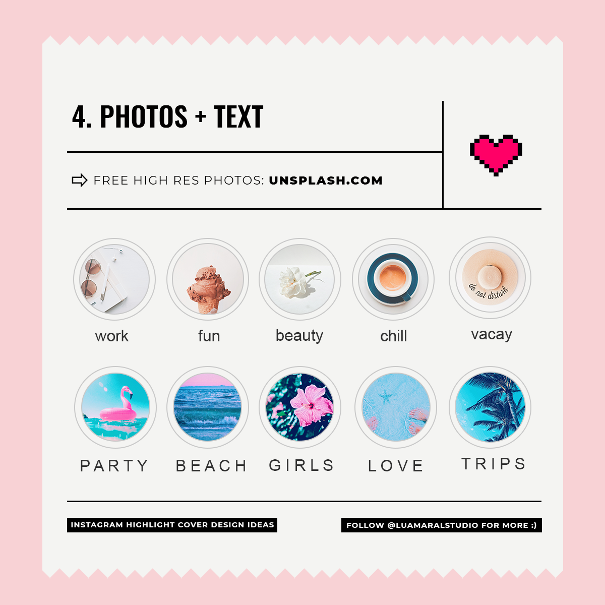

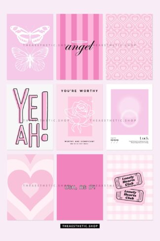
Last but not least, you can use beautiful photos in the covers as well. Even better if the photos are super minimal, very bright and with the same filter/aesthetic as the rest of your feed!
⟡ Get these photos: ⟡
Beijos,
Lu
