Aesthetic Edit Tutorial: Movie Posters
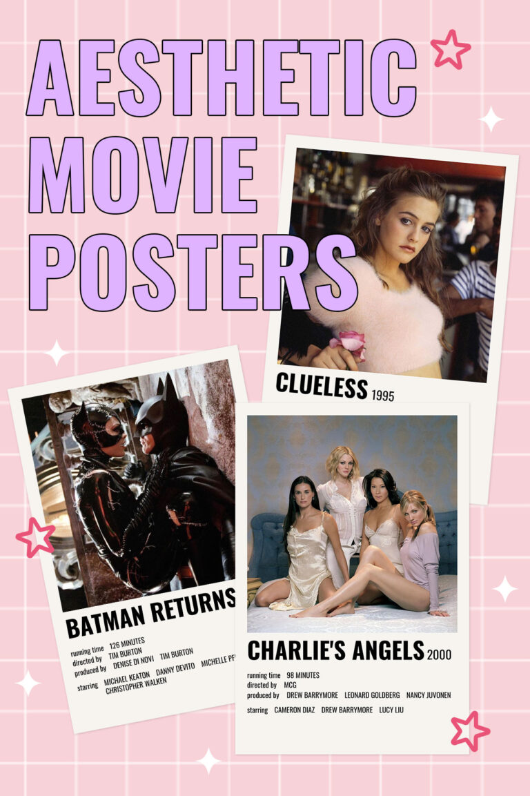
Hey gals! 💕 You’ve probably seen them on Pinterest or Instagram. The super simple yet amazing aesthetic movie posters with a single frame of the movie on top and a minimalist description of the credits below it are the definition…