Celestial Aesthetic Color Palettes to Inspire Your Creative Projects
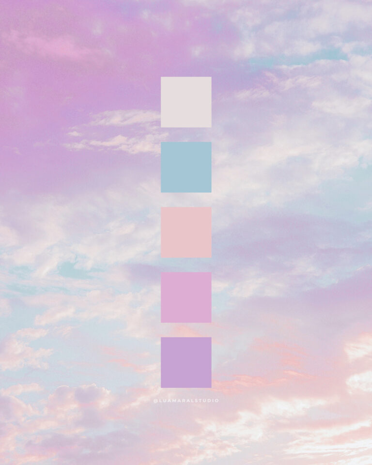
Hey! The infinity of space offers a never ending amount of beautiful shades. From our everyday blue skies with white clouds, to the vibrant, super bright and powerful hues of far far away outer space. No to mention the precios…