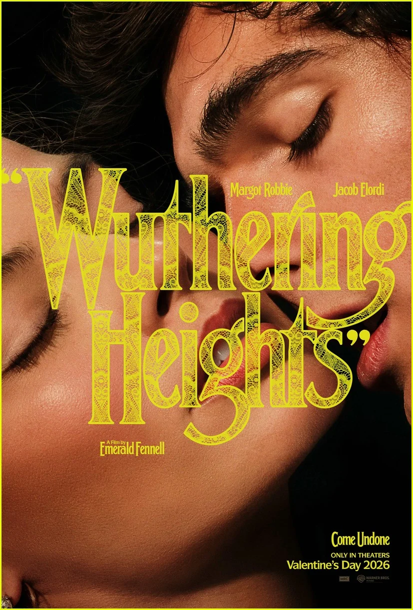
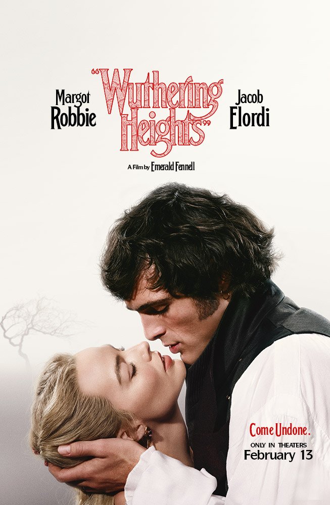
Let’s be real for a second: when we heard Emerald Fennell was taking on Wuthering Heights with Margot Robbie and Jacob Elordi, none of us were expecting a dusty, historically accurate BBC miniseries. We knew, deep in our souls, that the woman who gave us the mid-century neon of Promising Young Woman and the sweaty, aristocratic rot of Saltburn was going to turn the Yorkshire moors into a 136-minute fashion editorial.
And oh, did she deliver.
I just want to point out first how much I truly enjoyed the original novel. I recall devouring it in just two days during my teenage years, and it has remained with me ever since.
However, I wouldn’t label myself a fan. As we are all aware, this literary classic currently boasts a significant cult following, and many of its devoted fans were not particularly pleased with the creative liberties taken in the new film adaptation when compared to the original story.
And while the literary purists were busy clutching their vintage paperbacks in horror, I’m over here trying to figure out how to incorporate “Gothic Skin-Core” into my spring wardrobe after finally catching a screening of the film last weekend.
Courtesy of Warner Bros. – © Warner Bros.
But I should warn you: If you’re heading to the cinema for a plot-perfect adaptation of Emily Brontë’s 1847 classic, you might leave confused. But if you’re going for the vibes, the visuals, and the vibe-shift, you are in for a treat.

Courtesy of Warner Bros. – © Warner Bros.
A “Demented Dollhouse” Aesthetic
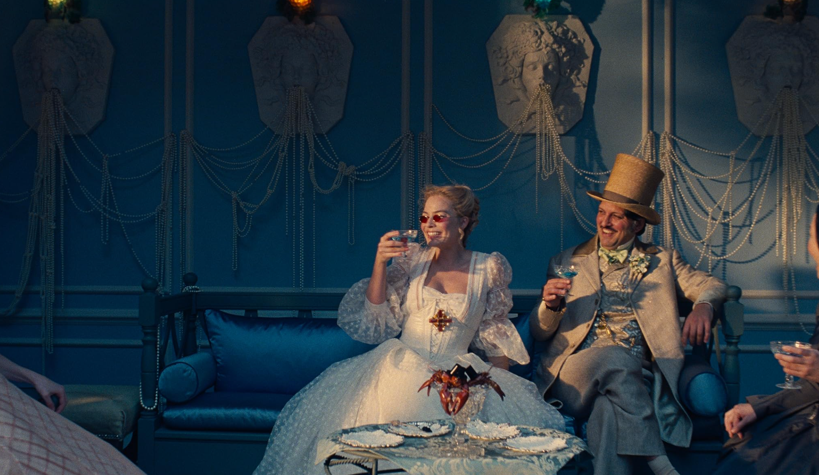
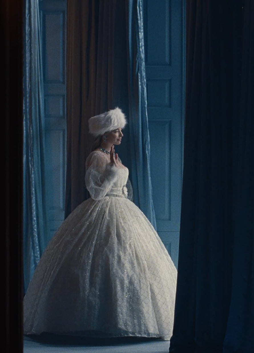
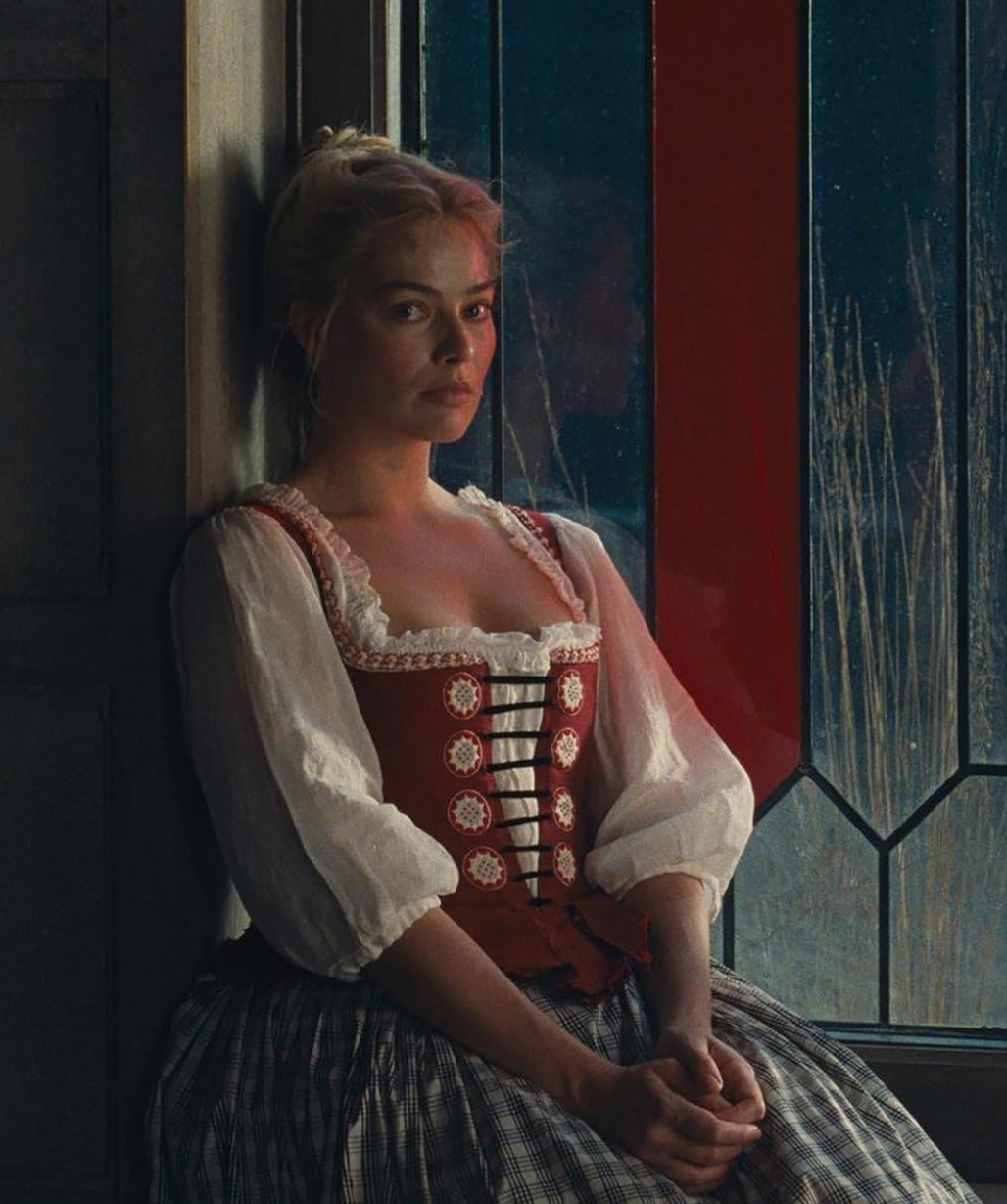
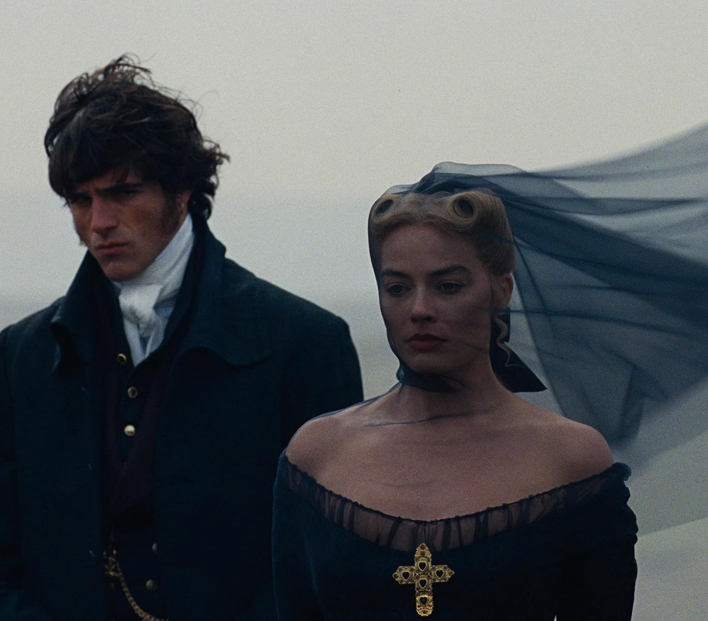
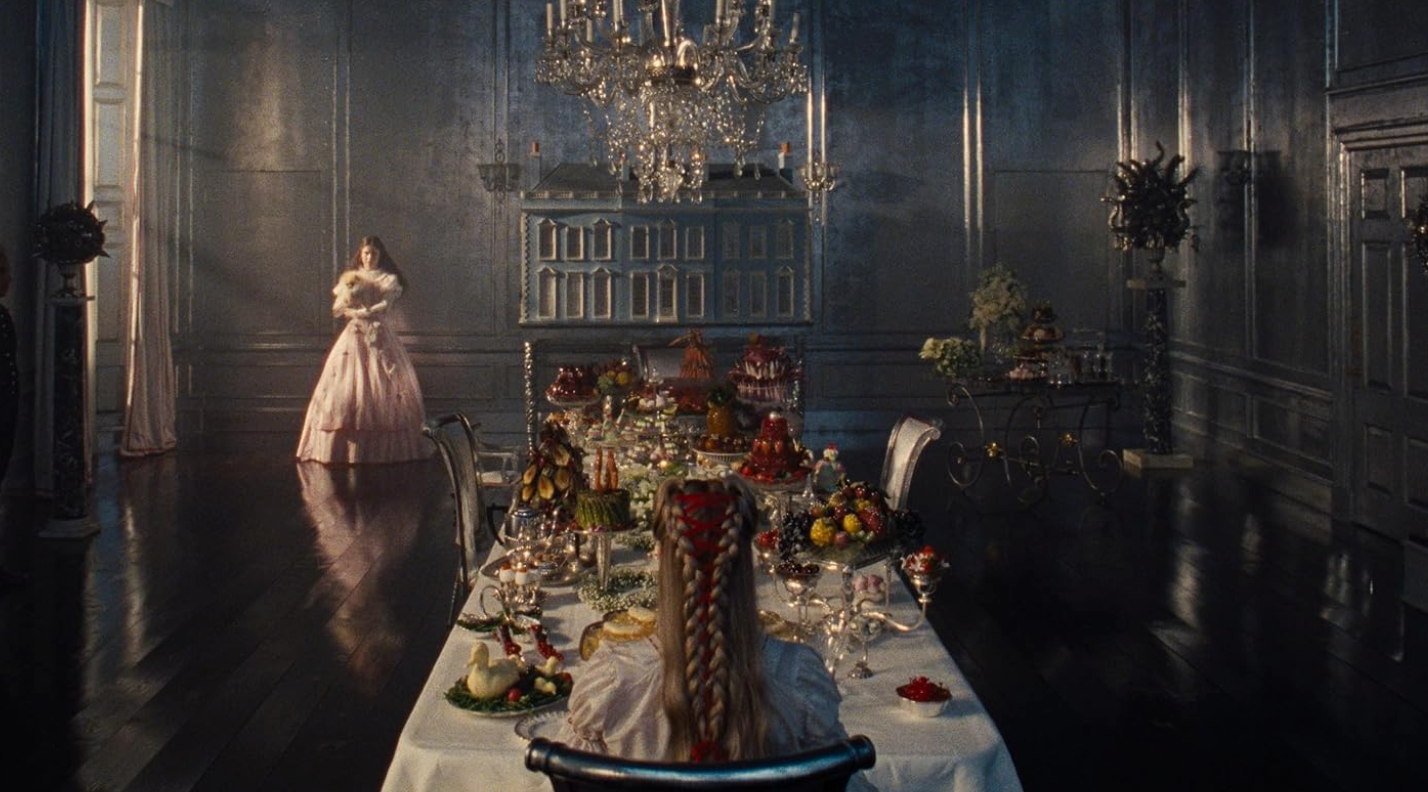
From the very first frame, Fennell signals that this isn’t your mother’s Cathy and Heathcliff. The title itself appears in cheeky quotation marks—“Wuthering Heights”—as if to say, “This is a dream I had about the book once.” The production design by Suzie Davies is less “period drama” and more “haunted Barbie Dreamhouse.” Thrushcross Grange, where the Lintons live, is rendered in symmetrical, bruised pastels that feel almost claustrophobic in their perfection. Everything is just a little off. The windows are too big; the ceilings are too low (literally—they built the kitchen set at 6’4” just so Jacob Elordi’s 6’5” frame would look menacingly oversized).
There is a moment in Cathy’s bedroom at the Grange that is genuinely the most unhinged piece of interior design I’ve seen in years. The walls aren’t just pink; they are covered in a latex-like wallpaper printed with high-res scans of Margot Robbie’s actual skin, complete with veins and freckles. When Cathy falls into a fever, the walls literally start to sweat. It’s gross, it’s gorgeous, and it’s peak Fennell. It’s the kind of “ugly-beautiful” design that makes you want to stare and look away at the same time.
iykyk!
The Wardrobe: McQueen Meets the Moors
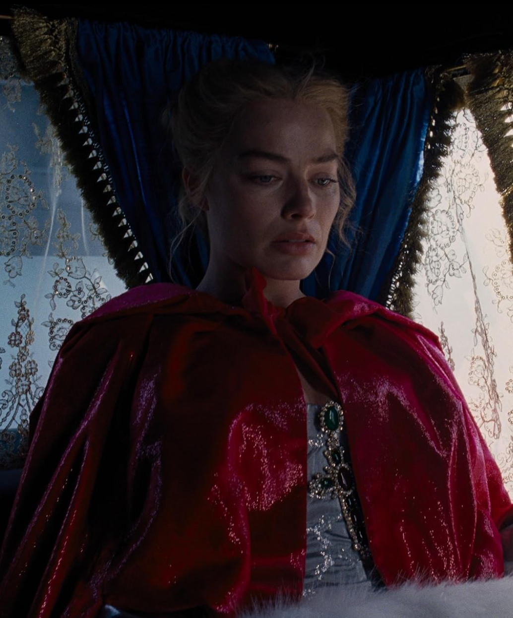
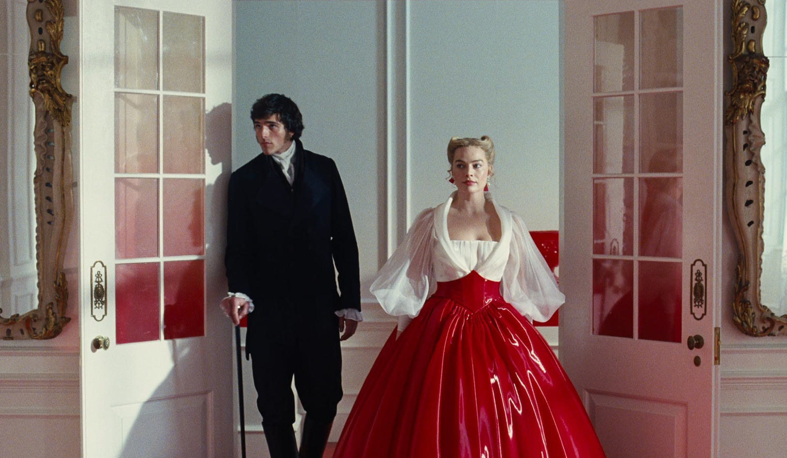
We have to talk about the costumes. Legendary designer Jacqueline Durran (the genius behind Barbie and Atonement) clearly threw the history books into the fireplace.
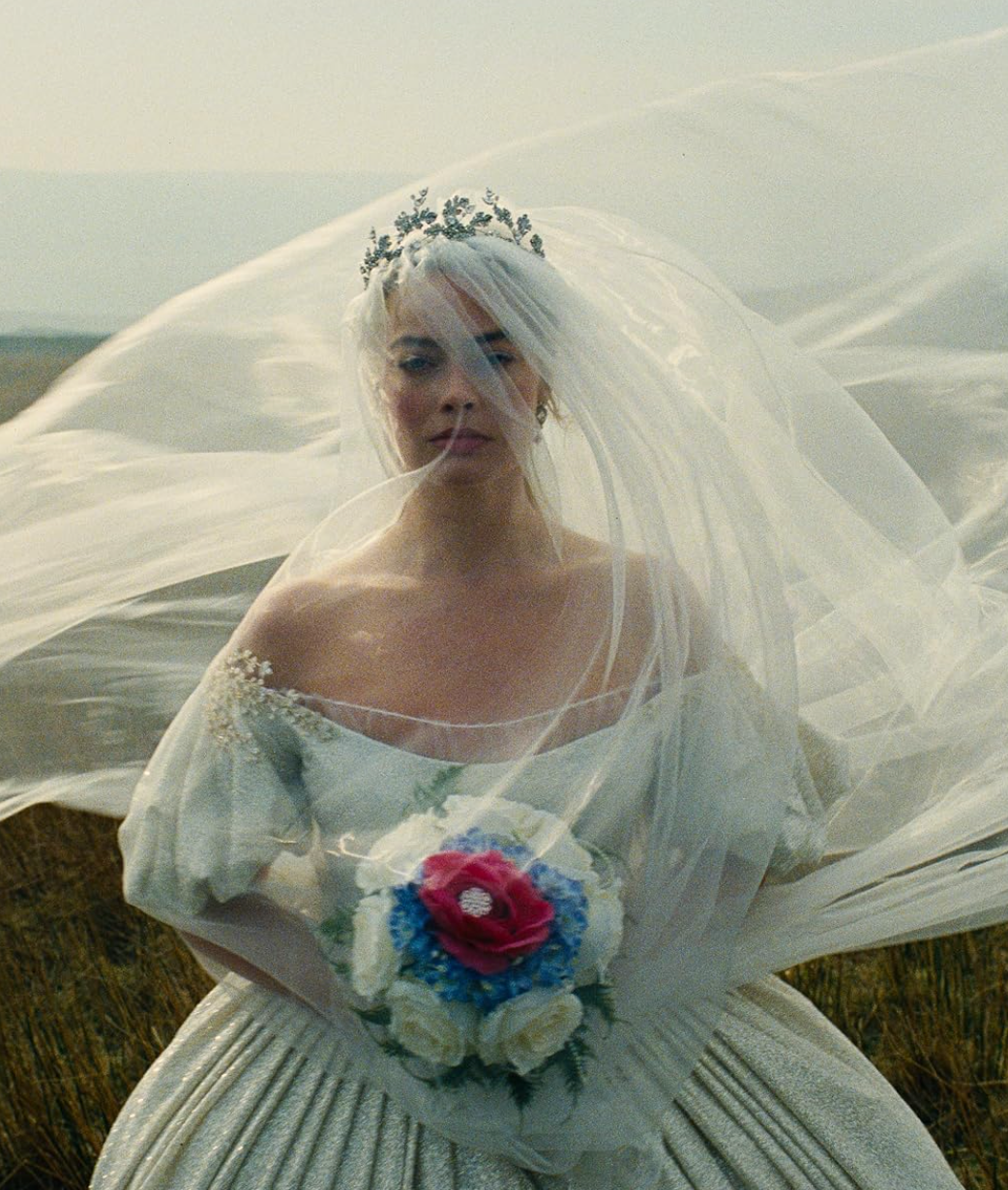
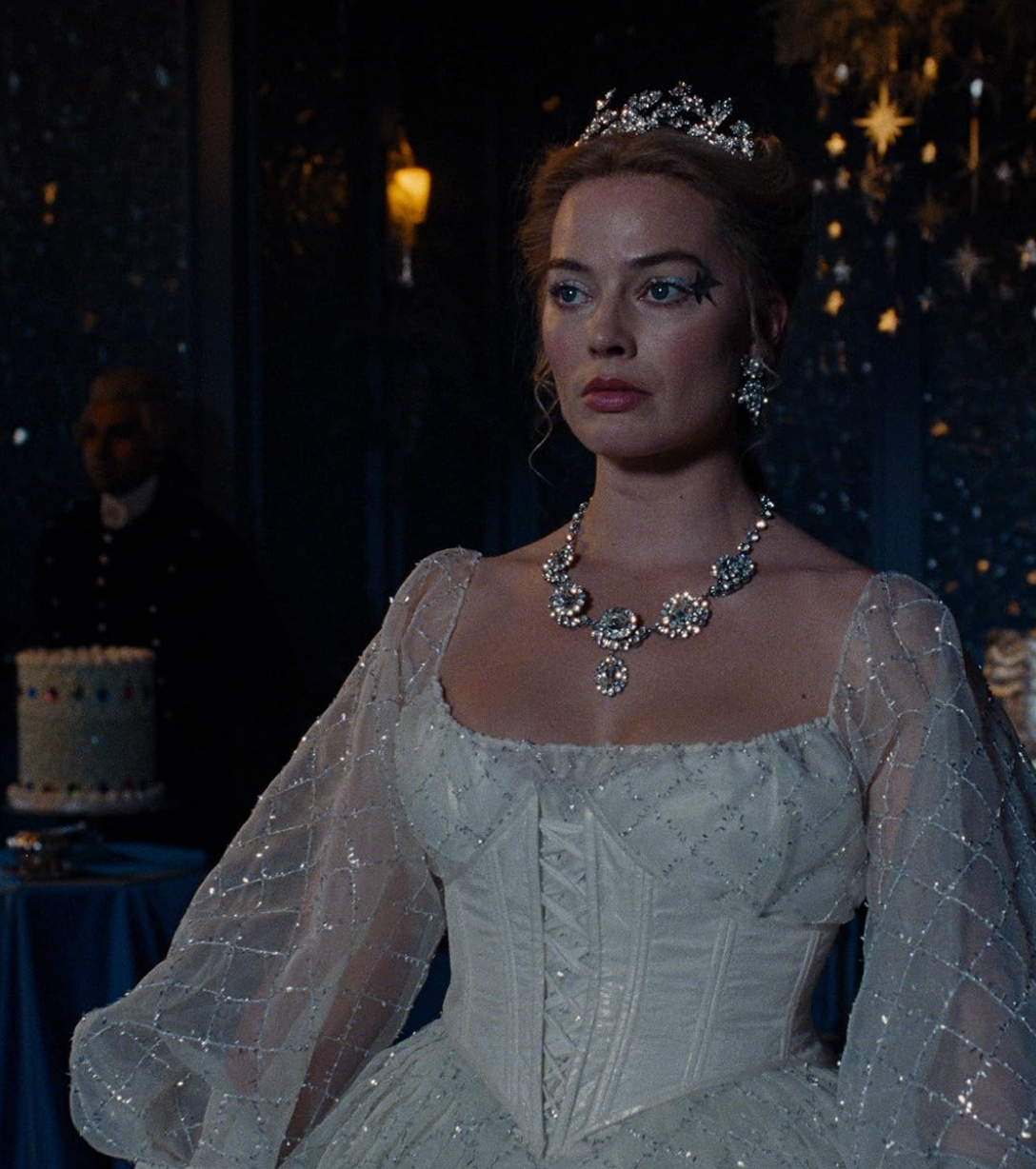
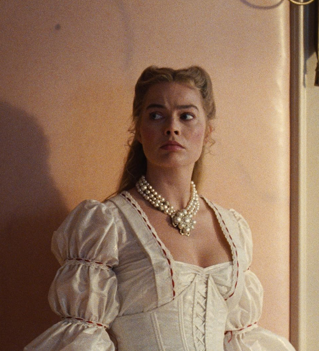
Margot Robbie’s Cathy spends the first half of the film in what I can only describe as “Gothic Coquette.” We’re talking messy hair, mud-streaked faces, and gowns that look like they’ve been dragged through a briar patch—but in a way that costs five figures. But the real fashion moment happens after she marries Edgar. Her wardrobe shifts into these incredibly structured, iridescent silks that look like they’re made of cellophane or oil slicks.
“It’s not about being accurate to 1847; it’s about being accurate to how a 14-year-old girl feels when she reads about a love that destroys everything.”
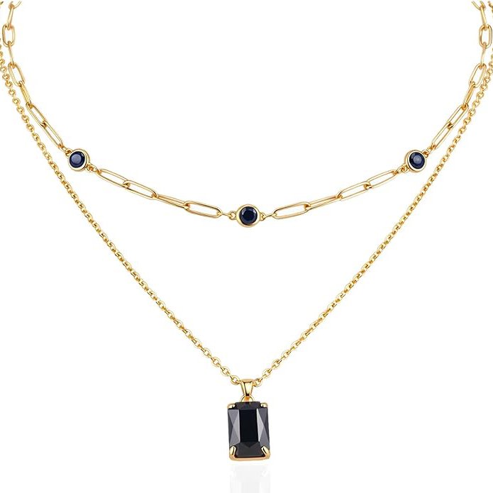
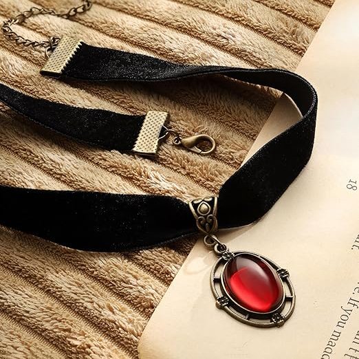
One specific look—a black mourning dress that catches the light so sharply it looks white—is destined to be pinned on every “Dark Academia” mood board for the next decade. And Heathcliff? Jacob Elordi is essentially a walking YSL campaign. His “Darcyfication” in the second half—think gossamer-thin white shirts and heavy, brutalist-inspired jewelry—is pure eye candy.
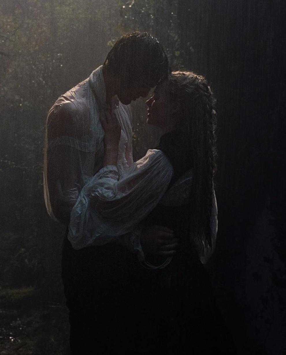
The Cinematography: A High-Contrast Fever Dream
Linus Sandgren shot this on VistaVision (the same format used for The Searchers and Vertigo), and you can feel the scale. The Yorkshire landscape doesn’t look green and rolling; it looks sharp, high-contrast, and deeply saturated. The reds are too red—especially the ribbons braided into Cathy’s hair—and the fog is so thick it feels like a physical character.
The film feels less like a movie and more like a Charli XCX music video (which makes sense, given she did the soundtrack). There’s a scene where Cathy and Heathcliff are caught in a rainstorm—a classic trope—but Sandgren lights it like a noir film. The water droplets look like diamonds, and the shadows are so deep you lose the actors in them. It’s “Hyper-Gothic” in the best way possible.
Is it “Trustworthy” Art?
Look, I’ll be honest: if you want the soul-crushing class commentary of the novel, this might feel a bit hollow. It’s a “style-over-substance” feast. It’s about the sensory experience of obsession rather than the literal text. But as a piece of visual art? It’s a triumph. It’s provocative, it’s tactile, and it’s utterly unapologetic about its own vanity.
Fennell has created a world where everything twinkles, bleeds, or breathes. It’s a movie for the girl who still has a Tumblr heart but a Vogue budget. It’s messy, it’s “too much,” and it’s exactly what I wanted to see on a big screen in 2026.
Courtesy of Warner Bros. – © Warner Bros.
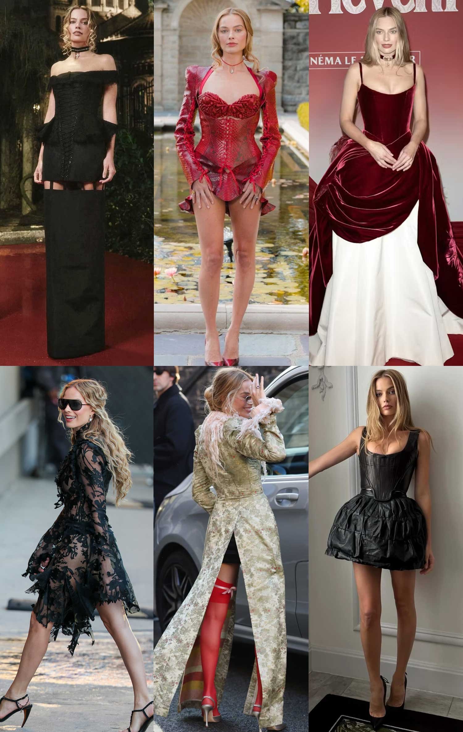
What’s honestly just as intoxicating as the film itself is how this entire aesthetic has escaped the screen and started living rent-free in our closets. We’re seeing a masterclass in what stylist Andrew Mukamal recently dubbed “The Rise of Method Dressing” on the Business of Fashion podcast. Essentially, the press tour has become the final act of the movie.
Margot Robbie has completely traded her Barbie pink for a wardrobe that feels like an extension of Cathy’s own fractured psyche. It’s less “red carpet glam” and more “Gothic restraint.” We’re seeing a lot of floor-sweeping silhouettes, razor-sharp tailoring, and a color palette that stays strictly within that moody, muted range. It’s minimalist, sure, but it’s a minimalism that feels heavy with intent.
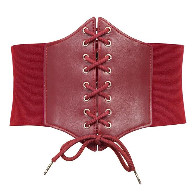
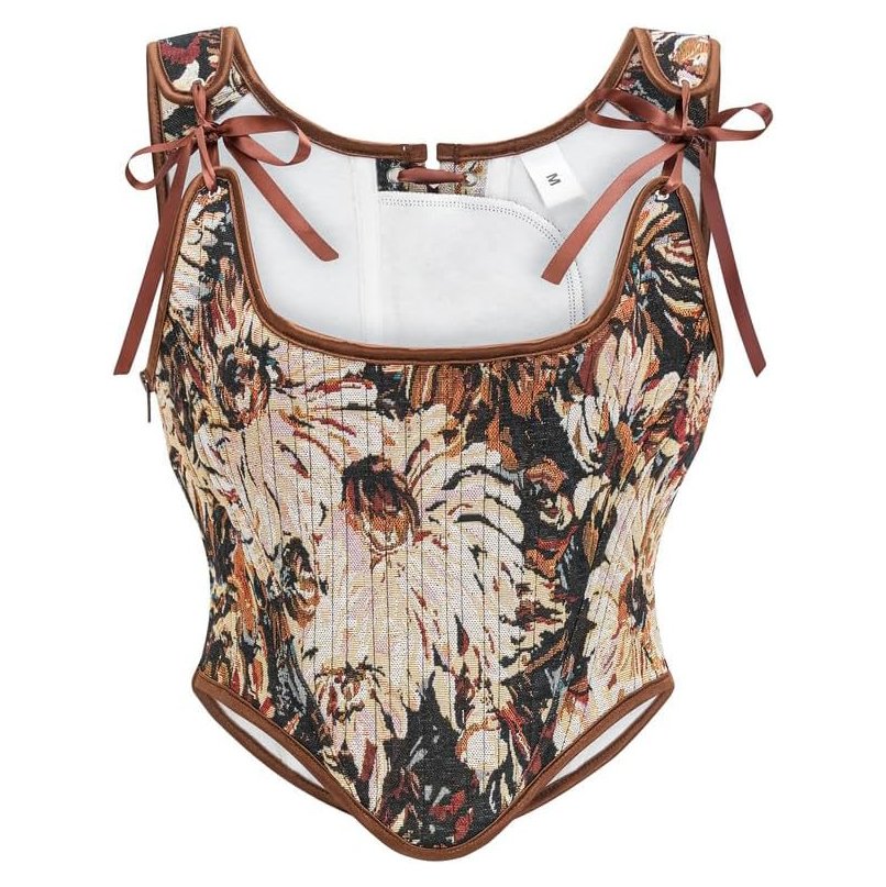
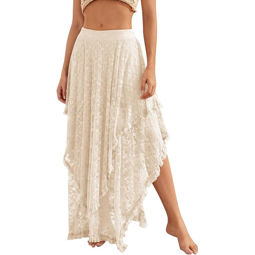
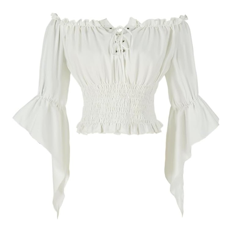
Even in the big fashion editorials, the styling feels like a conversation between 1847 and 2026. Robbie and Jacob Elordi are being draped in textures that echo the film’s emotional weight—think sheer, gossamer fabrics held together by brutal, structured corsetry. It’s romantic, but there is zero sweetness here. It’s severe, it’s modern, and it’s a total vibe shift. It proves that this Wuthering Heights isn’t a nostalgia trip; it’s a psychological haunting that we’re all invited to dress up for.
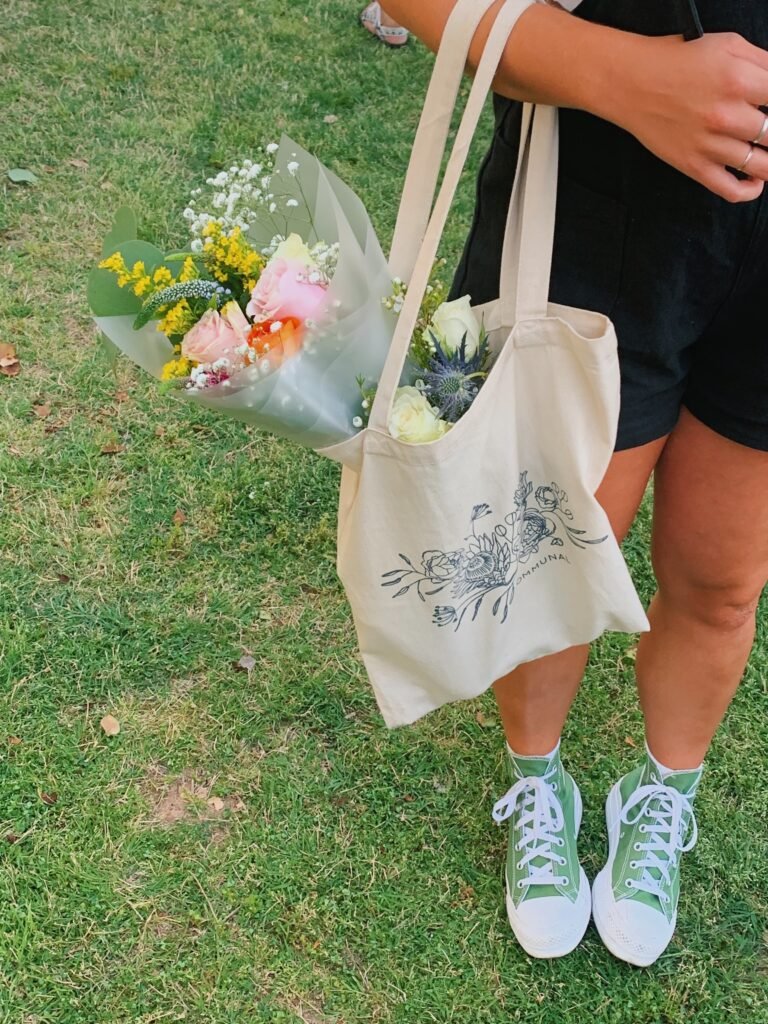
Get the Look: Unlocking Cathy Earnshaw’s “Gothic Coquette” Aesthetic
Margot Robbie’s Cathy Earnshaw is the ultimate “It Girl” of the moors: simultaneously chaotic, high-fashion, and deeply, deeply brooding. Her aesthetic is a masterclass in contrasts—messy hair but incredible jewelry; mud-splattered boots but gossamer-thin fabrics; a palette of dark blacks and shocking, iridescent pastels.
It’s “Gothic Coquette,” and it’s the mood we’re all channeling this season.
We’re not talking about literally walking around in 19th-century corsets (ouch). It’s about translating the essence of her look—the textures, the colors, the general “I-just-cried-but-I-look-amazing” vibe—into a modern wardrobe.
Here is your definitive guide to unlocking the 2026 Cathy Earnshaw aesthetic.
The Palette: Bruised Pastels & Ink Black
The foundation of Cathy’s look lies in the brilliant juxtaposition that designer Jacqueline Durran used to differentiate between Wuthering Heights (the Heights) and Thrushcross Grange (the Grange).
- For the “Heights” look: It’s all about Ink Black, Charcoal Gray, and Deep, Blood Red. We are talking rich, tactile fabrics like velvet, raw silk, and distressed leather. Think of it as “expensive mourning.”
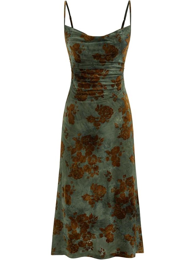
- For the “Grange” look: As Cathy becomes Mrs. Linton, her wardrobe adopts the Grange’s palette: “Bruised Pastels.” Not soft, sweet pastels, but colors that look slightly injured. Think lavender-gray, pale pistachio, iridescent pearl, and a very specific sour-lemon yellow.
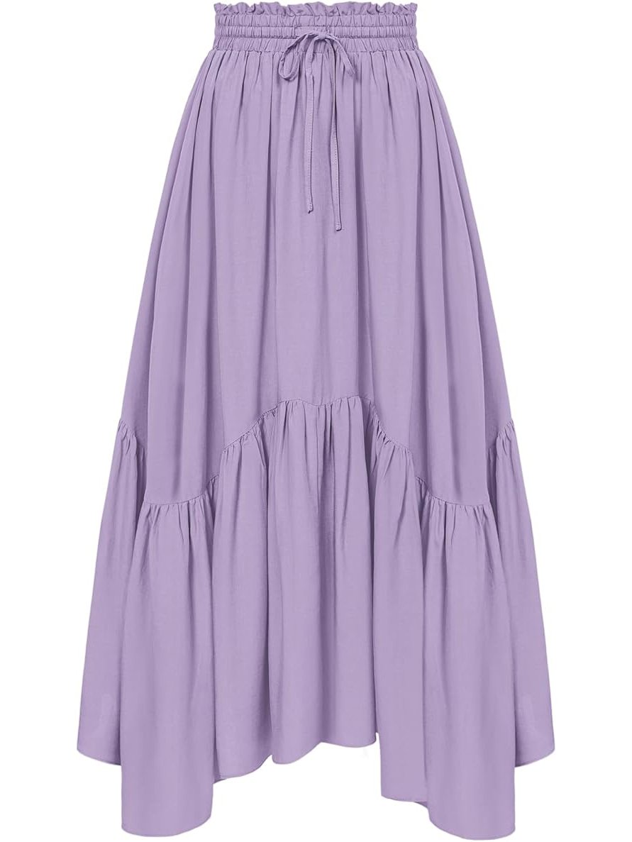
How to Wear It Now: Swap your classic black slip dress for one in a deep charcoal velvet. When reaching for light colors, look for fabrics with an iridescent finish—a blouse that shifts from pink to gray, or a skirt in a pale, slightly unhinged lavender.
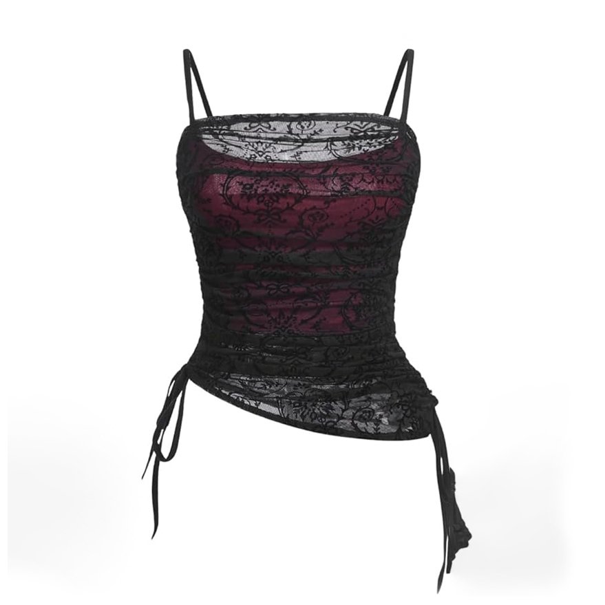
The Textures: “Worn-In Luxury”
The defining quality of Cathy’s aesthetic—especially in the first half of the film—is that nothing looks new. Everything looks loved, lived-in, and perhaps a bit tormented.
- Distressed Silk & Raw Linens: Look for fabrics that have natural imperfections. A slightly frayed edge on a skirt or a linen top with a textured weave captures that “I’ve been running through briars” feeling.
- The Power of the Layer: Cathy’s look is all about layering incompatible elements. A delicate lace top worn over a thick, distressed woolen sweater is peak Cathy.
- Velvet & Tulle: For your statement pieces, think the heaviest velvet and the sheerest tulle. A black tulle skirt paired with a chunky, slightly oversized black sweater is the perfect modern iteration of the moor-walking look.
Key Pieces to Invest In
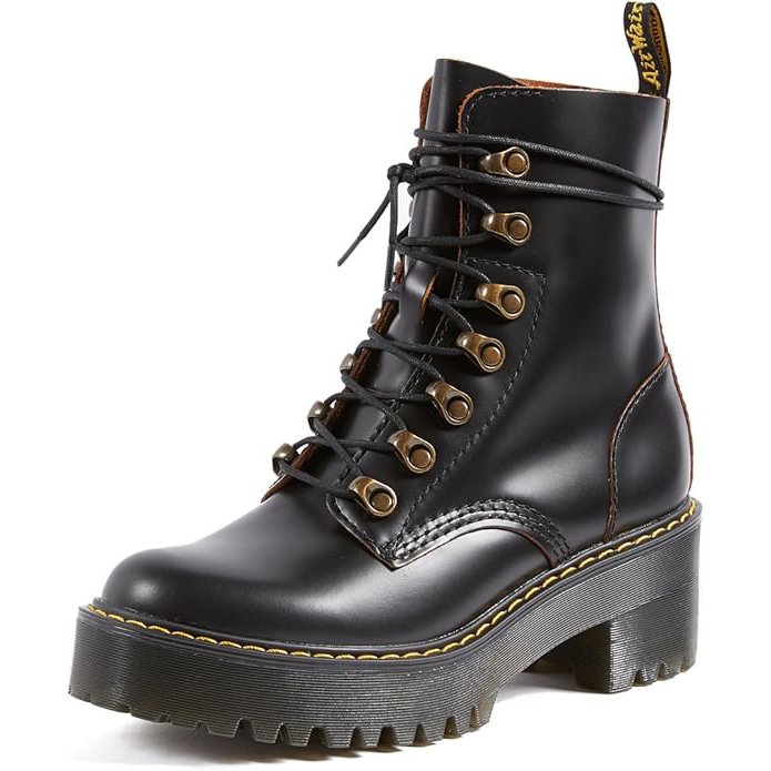
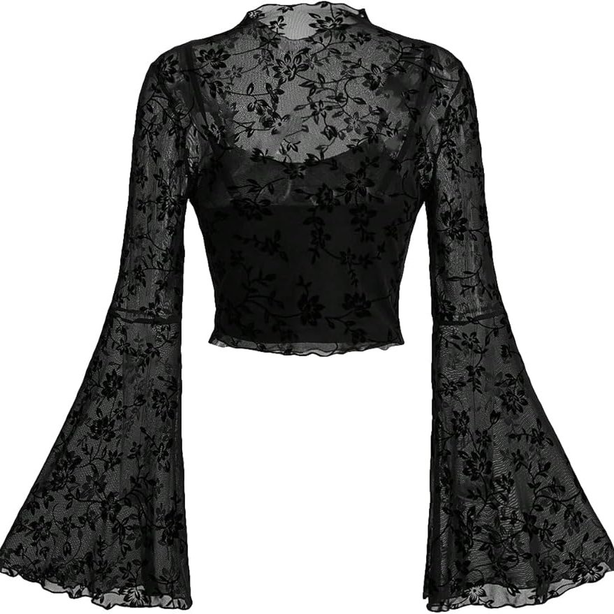
1. The “Brutal” Boot: You can’t navigate the moors in flats. Forget dainty boots; Cathy wears heavy-duty footwear. Invest in a pair of combat-style boots or Chelsea boots with a chunky, lug sole. They should look rugged, maybe even slightly mud-stained.
2. The Statement Overcoat: This is the piece that changes everything. Look for a long, heavy coat. Think oversized black wool, or, for a more Fennell-esque twist, a dark green or burgundy faux-fur that looks both glamorous and a little wild.
3. The Iridescent Slip: This is your nod to the Grange aesthetic. A simple slip dress in an iridescent material (like silk with a pearl finish) can be worn under sweaters or coats, giving a peak of that ethereal, sweat-soaked Grange energy.
4. The “Poet Blouse”: A blouse with oversized, sheer sleeves or a delicate ruffled collar. Wear it tucked into high-waisted, wide-leg trousers (we’re updating the breeches) or a long skirt.
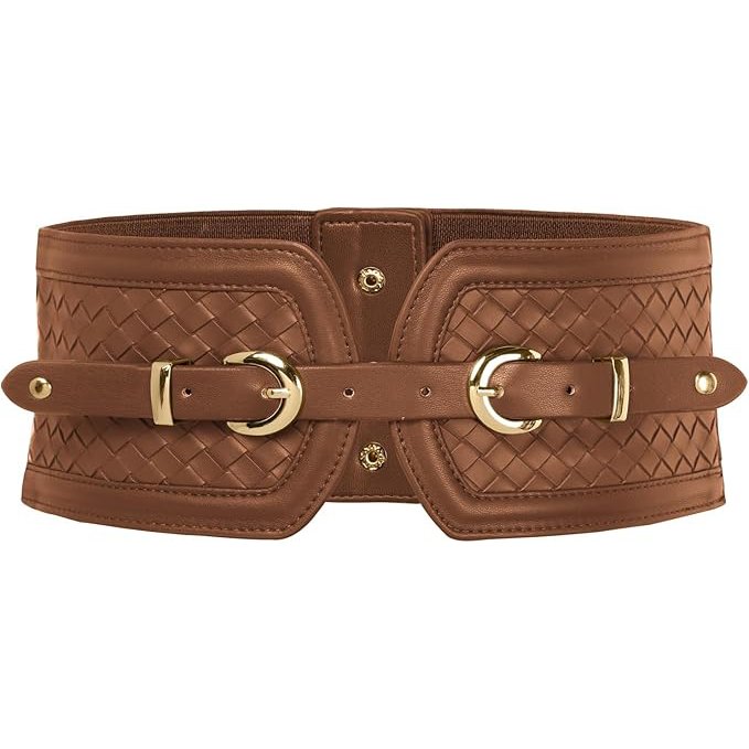
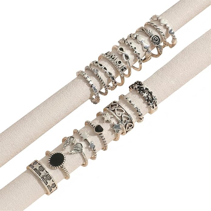
→ Shop the Wuthering Heights look:

The Beauty: “Moorland Grunge”
This is where the millennial aesthetic really shines. We’re moving away from clean girl beauty and into something much more raw.
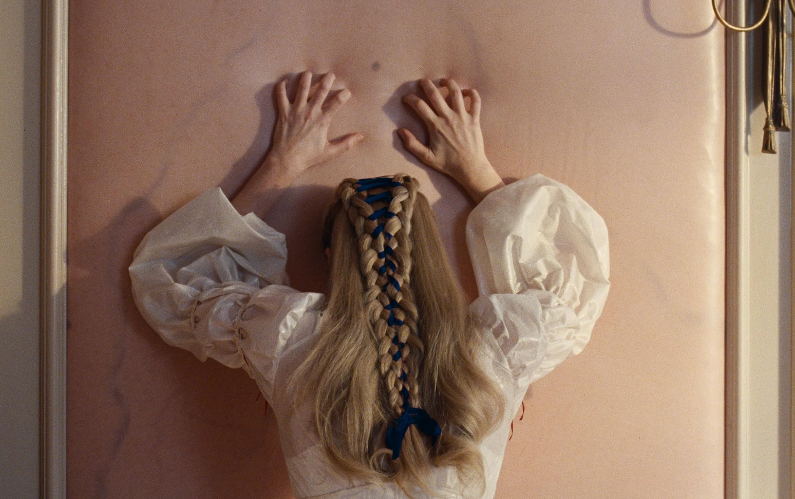
- The Hair: “The Mess.” Forget polished waves. Think messy buns with pieces falling out, a slightly greasy fringe, and, yes, perhaps a single, thin braid with a deep red ribbon tied into it. This hair should say, “I haven’t slept, and I’ve been outside for four days.”
- The Makeup: “The Fever Flush.” This is about looking perpetually flushed. Use a creamy blush and blend it high up on the cheekbones, almost onto the eyelids, to create that look of passion and exhaustion.
- The Accents: “The Bruised Eye.” Instead of a sharp winged liner, go for a soft, smudge of charcoal or deep plum eyeshadow under the eye, creating a natural shadow that looks slightly tired but incredibly romantic.
Cathy’s aesthetic is not for the faint of heart, but for those who want their style to feel dramatic, poetic, and undeniably powerful.
Love,
Lucy ♡₊˚