

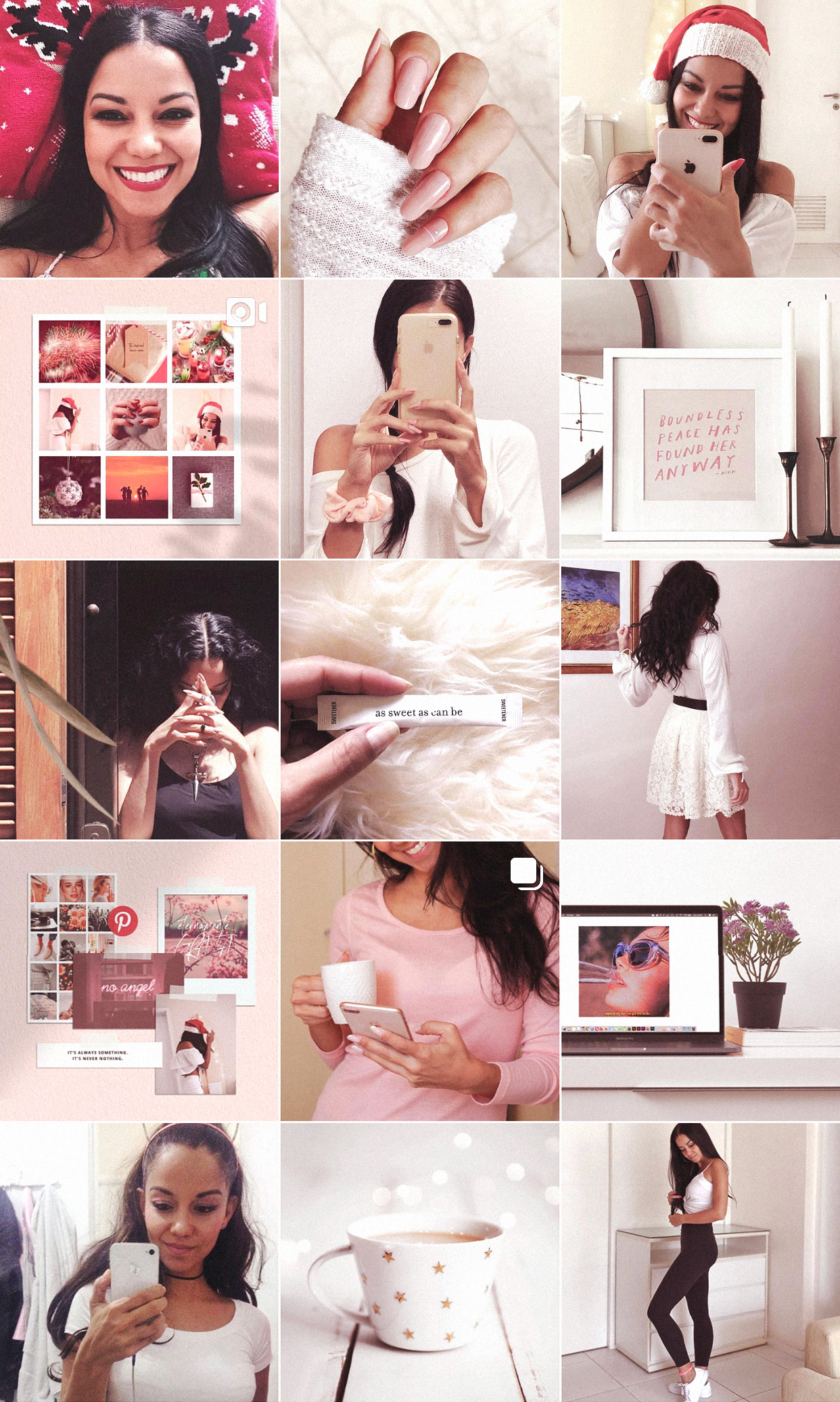
As a designer, I always get super excited and happy when I see a gorgeous Instagram feed 💖
It even warms up my heart I little. But also, as a designer, I suffer to imagine how difficult it is to keep up certain types of feed and layouts. And it hurts even more to realise that certain feeds are only complete and looking good a small percentage of the time, because it requires a specific number of posts up to be in the correct shape.

So I thought I’d write this post with some observations on types of Instagram feeds that can give you a lot of headaches, or simply do not pay off the effort, unfortunately… Trust me on this, I’ve learned it the hard way 😭😭
Before I start, make sure you check out the special of 5 posts I made here on the blog, with the step by step to have a very beautiful feed. GO! ❤️🔥
Also, if you want an easy way to visualise what your whole Insta profile will look like with a drag and drop easy to use tool, I have this planner on my shop. It’s a game changer, and honestly is super cheap hahaha!
Now let’s get to our main topic!
Feeds that scream trouble
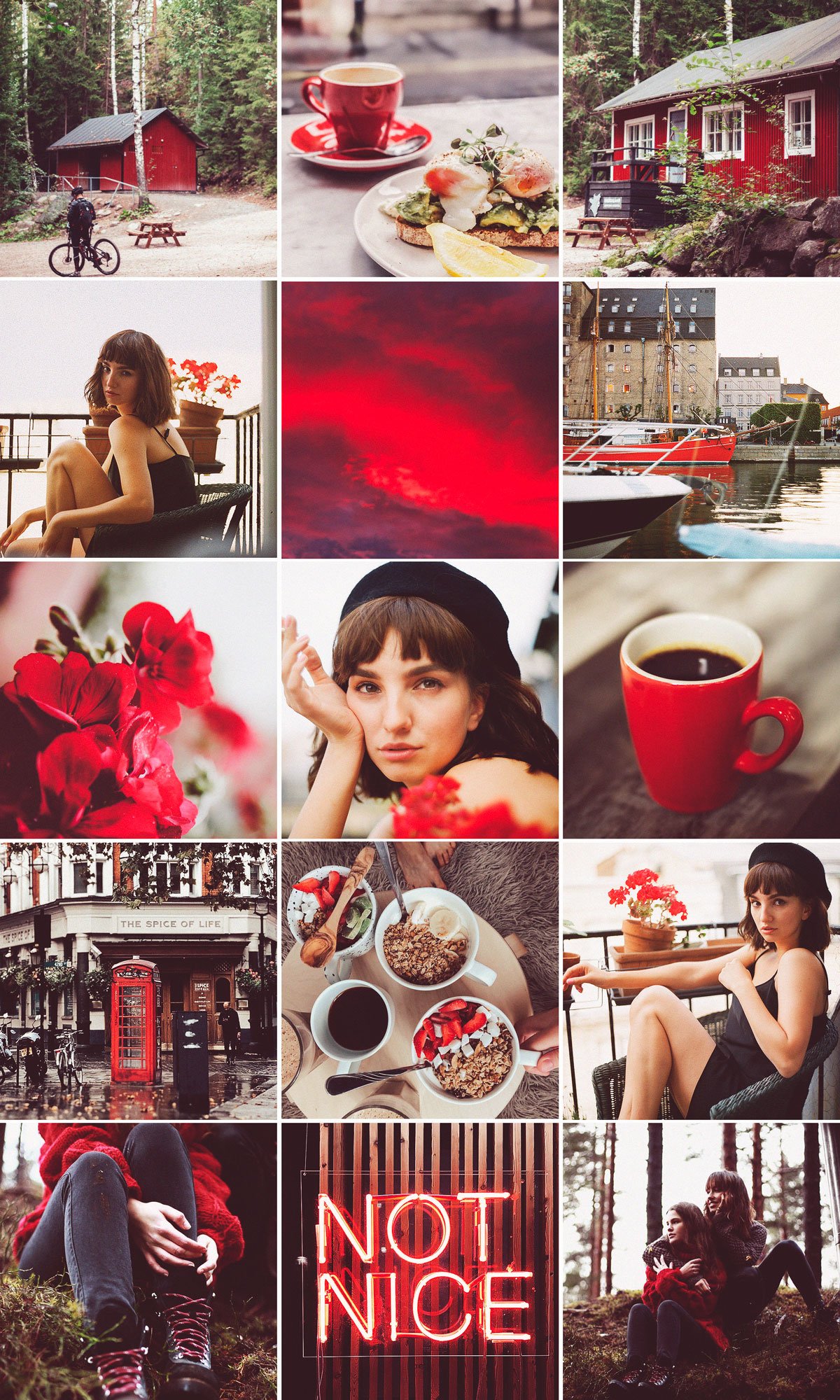
↝ Type 1: one color feed
💣 Why it’s a trap: I know it’s beautiful, but it’s not realistic. Unfortunately! It doesn’t fit in busy, complex, coloured real life. There will always be something special in another shade, style, concept, etc., that you will want to post and will not match the sole color you’ve picked for your feed. So what do you do?
✔ Exception: In rare cases, it may work for certain brands or projects. EVEN SO – I think that, even if you have a main color in the brand and it is overexploited, limiting yourself to just it will inevitably block your flow of posts. You can be Coca-cola and not just post red stuff. You can be Tiffany and not just post turquoise stuff. So the real exception goes to cases of accounts dedicated to the color itself. Or if you have energy and time available (to spare) to dedicate to the curation this kind of feed needs AND it makes sense to your project to go with the one color alone. In my opinion that’s true in rare cases.
💎 Instead… You can have a color palette that unifies your posts and match your aesthetic without being too extreme. First, choose a photo preset you love, and try to stick with it. To make the photos even more in harmony, pick images that originally have color schemes close to what you want. Because presets won’t do magic!


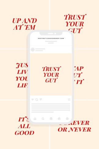
↝ Type 2: Too much text
💣 Why it’s a trap: Instagram is visual. It is not Twitter, nor Facebook. So very long text content usually doesn’t belong there. Instagram wants people to post photos, and makes posts that have no text stand out. So, if your strategy is to make a big visual impact with your posts, less text will usually be better.
In addition, creating a beautiful aesthetic feed design with image and text takes time. And it won’t always be easy, especially if you want to be able to post freely any time you feel like it. Like that amazing party with fantastic decor that you went to, or a loved one you met and took a selfie with. In those cases, either your feed will deviate prom the layout you defined, or you will hold back from posting the content you want to post. Skipping one post you’d planned so carefully is frustrating and you lose motivation to continue. And you end up giving up 😑😑
✔ Exception: There ARE gorgeous mood board accounts, portfolios, educational profiles and other categories whose main purpose is to share information that includes text. In that case, of course, go for it!
💎 Instead: Let’s put the text in the caption! This is good both to increase the reach of the post and ensure the attention of your followers increasing the chances of your content being found in searches. Why? The text in the post image cannot be detected by Instagram’s algorithm, but the caption text does.


↝ Type 3: middle column stands out
💣 Why it’s a trap: It was this type of feed that I saw on Pinterest and made me want to write this post. I don’t particularly find it beautiful, for example, the middle column is all white, with normal posts on the sides. I don’t see any harmony, it even bother me the lack of balance. That hole in the middle, for me, doesn’t make any sense! But that’s really a personal taste thing.
But in addition, thinking of the middle column as something fixed, is a big mistake on instagram profile aesthetics. After all, today’s “middle column” will be the right column tomorrow, won’t it? And the left one soon. As you upload new content, naturally, the previous posts on your grid will move. And if the feed with a white middle column is already ugly (IN MY OPINION, don’t hate me pls!), just imagine a feed with the first column all white 🤨
✔ Exception: I created a feed example in which the entire middle column stands out. I like it! But I’ve been working with design for almost 20 years, and I don’t really think it’s an easy thing to do. So I leave it here as an exception to this “trap”, in case you are a designer, or have good knowledge on how to make this work.
💎 Instead: Forget that there is a middle column. Forgot? Great! At the very end of the post, at the conclusion, I explain how it is better to alternate between only 2 types of posts. It is the best alternative to this trap, in my humble opinion.


↝ Type 4: Too many breathers, feed dividers or triplegrams in general
💣 Why it is a trap: In the post I wrote about triplegrams I talk more deeply about the pros and cons of this style. In short, your followers will not be going on your profile daily to check how good the triplegram you set up looks. Or to understand that all those posts with no sense, in fact, form a large mosaic style photo. A posts real impact is when followers scroll through their timelines. That’s when it will generate engagement. The aesthetic of your feed shouldn’t be a priority, but a bonus. It hurst me to say this, but it’s true 😂
Therefore, many pieces of posts, breathers and cutouts of dividers passing on the person’s timeline, will do more harm than good. And it won’t add much to your account, will it? I think it’s important to reflect on that! 😇
✔ Exception: Artists accounts do this a lot. I’ve seen some businesses doing it to. Their strategy is to create a beautiful page, usually to spread a concept that’s broader than just regular posts. The ones who do this successfully in my opinion are BIG players like band BLACKPINK and accounts created by movie studios to advertise new movies.
💎 Instead: Set yourself free from that! Combining posts of different types, using breathers from time to time will bring harmony and beauty, without limiting your options.


↝ Type 5: Posts with irregular borders
💣 Why it is a trap: First of all, there is fact that posts with borders, especially those that are more vertical or horizontal, are less likely to capture the attention of the follower. The impact of the photo decreases, unfortunately.
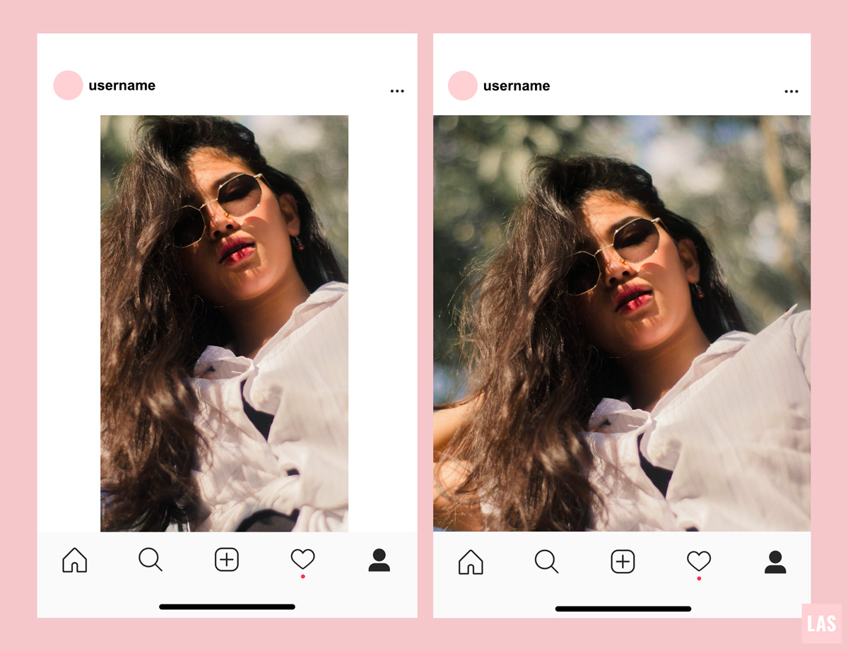
In addition, from what I see in most cases, the intention of placing the borders is good, but the execution is not sooooooo great… So the feed looks messy. That is the opposite effect of what was expected.
✔ Exception: Artists who use their Instagram profile to display their work, and created a very irregular feed design on purpose. They can make it work really well! When they do it, it looks like a nice wall art gallery, with the frames put nicely in the right places. I created a feed like that, you can see it below as the “exception”.
💎 Instead… Borders in general are hard to keep consistently, and I strongly suspect (I don’t have confirmation) that they don’t go well with Instagram’s algorithms. I think they consider it as a post of inferior quality or something? They’ve said publicly that reels with frames get lower engagement, so it could be true for feed posts as well. So it’s better to just go without them.
If you still want to try it, use exactly the same type, size and border color on all posts. OR, create a specific pattern and stick with it forever.


See how there is unity in the artistic feed regardless of whether the edges are irregular. That’s why I insist on recommending this type of feed only for designers and artists, who know how to make it look very harmonious.
↝ Type 6: Puzzle feeds
💣 Why it is a trap: First of all, I will make it very clear that I think the puzzle feeds are beautiful, I make many puzzles for clients, and I know how much many of you love them, and bring it up to me about it every day haha! But I like to keep it real about the struggles of keeping a consistent puzzle feed on Insta. I wrote more about that here.
✔ Exception: Commercial profiles, with strong artistic content or visual appeal, that do not need Instagram to generate a large volume of sales, views or something like that. That is, the account is more a showcase of products or services. And remember: you have to have a designer available to create beautiful puzzles and fit everything together constantly!
If you are going to invest on a puzzle feed, try to make it not too restricted or “closed” in a specific design. And I would only use it temporarily, or with less connections between images. So that each post individually is incredible, not just the whole set together.
💎 Instead: Have an aesthetic defined for your feed that is harmonious and cohesive. It is not so difficult to keep and it and you’re more free to create good quality content for your page.
In this puzzle example below, I used as a base the feed I was already using here in the post. I inserted a few connecting images between the posts to turn it into a puzzle.


Conclusion
Like everything in life, the “ideal design” will vary from case to case. There is no type of design that 100% sucks, nor the one that always 100% works. I said this a thousand times throughout the post but I can’t get enough of emphasising it.
So take into account these considerations that I made above, so you’re clear about what is a priority to you. Like, what are the positive and negative sides of each type of feed, and which style you really want, okay? And on we move! 🦋🧡
Finally, if you talk to me like this: Lu, in your opinion, what type of feed is the best one? I answer: a free style, always using the same preset, with a slightly balanced color palette, with no extremes. And to keep it neat and tidy, always take turns: a photo with face, then photo with no face. Or take turns: a predominantly dark photo and then a bright one, and so on.
That way, regardless of what type of post is, the feed never breaks or gets disorganised or misaligned. You are not limited to following very strict rules, basically following only one: the relay between A and B. This is the best way to have an organised feed that doesn’t break 🤸🏽♀️✨✨
Switching A and B ideas:
– Dark vs. Bright
– Black and White x Color
– With person x Without person
– With border x Without border
– Normal image x White background
– Close up x from far away
I’ve tested almost everything in terms of feed, and I’m currently following this. My relay is between: photo in which I appear (A) / photo without people (B).
That’s it, angels.
Let me know if you have any questions 💖✨
Beijo,
Lu


&url=https://www.theaesthetic.shop/product/30-perfect-pink-aesthetic-high-resolution-digital-images-with-editable-canva-template/&media=https://www.theaesthetic.shop/wp-content/uploads/2023/08/30-Perfect-Pink-aesthetic-high-resolution-DIGITAL-images-with-editable-Canva-template-2.jpg)