
Hey chicas!
Any designer will agree with me when I say that fonts are an essential part of any work we do. I think this is a little obvious, right? 💕😊
But I didn’t come here today to talk about basic principles to follow when choosing fonts, which type best applies to each visual style or where to find fonts online. This post aims to share 3 tips that I find very interesting to use in order to upgrade your your font game.
These are not obvious tips, but they make all the difference!
Many of the people I interact with here on the blog are amateur designers or design students, so I think these tips might come in handy. These are techniques that professionals already know, consciously or not, and usually already put into practice in the creation of each layout without even thinking about it. And it’s time for you to start using them as well! 💗💗

Let’s get to them:

1. Spacing
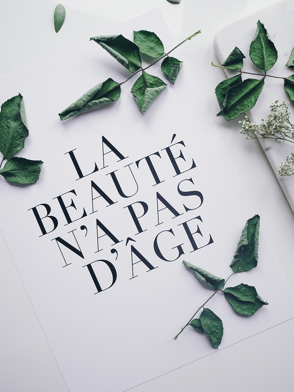
Letter spacing is something that took me years years to appreciate. Today I find one of the most important factors in any design I do. Yes, it’s THAT important.
My appreciation of this feature is even greater nowadays, since the search for minimalist layouts, with a very clean footprint is so high. As we increase the space between the characters, the text block as a whole gains lightness. And that influences the weight of the entire layout 🤓
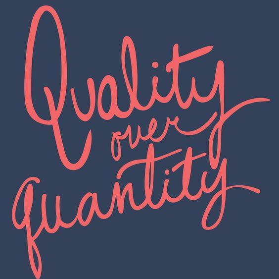
So the tip is to always take the time to adjust the spacing between the letters. Not necessarily leaving a huge gap between all the characters in all the layouts you create, of course! Just keep in mind that spacing is something to be explored and that it is always valid to test which character distancing is best for each title and body of text you write. In many cases you’ll notice the huge difference in the visuals after you’ve done this.
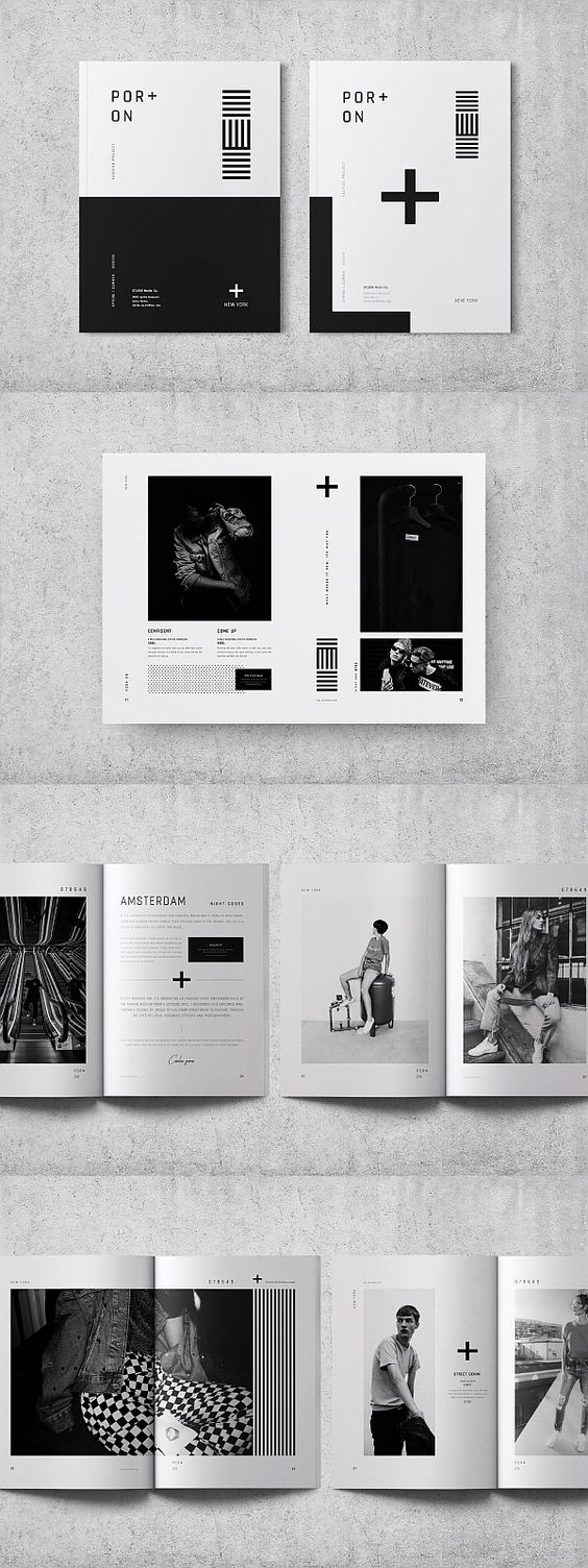
Exemples (via Pinterest):
2. The 5 sacrate fonts
Ah, my beginner days in the graphic design universe about 10 years ago, when I stuffed my computer with ridiculous fonts that were of NO use 😂😂😂 I was under the impression the more fonts I had, the more possibilities. But that is simply not true!
Not only that isn’t true, it doesn’t help in any way your creativity. Your productivity and thinking process can suffer a great impact if you choose to go through an endless list of fonts all the time. And it’s just not worth it.
Now, older and wiser haha, I have my 5 darling go to fonts. I also have about 3 possible variations for each one, to open up my possibilities a bit. And besides them, when the need arises, I go after more appropriate alternatives, which is totally fine, btw. It’s not like I have a closed mind to other options if I need something specific or unique!
My 5 sacred fonts are these below. Let me know which one are yours! 💌
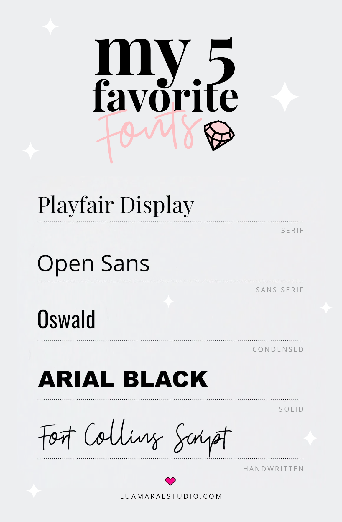
(They’re all available for download at Google Fonts, except Fort Collins, that you can get for free at Dafont.com 😉
3. The right match

Finally, I’d like to stress that the power of a good combination of fonts cannot be underestimated. It makes all the difference to choose types of letters that work together, or a potentially cool design can turn into a disaster.
And yes, it is very difficult to know exactly which fonts match, that’s something that experience teaches more than any class or tutorial. But with Pinterest existing in our lives, there’s no excuses 🙃💗
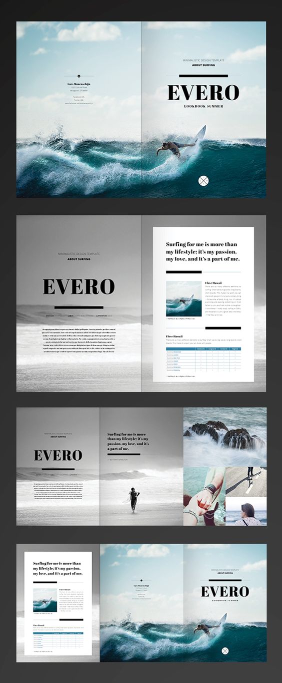
Look at these combination suggestions below, for example. You can get inspired, and start to understand better what are the fonts that go together better by studying these ideas:


That’s it, you guys. Hope you liked the tips 😇💕💞
Any questions let me know in the comments!
beijos,
Lu


%20level&url=https://www.theaesthetic.shop/2019/12/fonts-tricks/&media=https://www.theaesthetic.shop/wp-content/uploads/2024/03/Vanilla-Girl-aesthetic-stars-Instagram-highlight-covers-1.jpg)
%20level&url=https://www.theaesthetic.shop/2019/12/fonts-tricks/&media=https://www.theaesthetic.shop/wp-content/uploads/2024/03/Vanilla-Girl-aesthetic-photograph-Instagram-highlight-covers-1.jpg)
%20level&url=https://www.theaesthetic.shop/2019/12/fonts-tricks/&media=https://www.theaesthetic.shop/wp-content/uploads/2024/03/Vanilla-Girl-aesthetic-doodle-Instagram-highlight-covers-1.jpg)
&url=https://www.theaesthetic.shop/product/30-perfect-pink-aesthetic-high-resolution-digital-images-with-editable-canva-template/&media=https://www.theaesthetic.shop/wp-content/uploads/2023/08/30-Perfect-Pink-aesthetic-high-resolution-DIGITAL-images-with-editable-Canva-template-2.jpg)