
Hey guys! I have many readers who either are graphic designers or do it sporadically for fun or work. So for a while I’ve been planning to post here on the blog and on my Insta a few mistakes I’ve been seen way to often and that could easily be avoided.
Now, you always have to remember that design is not and never will be an exact science. So there are situations where these mistakes I mention do not apply, and actually the opposite is true. Knowing when exactly you should consider these types of rules and when you should ignore them is a big challenge that designers learn with experience and lots of trial and error. So… good luck! 😬
But don’t worry about that now! Let’s focus on these super avoidable mistakes and, for now, do our best not to make them anymore!
⟡ New on the shop: ⟡
-
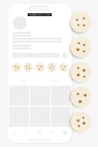
 Vanilla Girl aesthetic stars Instagram highlight covers ready to use – includes editable Canva templates$6
 -
Vanilla Girl aesthetic photograph Instagram highlight covers ready to use – includes editable Canva templates$6
-
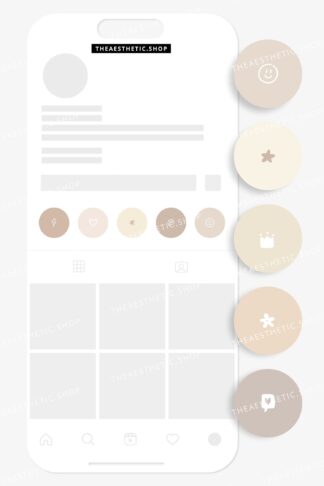
Vanilla Girl aesthetic doodle Instagram highlight covers ready to use – includes editable Canva templates$6

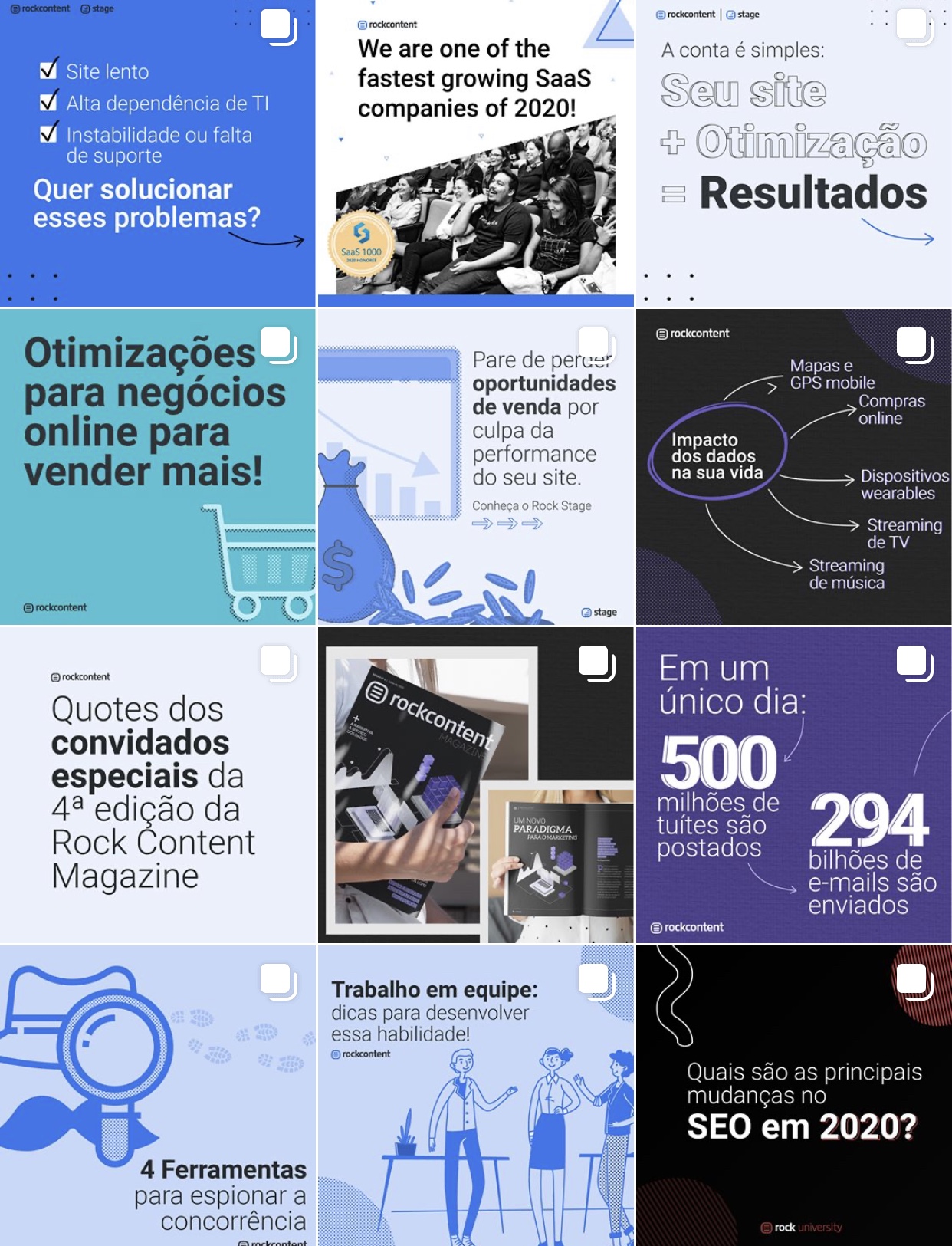
Common graphic design mistakes
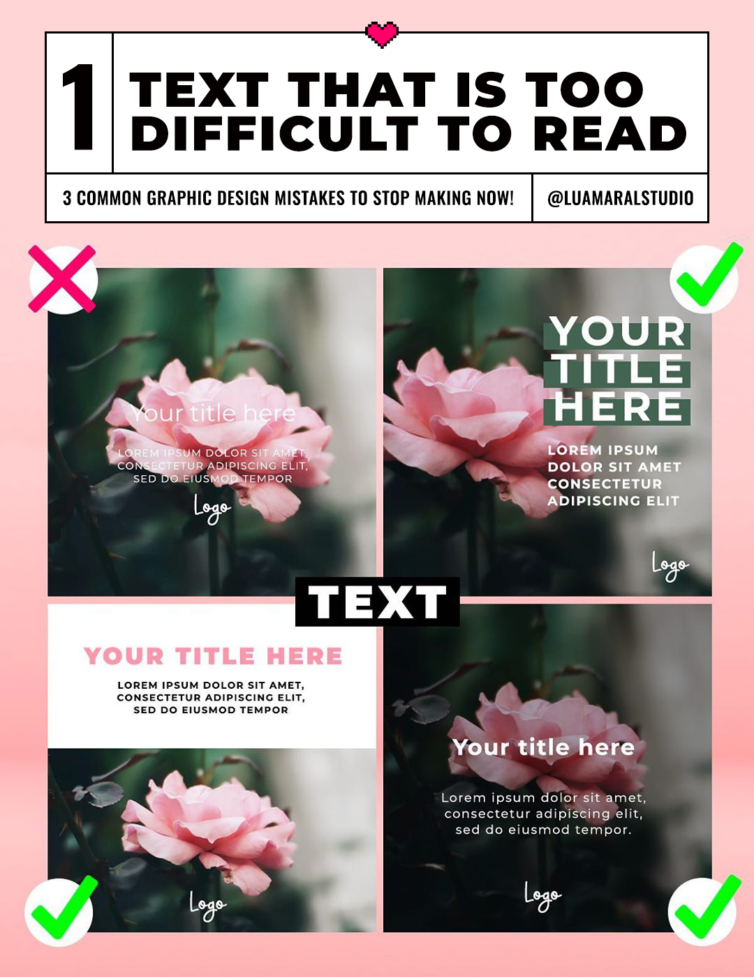
This is a constant struggle in pretty much every graphic design job in the world ever haha! And in the end, we have to get used to sacrificing the art part of the design a bit in order to make sure the message you’re trying to deliver (and most importantly, the product you’re trying to sell) is understandable immediately by the audience. Yes, that’s priority, it will always be.
So go ahead and place some boxes behind the text if necessary, or rethink the design in a way that the written parts are not getting lost and mixed with the photo below it. You’ll find a solution, you’re a great designer. And great designer knows that the message comes first, and the art comes second.
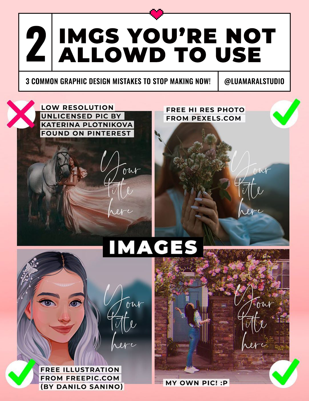
I’m guilty of this sin myself, I know. Even here on the blog and on my social media, I’ve used unlicensed images and graphics when I knew damn well I shouldn’t, even if just to illustrate my blog posts. But I don’t anymore, and no one should.
It might be tempting to use those beautiful photos and art pieces we find on Pinterest and even Instagram but it’s wrong, and it’s damaging someone who created it. Also, in most cases, those images are poor in quality, because you can’t download a high resolution version of them.
There are countless image and illustration banks available online, many of them with stunningly beautiful items for free, and some very affordable options with everything a designer might need. So let’s all get used to doing the right thing, period. Are you guys with me? 😊
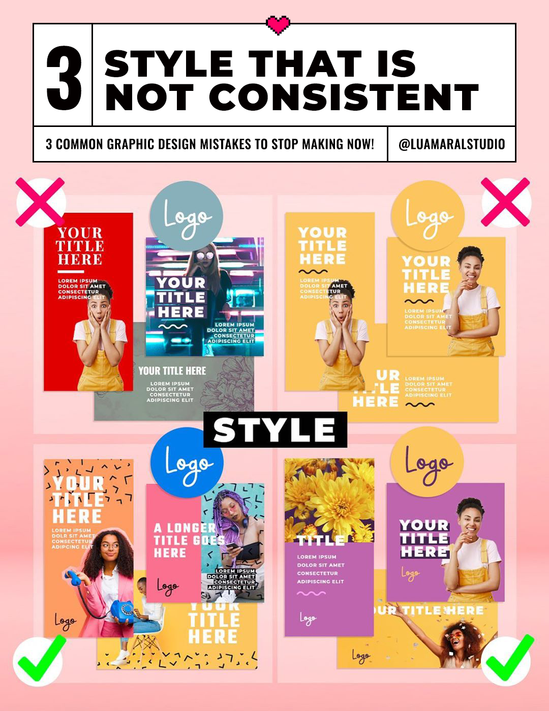
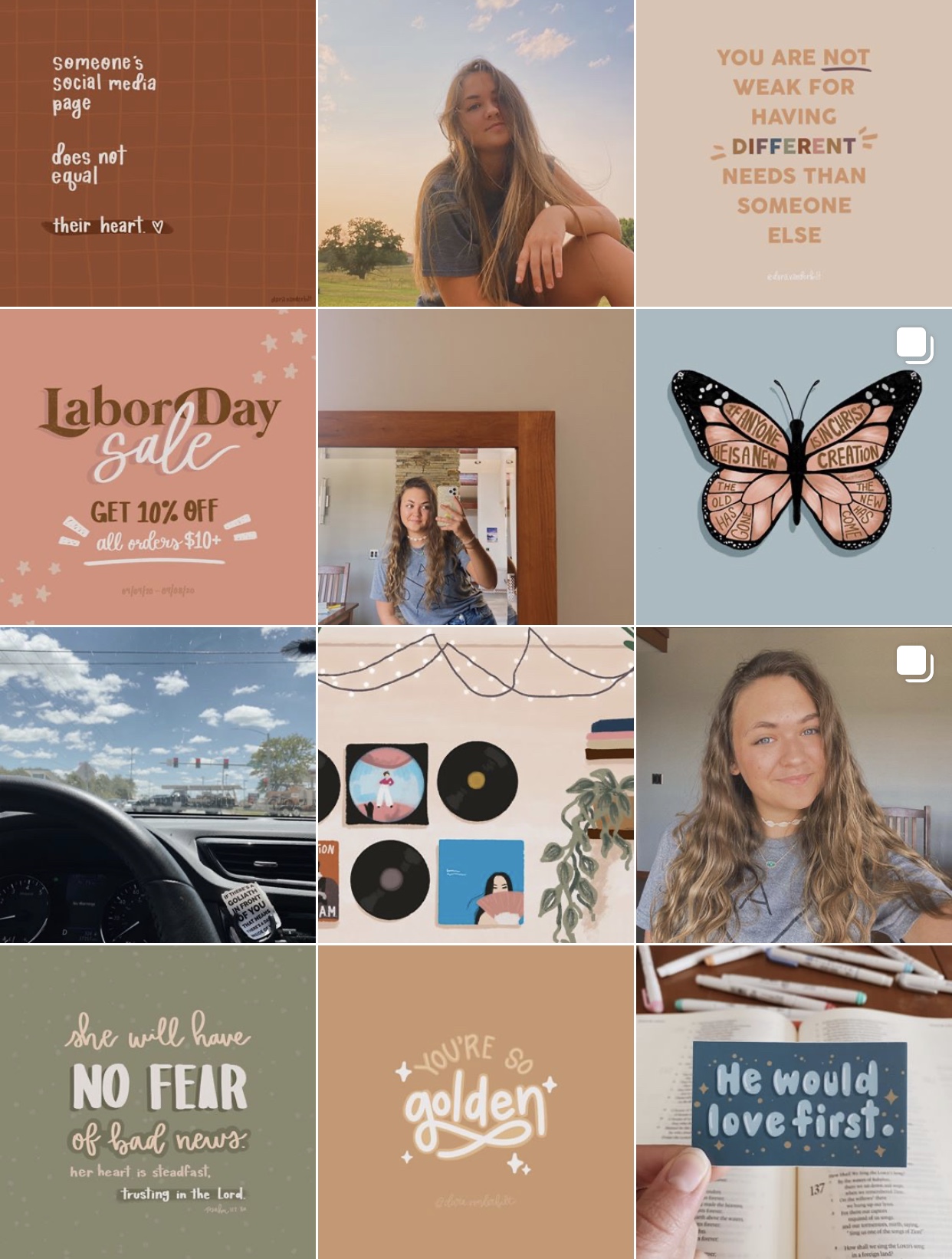
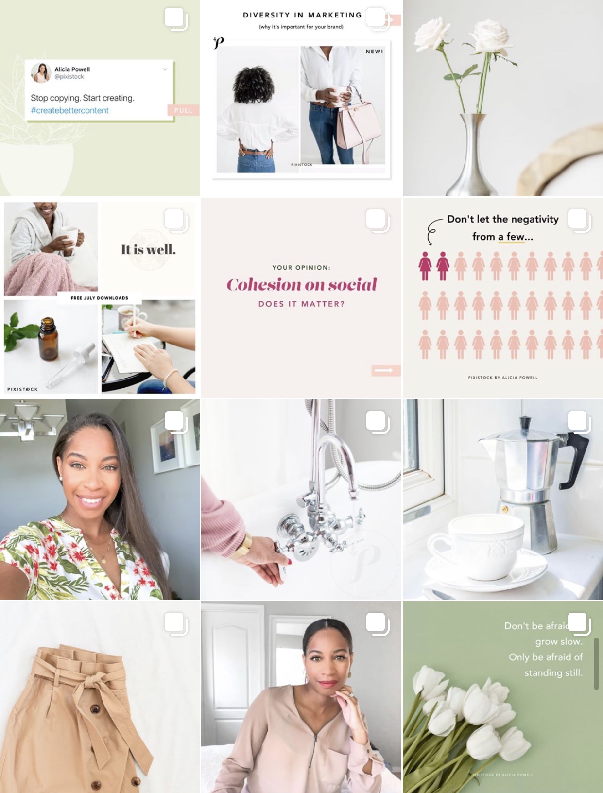
Last but not least, let’s talk about cohesive style. This is a no brainer, but at the same time, a mistake that happens very often on social media marketing strategies. Everybody wants to keep their aesthetic consistent, but it’s easier said (and dreamt of) than done, right?
I’ve been jumping from style to style for a while now, and I’m supposed to be the one who knows about this and stuff haha! But considering all the challenges I’ve had myself at not being able to find the exact style I want for my brand, this is the advice I can give: try not to commit to a style or elements that are too specific. It will limit you, block your content flow and your whole aesthetic might end up looking a bit cold (not natural) or boring.
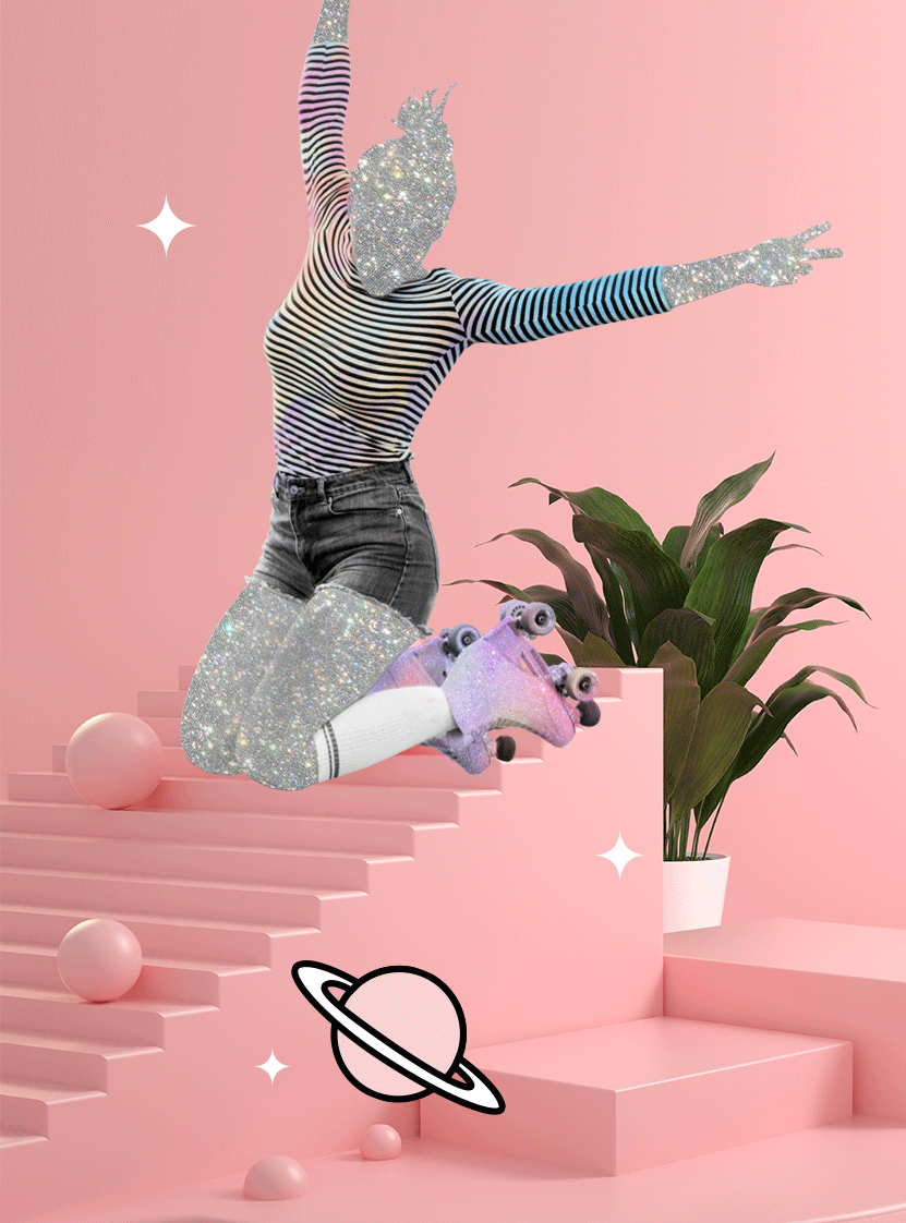
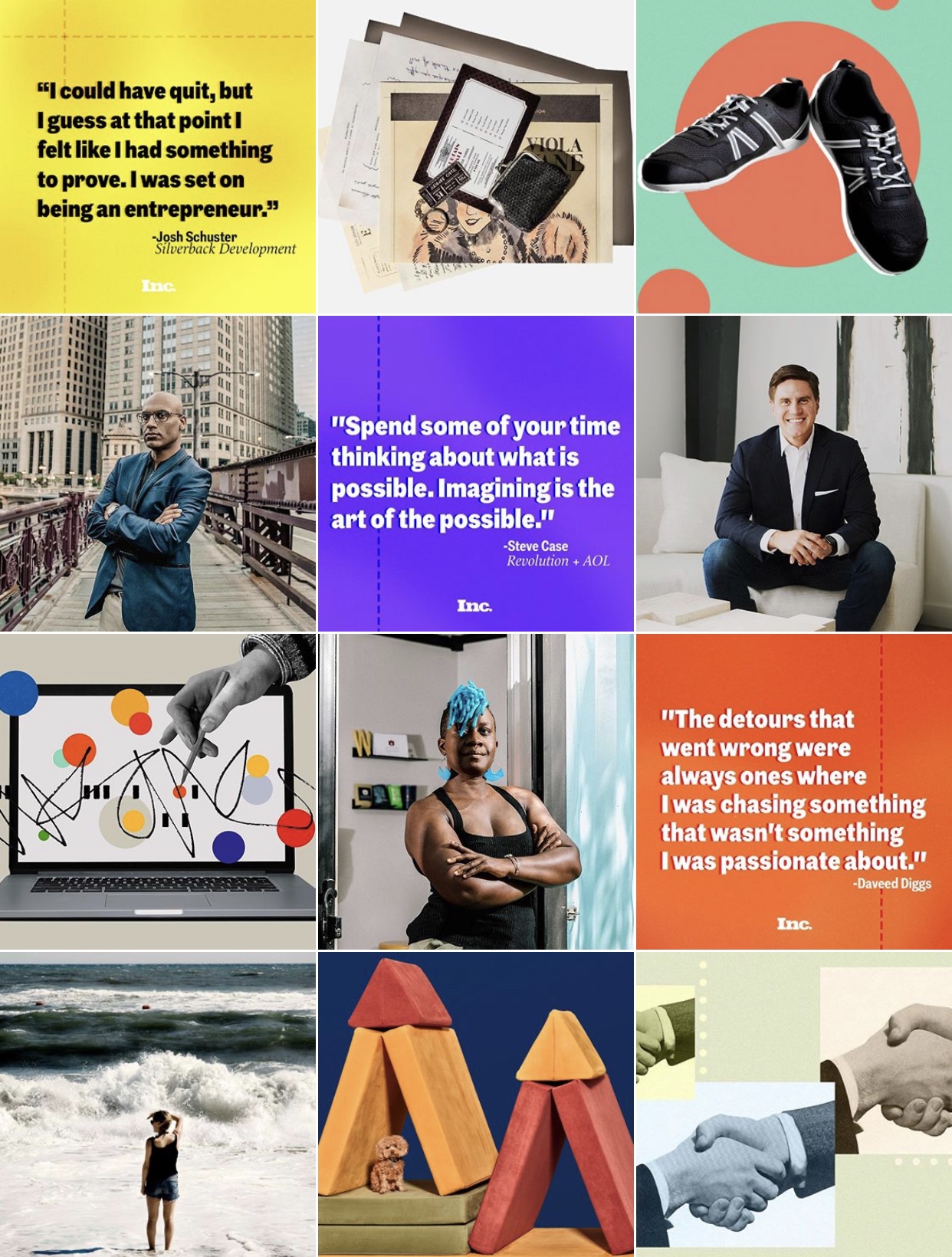
Some design inspo to wrap up the post:
I hope these tips are useful! I’d love to know what you guys think about these and other common design mistakes we all make at some point. Let me know! 🌷
Beijos,
Lu


&url=https://www.theaesthetic.shop/product/30-perfect-pink-aesthetic-high-resolution-digital-images-with-editable-canva-template/&media=https://www.theaesthetic.shop/wp-content/uploads/2023/08/30-Perfect-Pink-aesthetic-high-resolution-DIGITAL-images-with-editable-Canva-template-2.jpg)